Eric Chavkin reviews recent John Lautner Exhibition in Hammer Museum exclusively for Archinect. Along with the museum show, Mr. Chavkin anecdotes his personal experiences with the late architect as well as his takes on few of the projects. Review after the jump
_______________________________________________
Between Earth and Heaven: The Architecture of John Lautner
By Eric Chavkin
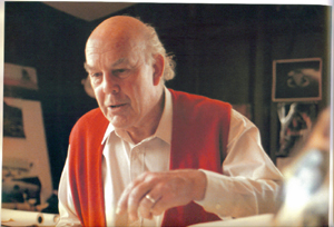
“You’re from Chicago? I like people from Chicago, they’re honest. LA people, they’re all phonies. Phony as Hollywood” my conversation with John Lautner at his Hollywood Blvd studio.
I always shake my head when I recall this most cinematic of architects dislike of film.
But like a reluctant movie star Big John is having his retrospective, applauded more after his death than when he was alive. Even his funeral was a sad joke with the service for the pantheist Lautner held at a Sunset Boulevard Catholic church presided by a priest he never met. LA’s architectural elite never showed, just scattered friends and gawkers saying goodbye.
The new exhibit has an ‘observatories of nature’ angle and curator Frank Escher is right-on with this one. The overall experience for me was positive, a good exhibit in a bad museum. The good is that the presentation is very specific to how Lautner conceived his work.
Construction Documentation. Chemosphere, Silvertop, Gantvoort
Between Earth and Heaven is not arranged like a book. All of us are savvy enough to know how print photography emphasizes the sculptural aspects of architecture, the gloss. This presentation downplays the standard photo essay format and substitutes process for the pictorial. The process is the transparency of the construction documentation leading to the finished work. Nothing precious here, just hand drawn, mostly messy elevations, plans and lots of detail sheets. This part is mostly for other architects and it was a bit like visual gibberish if you didn’t read blueprints or knew drafting shorthand. I wonder if the mouse jockeys can read them?
More interpretation; My speculation is that the exhibit layout alludes to the architects own office with an imaginary staff of many, maybe an imaginary Taliesin? Both double room exhibits are filled with drafting board mock ups with dozens of concept sketches and as many working drawings taped to surface boards. All that's missing are some scattered metal drafting chairs and a water cooler.
Along side the exhibit boards are period construction and site photos that document the drawings. Many are by Julius Shulman. The laid bare hands-on design approach and his matter-of-fact detailing somehow demystifies Lautner’s unique forms. It makes me feel like 'why didn't I do that'. Its a classroom if anyone wants to take notes.
Dynamic walkabouts: Walstrom, Pearlman, Mauer
Dynamic walkabouts. I am just a camera recording what I see and experience. Lautner’s work, especially the later, residential works are best experienced, not seen. The exhibit features several video walkthroughs that are projected on the walls. At first, the projections are a bit disconcerting, with slow zooms and pans. I felt like I entered a virtual 3D dynamic web page, but this effect fades to the backdrop quickly. I know from my experience that video walkabouts are the best way to capture John's dynamics and fluid architectural interiors.
Lautner's architecture is very exciting to the eye. The visual flow is not frozen music, but cinematic. His spaces flow like a tracking camera movement and is closest to Kubrick in spirit and feel, texture and exoticness. Maybe that's why so many of his building are in films: The Elrod in Diamonds are Forever, the Chemosphere Body Double, and the Garcia residence in Lethal Weapon 3. The best part of the Bette Cohen documentary John Lautner: Spirit in Architecture were the filmed walk-throughs of the Arango house in Acapulco.
Vista vision views: Arango, Elrod, Pearlman
Vista vision views. Lautner’s architecture was always about the extension of architecture into nature. He accomplished this with floor to ceiling glass walls and unobstructed views. I suspect he had a pantheistic reverence towards nature. The exhibit presents this concept with photo dioramas of the actual site projected onto the gallery walls. The wide screen vistas visually tell half the story. The building models completes the other half, Sliced in half,at eye-height level, I participated in natures narrative and viewed in miniature the panorama intended. It was easy to understand the reasons why each residence was configured around that orientation. For Mies God is in the details, with Lautner all you have to do is open your eyes.
Later works: psychic ecosystems, symbolic environments
My take is that Big John designed his own psychic ecosystems: a house that is a solar sundial (Elrod 1968), a forest for the trees pavilion that disappears (Pearlman 1957); rock outcrops and waterfalls as interior elements (Wolff 1961). He inverted the 'objects in the landscape' strategy, and made 'landscapes in the object’ within his own metaphoric ecology. His architecture often mediates between the structure and vista. The Arango Acapulco (1973) sundeck bridges the ocean view with broad retaining pool reflecting the blue Mexican coast and sky.
The construction of the Malibu Stevens residence (1968) pairs concrete and glass centenary curves which metaphorically mimic time-frozen waves, ‘suitable’ the architect says for a ‘beach environment’
The exhibit museum book is co-written by Frank Escher. Ironically the publisher Rizzoli is the same one that initially declined Lautner’s own book proposal, describing him as ‘having only a regional interest’. It is the same Frank Escher who convinced the Swiss publisher Artemis to publish Lautner’s first monograph during the architects lifetime. The exhibit runs from July 13 thru October 12.
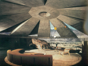
ELROD RESIDENCE, PALM SPRINGS
Lautner has many solar sundial variations in his work but the Elrod is the best. Beneath the open-closed sequence of the dome are huge desert boulders projecting above a floor of polished concrete. The dynamic light-dark “sundial” is a sun worshipers celestial timepiece. There is something cosmic about sun and shadow traversing space in time. 
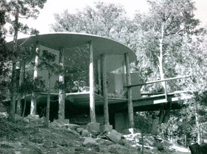
PEARLMAN RESIDENCE, IDYLLWILD
You cant see the forest for the trees. The ultimate and most organic solution to the glass box problem. The trees and pavilion columns visually integrate with each other in counterpoint and parallax.
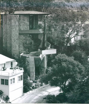
WOLFF RESIDENCE, HOLLYWOOD
The Hollywood Hills hugging Wolff residence spirals down- slope squeexing an idealized nature cave, pool and rock grotto into a vertical garden landscape. Lautner said this was his most Wrightian project as requested by the client. I think its better than Wright. It looks carved from an existing cliff formation with water plummeting into a cantilevered pool.
3 Comments
Eric...............Nice! xo JanMardian
hi jan!
welcome to archinect!!
o.
I found Mr. Chavkin's article both engaging and insightful. Because my field is not architecture, the fact that it was also delightfully jargon-free added to my pleasure in stumbling upon it.
I hope that you run more articles like it.
David Lasson
Block this user
Are you sure you want to block this user and hide all related comments throughout the site?
Archinect
This is your first comment on Archinect. Your comment will be visible once approved.