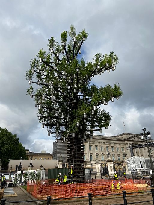

Heatherwick himself has become the puckish poster boy for the current bout of arboreal mania. He has even incorporated his trademark plant-pots-on-sticks into a range of office furniture. If in doubt, the studio mantra seems to go – just smother the design with a garnish of greenery. — The Guardian
The Guardian critic echoed colleague Rowan Moore's derisive critique of Heatherwick’s continued “abuse of metaphors” published in late April and added his own criticism that the 350-tree structure, just like the MVRDV-designed Marble Arch Mound, offers “yet another example of the recent fetish among certain architects and designers for conjuring a cartoonish version of nature, suspending shrubbery and balancing trees in ways that make the plants look decidedly unhappy to be there.”
3 Comments
Seriously inelegant this whole thing.
Heatherwick's team has been having trouble translating small objects into full-scaled sculptures and buildings in recent projects. They just scale up without any corresponding increase in material richness or structural elegance. Those canopies at the Lantern condo next to the High Line are pretty grotesque.
His earlier work was much more refined, even at a large scale. They operate on a lot of visual levels - that Shanghai pavilion transforms as you get closer, revealing material details and even a change in its form. Now it's just toys blown up hundred-fold in size.
mvrdv already did a stupid planter thing... i didn't think it could get any dumber, but there's always a bigger idiot
Block this user
Are you sure you want to block this user and hide all related comments throughout the site?
Archinect
This is your first comment on Archinect. Your comment will be visible once approved.