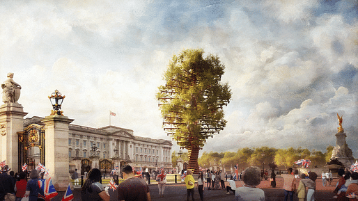

I’ll pass by the abuse of metaphors (do milestones have hearts?) but not of trees, this being another case of certain designers’ mania for picking them up, moving them around and putting them where they don’t want to be.
Those words from the studio also take liberties with the idea of art. They call the Tree of Trees a “sculpture”. Boris Johnson may once have compared Heatherwick to Michelangelo, but David it is not.
— The Guardian
The Observer critic joined a plethora of online commentators that picked apart Heatherwick Studio’s “Tree Of Trees” Earth Day announcement by comparing it to last year’s fiasco surrounding the MVRDV-designed Marble Arch Mound, which he described as a “cartoon version of nature is placed in a London ceremonial space by people who don’t seem to have thought much about what it is that makes trees lovely.”
Moore has been critical of Heatherwick’s design inspiration in the past, referring to The Vessel designer as a “pied piper [of the] very rich” in a 2017 missive and famously citing his work as an example of the migration away from “grown-up architecture” in a 2019 piece, in which he derided cloying gimmicks that offer “at most two-liners.”
Moore also touched on the controversial (and recently-rejected) UK Holocaust Memorial proposal, laying its failure on the decision to include a learning center and stating that the government should now “take the opportunity of its verdict to apply the intelligence and sensitivity that it should have shown at the outset.”
5 Comments
Only you can stop metaphor abuse.
The Heatherwick studio statement referred to calls it a “sculpture” that “seeks to put the importance of trees and nature at the heart of this historic milestone.”
There is little natural about this. Great expense and wholly artificial construction is used to give this insipid appearance of a tree. The only thing it calls attention to is another Heatherwick "neato" trick. How else could the money have been spent with greater message and effect?
A culture depends upon the strength and vitality of its language and of its metaphors and symbols. Here we see cultural collapse.
There's something really jarring, almost sickening about the 'tree' in the rendering... it looks like a creepy, ramshackle simulacrum...
Heatherwick's best works used to have a sense of wonder in them - through material transformation or unexpected motion, they surprise users and audiences. Now the studio banks on tired tropes.
This project is an example of an inability to extrapolate a concept geometrically.
It will fit in nicely with his oeuvre.
Block this user
Are you sure you want to block this user and hide all related comments throughout the site?
Archinect
This is your first comment on Archinect. Your comment will be visible once approved.