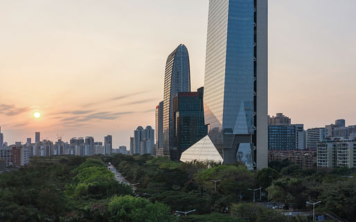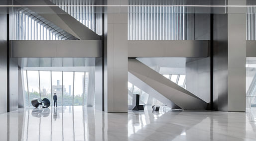
Construction has been completed on the Morphosis-designed Hanking Center, a mixed-use complex with a commercial office tower and retail center located in Shenzhen, China. The 65-story tower is defined by its pioneering steel structural system and a detached-core configuration which places the tower’s primary core on the building’s exterior. This arrangement promotes higher efficiency and adaptability of interior floor plates, as well as the creation of social and work spaces that seamlessly integrate public and private domains. At 359.8m (1180ft) tall, Hanking Center is the tallest detached-core building in the world.
“As a typology, skyscrapers tend to emphasize shape as the primary differentiator,” said Pritzker Prize-winning architect and Morphosis Founding Partner Thom Mayne. “Instead, we focused on lived experience within the city. The delamination between the circulation core and the office spaces within the tower generates a threshold, an intensification of the urban landscape as part of the day-to-day."

The slender tower sits atop a low-rise retail podium with angled facets reflecting the form of the tower above. A series of glass sky bridges and steel mega-braces link the offset core to the main body of the tower, creating dramatic, efficient connections in the sky. At ground level, the Center is accessible by multiple entrances and is set within a landscaped public plaza, creating a permeable site that invites the public into the retail podium.
The tower itself is defined by a robust steel frame that provides structural support while also shaping the building’s geometry. Rather than creating a perfectly symmetrical block, the exoskeletal frame bends and straightens to expand and contract interior floor sizes, creating a sense of movement through this sculptural quality.
Designed as an incubator for the city’s rapidly developing high-tech industrial sector, the tower has been constructed to enhance the flexibility of interior spaces to meet the evolving needs of start-up firms. By shifting the primary movement and service cores outside the main body of the tower, Morphosis’ design significantly minimizes the building’s structural footprint while maximizing open spaces inside the tower. This separation also allows for an interrupted public-to-private gradient of activity on each floorplate, while circulation and amenity areas are shifted to the tower’s perimeter to improve access to natural light.

Inside the retail podium, a tapered atrium draws natural light down into the mall creating an inviting interior environment for the visiting public. Further integrating the development with the existing streetscape, a grand plaza and dimensional hardscape surrounds the tower’s podium, creating a new neighborhood landmark that enhances public activity at the street level.
The project is the latest in a line of recent high-profile developments in Shenzhen. Last month alone, MVRDV’s sustainable, mixed-use Shenzhen Terraces began construction, Sou Fujimoto revealed their exhibition hall designed as “gardens within a box,” and SANAA unveiled images of their Shenzhen Maritime Museum. Meanwhile, Grimshaw unveiled their mango tree-inspired design for Shenzhen’s international airport and transport hub.
Zaha Hadid Architects have also unveiled two recent projects for the Chinese megacity: their competition-winning Tower C at the Shenzhen Bay Super Headquarters Base, and their Shenzhen Science and Technology Museum. Meanwhile, the designed team was recently selected for the design of Shenzhen’s Natural History Museum; comprising 3XN, B+H, and Zhubo Design.
27 Comments
Think this will be in the MoMA exhibit? All the best American architecture going to China, whereas all the best Chinese propaganda coming to the USA.
this is the "best?"
they can have it.
Jeeesus dude let it go.
The KoolAid is strong in this one.
Didn't MOMA just do an exhibition on American architects and the African American experience?
More of a research, abstract art and prospective exhibition vaguely about cities than specific, built architecture in the real world
Nice work project team. Makes my detached core days working at the Inland Steel building seem like kindergarten. Really nice design from the ground to the sky. Great photos.
the challenge about doing exterior core towers is that it's fighting the code to put the stairs and service elevators outside the core. so actually it's more accurate to call this a triple core building...
there's no practical advantage to this - any talk about it is just architectural bs. the purpose is to create a fantastic space and interesting form.
A couple of recent comps:
Right. You seem like an architect who understands efficiencies etc at this scale of building (which in an insight most of us lack). And yes when you think of all that, this is basically a form-making exercise. It is a beautiful form, I have to admit.
Morphosis took the Paris Phare Tower project a few steps further. Open floor areas have long been an interest to Mayne & Co. Separation area with perimeter glass skin provides the natural light and, possibly, the natural air circulation if mechanically designed that way (I don't know.) The idea of placing the circulation on the outer line isn't a new idea, this one is done quite well with a beautiful plastic form in a classic modernist sense.
I have been to Shenzhen twice for its architecture biennale. It's a boomtown in every sense. A very fascinating city, from a small fishing town to a megacity, all within a century.
What? Do we write off any place because they are different than our shitty democracy and imperialism?
after consideration my main criticism is that this is a tower fully visible from all 4 sides, but one of those is a back. views of the core from the north are bleak.
Yeah, the backside is the tower's weakest facade - and it extends the full height of the building! Wish they did more with that huge expanse other than metal panels. I like the contrast between the designed front and quiet back but there's a good reason why this tower is rarely shot from the back. Its also in the middle of a low rise area in Shenzhen for now.
Foster also did a detached core for their Park Ave tower but I think it is tucked between other buildings so its not as visible. The Cheesegrater in London too - though I've never seen a photo of its back. Based on Google Earth, it seems like Rogers did their trademark color-coding on the back, which is partly hidden by that much larger tower next to it.
i guess i'm over unnecessary, glass towers that are simply conduits for the FIRE industries, no matter where they might land. but that's me.
We're going to look at this stuff in 100 years and wonder wtf we where thinking. As for "our shitty democracy and imperialism", are we supposed to sign up for authoritarianism because our democracy has taken a huge stumble? What are we saying.
Lmfao. Go live in China then. I hear their summer camps are wonderful.
Full immersion. You'll leave fluent.
They are also pretty good at imperialism...
you can't do this in a shenzhen tower
pssh I can break an image link anywhere.
Some highly dubious archi-speak here, well done!
"Instead, we focused on lived experience within the city. The
delamination between the circulation core and the office spaces within
the tower generates a threshold, an intensification of the urban
landscape as part of the day-to-day."
Question: how is people's lived experience of the city affected by the delamination of the core exactly?
This is the result of a modern architecture education - how to justify your design with a mountain of bullshit. Because that's the only thing that matters.
Here here. Too much gaslighting in this world.
What the hell does this mean? “The delamination between the circulation core and the office spaces within the tower generates a threshold, an intensification of the urban landscape as part of the day-to-day."
LMAO wonder if they got some intern to draft this nonsense. Its a cool looking building with a butterback. Really no need to justify it with some BS - Morphosis should be way past this level of insecurity.
@TIQM, It makes you feel really, really small.
"delamination" :)
Block this user
Are you sure you want to block this user and hide all related comments throughout the site?
Archinect
This is your first comment on Archinect. Your comment will be visible once approved.