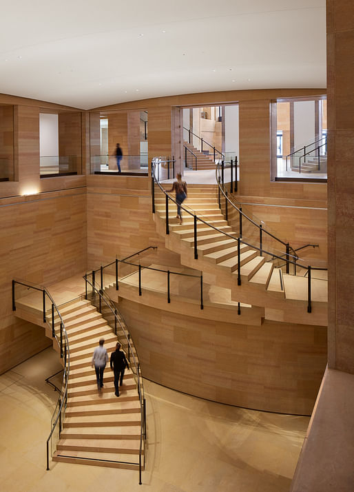

The Philadelphia Museum of Art has unveiled a $233 million renovation, reorganization, and interior expansion of its historic 1928 main building. The undertaking, called the Core Project, was led by Frank Gehry and saw the addition of nearly 90,000 square feet of reimagined and newly created space within the museum. This is the latest phase of a master plan for improvements that was approved by the museum’s board of trustees in 2004. It also marks the completion of four years of construction.
The primary elements of the Core Project include: a rebuilt and more accessible West Terrace, now the Robbi and Bruce Toll Terrace, with the addition of integrated ramps; a renovated Lenfest Hall, a space that has long been the main western entrance to the museum, which has become more open and light-filled and now features new coffered ceilings, restored columns, a newly installed wall sculpture by American artist Martin Puryear, and new, Gehry-designed admissions desks; the newly created Williams Forum, which will serve as the setting for a wide range of activities and will connect the ground floor of the museum to its upper levels; and the completed Vaulted Walkway, a 640-foot-long corridor that spans the length of the museum that has not been open to the public for nearly 50 years.
In addition, areas previously devoted to offices, the museum’s restaurant, and retail spaces have been converted into two new suites of galleries, the Robert L. McNeil, Jr. Galleries and the Daniel W. Dietrich II Galleries, which together total more 20,000 square feet of exhibition space. The Core Project also addressed a number of badly needed infrastructural upgrades meant to bring the nearly century-old building up to today’s efficiency and accessibility standards. This included work on the museum’s electrical, heating, water, air handling, and networking systems.
While the Core Project saw immense renovations to the museum, much of the work was done in close consideration of the existing structure. The building’s temple-like exterior and picturesque setting has been fully preserved, and the museum’s uppermost public levels have been largely untouched. Gehry and his team focused on the lower levels of the museum, and most of the project took place from within. Gehry and the museum were determined to honor the building’s original architectural language and materials. They used the same Kasota limestone, sourced from the same quarries in Minnesota, in the renovation that was used in the construction of the building in 1928.
“The goal in all of our work at the Philadelphia Museum of Art has been to let the museum guide our hand,” says Gehry. “The brilliant architects who came before us created a strong and intelligent design that we have tried to respect, and in some cases accentuate. Our overarching goal has been to create spaces for art and for people.”
Gehry met this goal as the work of the original architects, Horace Trumbauer and Julian Abele, is not only present but accentuated.
To celebrate the completion of the Core Project, the museum will welcome visitors on a pay-what-you-wish basis starting May 7th through May 10th, which is the date the museum first opened to the public in 1877 at its original home: the Beaux-Arts Memorial Hall. Additionally, Senga Nengudi: Topologies, the first major special exhibition to be presented at the museum in more than a year, will be on view.
9 Comments
this is nice, restrained and elegant in a sturdy way. i guess the 17 year timeline and budget of $2600/sf limited him to doing something simple and careful.
What a tough break, to think he's been reduced to working on such limiting projects... True sign of the times.
Inga Saffron's article on it is, per her usual, beautifully written and insightful. Frank Gehry’s Philadelphia Art Museum expansion sticks with tradition (inquirer.com)
If you want to get something really good from Gehry, ask him something with existing rules. He'll play with them like nobody can.
nice
I like the project in general, but that photo of the structural detail at the stair hurts my brain.
counter intuitive egress
Yikes
That Hogwarts stair is hideous. Otherwise nice work.
Block this user
Are you sure you want to block this user and hide all related comments throughout the site?
Archinect
This is your first comment on Archinect. Your comment will be visible once approved.