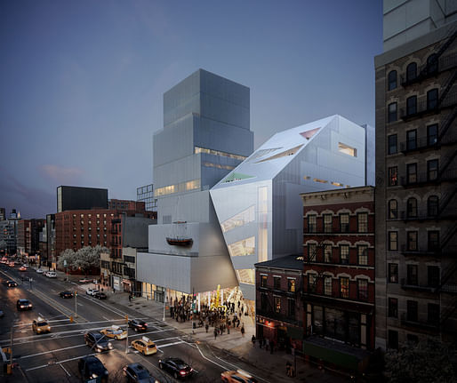

The Office of Metropolitan Architecture (OMA) has unveiled a faceted, prismatic design for the firm’s proposed expansion to the SANAA-designed New Museum in New York City.
Designed by OMA partner Shohei Shigematsu in collaboration with Cooper Robertson, the 60,000-square-foot addition marks OMA’s first public building in New York. According to a press release announcing the project, the wedge-shaped addition is designed to “complement and respect the integrity” of the flagship museum, which opened in 2007.
Though the New Museum does not maintain a permanent collection of its own, the institution has been remarkably popular since its opening. Annual attendance at the museum has skyrocketed from roughly 60,000 visitors to over 400,000 patrons in recent years, while the museum’s staff has quintupled to 150 workers, according to The New York Times.
The project will help the New Museum soothe its growing pains by doubling the institution’s overall gallery space to 20,000 square feet, boosting the capacity of the museum’s ground level cafe and gift shop, and adding new vertical circulation routes throughout the complex
“We wanted it to be complementary but not competitive,” OMA co-founder Rem Koolhaas told The New York Times, “to be independently appealing but also make sure the coexistence of these two buildings gives something fresh.”
Shigematsu added, “We did not want to make a new wing. We wanted the two to have a dialogue.”
That dialogue takes shape across the buildings’ facades. OMA’s addition, according to the renderings, is wrapped in clear glass and metallic panels that evoke the original building’s wire mesh exterior.
The conversation continues inside the new building, where a new 75-seat auditorium as well as an 80-seat restaurant will complement the existing cafe and presentation spaces. The expansion will also connect to the flagship building across seven levels, including along an upper level terrace.
But, while the SANAA building is organized as a series of canted, segmented boxes, the addition presents singular, swooping geometries that extend from roof to floor. The front of the addition, for example, is marked by a canted atrium filled with a spiral staircase that leads to the top of the museum. Here, new glass-wrapped elevator cores will ferry passengers up to the fourth floor while the lower levels below gently cantilever out over the soaring lobby. The back of the building, meanwhile, will contain a third elevator as well as a set of fire stairs.
OMA’s addition is scheduled to break ground in 2020.
I'm bored. This is really weak, a caricature of an OMA project.
Also what's with the abundance of American museum expansions lately? It seems to be becoming a competitive sport for donors.
my more thoughtful critique: it's two buildings designed to play off the context of adjacent boxy rowhouses. Except those are gone now, so they're just two dropped packages along the road.
All 11 Comments
cool
I really like how they take the SANAA-like stacked boxes and simply wrap them, has a nice Seattle Public Library vibe...
That was my thought. Very much in the vein of the Seattle Library. It'll be interesting to see how they make this its own, though. The Library is one of my favorite buildings, but a clone of it, in NYC, this many years later (and by a totally different designer) would seem hacky.
Are any of you tired of this shit yet? Seriously.
Look at that thing. LOOK AT IT!!!
looks like a temporary stairwell. takes away some of the magic from the old-new contrast, but museums now have to obey the rules of hypercapitalism
also, I thought OMA was against context. Now they seem overly referential in a way that doesn't really work well. Should make it black so the original still stands out rather than looking like a tumor growing on it
I'm bored. This is really weak, a caricature of an OMA project.
Also what's with the abundance of American museum expansions lately? It seems to be becoming a competitive sport for donors.
my more thoughtful critique: it's two buildings designed to play off the context of adjacent boxy rowhouses. Except those are gone now, so they're just two dropped packages along the road.
Yes, the SANAA work seemed made to contrast with older buildings on either side of it. The OMA addition is "sorta the same but not quite matching" and starts to make the whole thing into a pile. The little plaza that breaks the street wall is especially bad.
I agree with both your less-thoughtful and your more-thoughtful critiques, midlander. It's really....not strong.
Can we do more fucking stacked boxes!!!!
amen
This OMA shit looks like the goofy little brother of the Seattle library.
Just stack boxes on the boxes on the boxes!!!!
Think they stopped caring 10 years ago
From the movie Crazy People:
But volvos *are* sexy.
The damn thing is so ugly, they had to resort to hanging an old sailboat on it to distract us.
You can see New York's lovely character slipping away one stupid building at a time.
.
Con man.
Block this user
Are you sure you want to block this user and hide all related comments throughout the site?
Archinect
This is your first comment on Archinect. Your comment will be visible once approved.