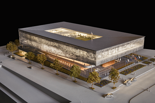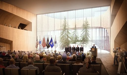

What should a National Veterans Resource Complex look like, exactly? SHOP Architects has been given the official opportunity to find out, courtesy of Syracuse University. The early renderings for this project, which the school in a release is careful to note "are conceptual in nature and may not reflect the final NVRC design" show a rectilinear, sloping tiered structure with a massive central open-air courtyard.


According to Syracuse University, the NVRC "will include classroom spaces to accommodate local and national veteran-focused programming. It will also house a conference center and a roughly 1,000-seat auditorium, which will be available for use by the whole campus and fills a critical space void."


The facility will be designed to be LEED-certitified.
News on other notable military/governmental-themed designs:
6 Comments
Hope it does end up like this. Great design.
SHoP does well when the think in building scale, not those ugly stacking superblocks
Nice
good job!
Syracuse does not need another box that hides all the program behind a heavy wall enclosed in glass entry/lobby while playing off the campus topography. Sadly it describes too many of the buildings that have been recently constructed. Based on what is presented here, it appears to be a nice building, the context will have the effect of dulling it down a bit.
That said, I like how the green roof is being used.
I'm all for buildings that don't operate as one liners
I didn't want to be the firs to say it, but Marc Miller is right. Another hovering glass box that fives the passerby nothing to look at except another gridded façade. This doesn't just describe recently constructed buildings, it descries most buildings in the last 60 years.
Oh well.
Block this user
Are you sure you want to block this user and hide all related comments throughout the site?
Archinect
This is your first comment on Archinect. Your comment will be visible once approved.