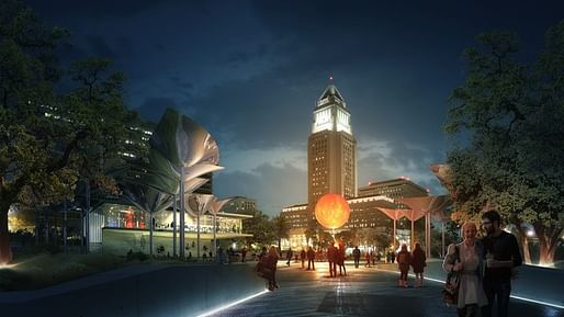
Los Angeles is in for a lot of (proposed) change, especially in its downtown core. Yesterday, the City of L.A. announced Mia Lehrer + Associates and OMA as the winners of a competition to design a new public park called the FAB Park...Proposed for the well-trafficked streets of First and Broadway in downtown L.A., the 1.96-acre FAB Park will integrate “the themes of food, art, and land.” — Bustler


Find out more on Bustler.
Previously on Archinect:
Take a look at these bold visions for Downtown LA's next park
A critical look at Downtown L.A.'s ambitious plans for two new public parks
Agence Ter and Team wins Pershing Square Renew with “radically flat“ proposal
The pv/canopy structures are interesting counter-forms versus tree canopy, but the building they try to hide under them seems to be a little uncomfortable.
Hooray for design and all, but Los Angeles could do with some parks that aren't designed for signature architects, are made up largely of unprogrammed open space, and are distributed in the parts of the city besides downtown and Silverlake...
All 13 Comments
The pv/canopy structures are interesting counter-forms versus tree canopy, but the building they try to hide under them seems to be a little uncomfortable.
The first one is Terrible.
brooks+scarpa should have won this one. oma just grabbed ideas off the shelf and mashed them up.
Hmm, the Brooks+Scarpa and EOM ones looked dated...
Hooray for design and all, but Los Angeles could do with some parks that aren't designed for signature architects, are made up largely of unprogrammed open space, and are distributed in the parts of the city besides downtown and Silverlake...
+ Janosh
that one with its mouth-ajar ramp reminds me of this except the Mehdizadeh & Bathaie building is so much more rich and convincing; the upper volume with its gravitas and its starkness, plays off against the lower sweeping lyricism ... and of course how the bricks give over to steps. very impressive and not at all forseeable. that other one linked here...meh.
in the first image, it looks like a big squared off toad surrounded by leafy srouts, lulling zombie human-insects into its mouth. probably with the promise of coffee (per the sign), which admittedly is seductive.
this park, next to grand park is unnecessary.
That building next to the other building is unnecessary.
two different things.
this seems like the most random layout ever which should make it a pretty cool park
Its unfortunate that a tech magazine covers these things better more than architecture blogs.
http://www.wired.com/2016/06/park-like-no-la-constant-flux/
Block this user
Are you sure you want to block this user and hide all related comments throughout the site?
Archinect
This is your first comment on Archinect. Your comment will be visible once approved.