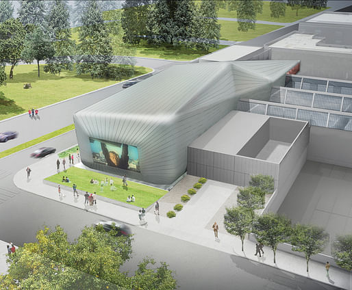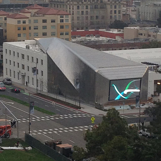

Commissioned to convert an abandoned printing plant into a university art museum, Diller Scofidio + Renfro took inspiration from fresh fruit. The architects left the original building intact, stretching a sleek skin around it, split open at the front. The new Berkeley Art Museum will open next week with an exhibition that historically contextualizes Diller Scofidio + Renfro’s design process, and provides a formidable storehouse of ideas for future architecture. — forbes.com

Recent photo of the almost completed structure on January 21. (Image via @BAMPFA on Twitter.)
Previously on Archinect: DS+R's new Berkeley Art Museum gets opening date
29 Comments
Oh lord. That's truly terrible.
Ow...that's just awful...
If you go to the twitter feed you can see a short video of the screen working. It's like, a huge TV on the sidewalk...yay?
I think we posted that at the exact same time Donna LOL.
... provides a formidable storehouse of ideas for bad architecture.
There, I fixed it.
Very modern, and elegant!
Seriously, who ever can't design better than needs to quit and take the MTA test...heard they pay good ;)
Rendering vs reality pt infinity
Too bad it's a lame design to begin with... An alien with a TV head. Oh goody I'm going to lay in a lawn next to an intersection and watch a screensaver.
DSR, another promising firm gone bad...
LOL jla-x.
Seriously, this is Not Good. I do enjoy how it lovingly embraces that shantytown of HVAC units on the existing building, though. No accusations of improper photoshopping will happen with *this* award submittal!
“Diller Scofidio + Renfro took inspiration from fresh fruit.” Before somebody ate it or after?
It looks much prettier in the pictures in Mimi Zeiger's review (spoiler: she's not crazy about it). But that's typical - those glossy picss are always beguiling.
I've been by there numerous times - the stainless steel cladding on the northwest corner has discontinuities in it - they couldn't figure out how to do it, so they just left it that way -
Miles, I think we’re going to have to move the dog….to Berkeley.
It would be more effective if it functioned as a mobile fountain.
^ Think you’re right, better put wheels on it....got a feeling we are going to be moving it a lot.
a sphincter from which digital art issues..
Carrera
Wait till it happens in your hood - here in Berk, it will be a new haven for the homeless since they are getting booted out of the BofA branch, so they can build this big tall ugly apt. edifice
^ ?
Would look great on paper in black and white line drawings with hard shadows but why would they build a retro 90's Diller + Scofidio / Denari in 2016?
randomnized are you suggesting they designed by drawings?
Olaf, that's not what i'm trying to say. To me it's just that the aesthetics of the building would fit with such a retro-style of representation since, in my opinion, this project looks like it was designed quite some years ago. It's in fact more or less a built tribute in 2016 to these old speculative works that were never built and only existed on paper.
ah ha...one of those that possibly sat on the boards for years and was recycled until it was built?
Nice on, a mouse. Now I'll forever see the building pooping. LOL
Really depressing the UC Berkeley bought this.
The form of the Osher Theater reinterprets 1930’s Streamline Moderne style of the Press Building in a contemporary language of ruled surfaces and precision-formed stainless steel. The sleek outer body is lined by a striated interior; the warm-colored sinews wrap the inside of the silvery shell. At the Addison Street end, the new structure hovers above an open excavation, exposing the library and works on paper study center to the public. The other end of the new form is counterbalanced by a café dramatically cantilevered over Center Street.
DSR
^I say its copyright infringement.
At any rate I was invited to go to the grand opening - Maybe DS+R
I like it
I'm seeing some shots on Instagram. I like the relationship to the street and the relationship to the existing building. The tapering shape near the video screen seem a little clumsy though.
Brand-spanking new and it already looks like shit. Look at the ash-canning on those panels, and the crumpling shadows where they roll over the fold. Must be some kind of expression of "materiality".
And that marquee is hideous - they made the entrance to a museum film archive look like a strip mall donut shop.
Block this user
Are you sure you want to block this user and hide all related comments throughout the site?
Archinect
This is your first comment on Archinect. Your comment will be visible once approved.