
From a super-sized cheese grater, to a contraceptive sponge, to an inadvertent fun house ride, the critics have thoroughly analogized the new Broad museum in mostly positive (if occasionally biting) reviews. To follow up with Amelia's review, published earlier today, we offer some other critical perspectives on LA's latest architectural landmark.
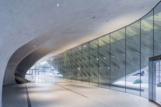
The L.A. Times' Christopher Hawthorne frames the museum's relative success principally in terms of the political and physical struggle it took to realize it (Broad is currently suing the structure's skin fabricators for what he claims were costly, time-delaying fabrication errors). "It wouldn't be fair to say that the museum, which has moments of real charm, buckles under the burden of those expectations and conflicts. But in a number of places, including its surprisingly punchless facade, it shows the considerable strain of holding up that weight."
Hawthorne also reflects on the building in terms of Diller Scofidio + Renfro's overall body of work. "The Broad is a more confident and resolved piece of architecture than the firm's 2006 Institute for Contemporary Art in Boston, a top-heavy waterfront building overstuffed with clever (and some too-clever) design ideas." He notes that because this is a museum that has been extensively worked and reworked, "it is only in the relative shadows — in the peripheral or easily overlooked spaces, or in the rooms added or enlarged late in the design process — that the architecture of the museum really comes to life."
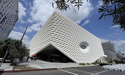
CityLab's Katharine Schwab takes a newsier approach, asserting that the building "present[s] itself as a work of art on par with the contemporary masterpieces it was built to house," before citing the opinions of numerous other critics, including The Washington Post's Philip Kennicott, to back her up.
For his part, Kennicott applauds what he perceives as the Broad's removal from the frenzy of urban engagement. "Perhaps without intending to do so, it recaptures some of the spiritual drama of the much-maligned monumental museums of yesteryear: Fundamental to any tour of the Broad is a long escalator ride from the lobby level to the square-acre expanse of open, column-free exhibition space on the third floor. This escalation performs much of the same function as the wide, monumental steps that front many of the museums built a century ago. It separates the visitor from the city and from his cares, cars and concerns."
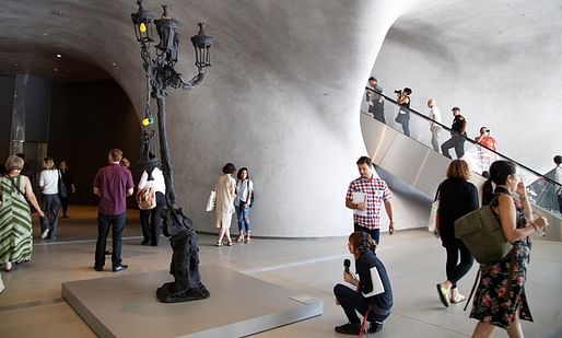
Holland Cotter, writing for The New York Times, focuses on the actual art collection and Eli Broad, who "has done wonders for art in this city." Although delighted by the inclusion of pieces by Chris Burden among others, he wishes that the collection would "stray from the blue-chip-masterpiece path that winds its way from Mr. Koons on the third floor to a gallery on the first floor of big, bland, abstract pictures by Mark Grotjahn and Christopher Wool." As to the structure itself, he describes the exterior as being "unmagical," but concedes that the lobby "sets up a mood of mystery." Ultimately, he draws a parallel between the Broad and unimaginative, narrative-controlling traditional art museums of the past, deeming the Broad "unadventurous."
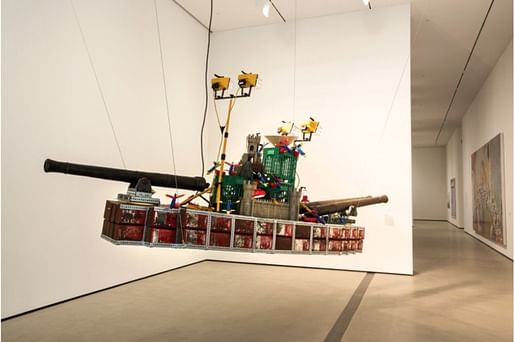
Weaving his usual astute social analysis with humor, Paul Goldberger details in Vanity Fair the relationship between the Broads and the nature of urban development in Los Angeles before closing with an observation about the museum's unexpectedly playful nature: "Moving to and from the galleries, going up through the tube and coming down past the vault, are fun-house moments, hardly typical of museums. For all the seriousness with which Diller Scofidio + Renfro have taken on the challenge of this building, I suspect that these whimsical interludes are what people will remember most about the architecture of the Broad."
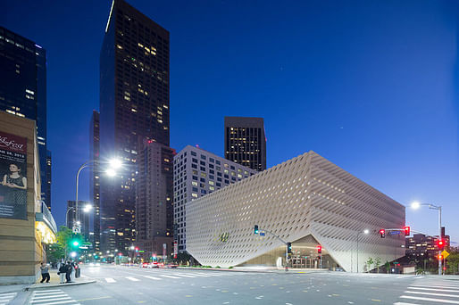
Meanwhile, The Guardian's Oliver Wainwright tartly seizes on the museum's representation of Los Angeles' car culture: "...in a move that can be ironically forgiven as contextual, the entire thing sits on a three-storey parking garage, a vast piece of infrastructure that presents a dumb frontage to the lower street to the north. By 2020, the city’s medieval public transport system will extend here with a new metro station, although it will shuffle people across a bridge to the Broad’s unprepossessing back-of-house plaza – an opportunity for the building to embrace the city’s post-car ambitions sadly missed."
For more of Archinect's coverage on The Broad:
1 Comment
I will reserve comments about architecture until I see it in December...
But damn! Put some trees on that street!!
Block this user
Are you sure you want to block this user and hide all related comments throughout the site?
Archinect
This is your first comment on Archinect. Your comment will be visible once approved.