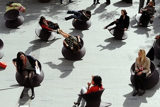
As with any great architecture, furniture design is a nimble synthesis of form and function. In the case of chairs, some designers have artfully combined both to create visually striking objects that are actually comfortable to sit and work in. The Eames line of chairs has of course received considerable acclaim, not only for their sleek design, but their relative hardiness. College dorm, office conference center, plush living room; the Eames chair can handle it, and look good while doing so. Similarly, Heatherwick Studio's ubiquitous spun chairs have become something of a pop culture phenomenon, partially because they not only spin the person sitting within them a full 360 degrees, but also tilt that person almost completely upside down:

When not in use, the chairs also can be placed sitting straight up on their small rounded base, or left positioned at a slight angle without rolling away. They are pragmatic primarily because they are so well-engineered: indoor, outdoor, wherever, these chairs will last the duration. While they are perhaps not the best choice for an action-item oriented conference, they are excellent for leisure, and create a festive atmosphere when clustered in groups.
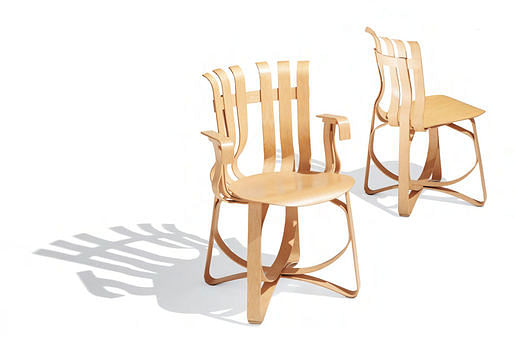
 While Frank Gehry's bentwood wooden chairs do not spin and bend (on purpose, anyway), they do make for excellent places to sit and think, primarily because of their materiality. These chairs are by far the most voluptuous and earthy: where Eames skews toward a impermeable practicality, the fluidity of Gehry's chairs requires a softer touch. Much as Heatherwick's tilting axis chairs encourage a kind of abandon, the delicate form of Gehry's chairs encourages a nuanced focus best suited to creative work.
5 Comments
The Eames chair shown is an incongruous assemblage of dissimilar materials. Granted, there is a minimalist structural aesthetic, but the contrasting structural systems colors are visually unappealing.
In contrast, Harry Bertoia's wire chairs are structurally minimalist and elegant in design.
Heatherwick's cauldron isn't a chair it's an amusement. And one which will soon wear out if you're over the age of 5. The woman on the lower left in the photo has clearly had enough.
Gehry's chair is - like much of his architecture - downright ugly, and proudly so, as if that was virtuous. Aside from that a lack of material sensitivity (it could just as easily - in fact more easily be made in plastic or metal), it look like a bad design from a first year college student.
See, I disagree, Miles. The Eames chair is beautiful because each material is doing what it's really good at doing. Bent/formed fiberglass, wood for stability, wire in tension (for the most part) - it's really beautiful and *very* modern.
I like the Bertoias too, but neither of them(Eames or Bertoia) did a very good job of integrating the padding.
I recognized the aesthetic, I just don't care for it in this application. Chairs are a bitch, probably the most difficult thing to design. Human factors, structure, aesthetics - with the kicker being no two people are the same.
Recently visited The Glass House and was told by the docent that Venturi designed the carpet in the Studio, and was the one that suggested to Knoll that they send Philip Johnson their prototype of Gehry’s Cross Check Arm Chair to see what he thought….he never returned it, but then got a letter from Knoll that said that he was welcome to keep it “but please don’t sit in it”.
Looked at it pretty close, it was definitely the Elmer’s Glue version.
A discussion about pragmatic and aesthetically pleasing chairs includes Frank Gehry but excludes Jean Prouvé? What a joke.
Prouvé's chairs were pragmatic first, and elegant second. But did both quite well.
Block this user
Are you sure you want to block this user and hide all related comments throughout the site?
Archinect
This is your first comment on Archinect. Your comment will be visible once approved.