

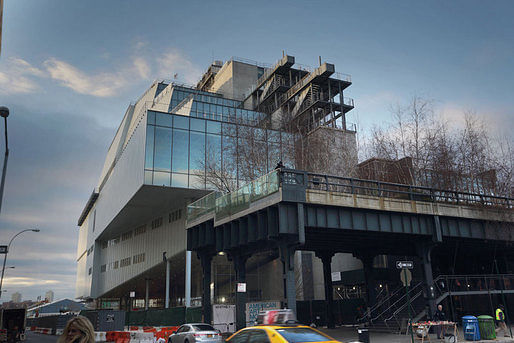
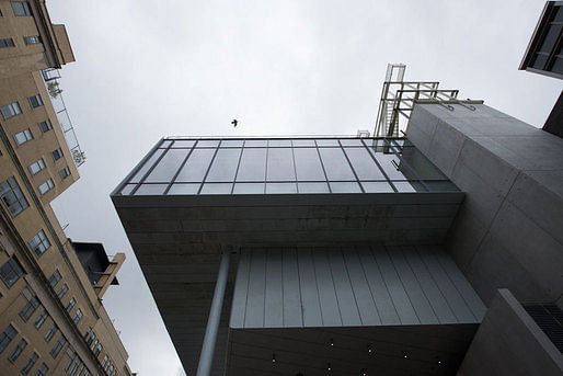
With almost two weeks left before its public opening, the Whitney Museum of American Art’s new Renzo Piano-designed building is already shaping up to be one of the most talked-about buildings of the year. The 200,00 square-foot exhibition space is the long-awaited, and controversial, replacement of Marcel Breuer’s 1966 brutalist (and equally, if not more, controversial) Upper East Side masterpiece. Critical responses have already started proliferating across the Internet. Inevitably, most include comments on Piano’s precedent, as well as the drawn-out design process that included proposals by OMA and Michael Graves to expand Breuer’s original building.
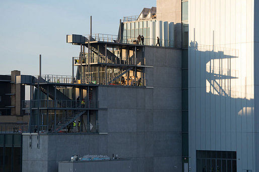
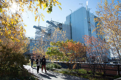
Piano has designed more museums than probably any other contemporary architect: the Pompidou in Paris, the Menil Collection, two buildings at the Los Angeles County Museum of Art, among others. So far, many critics have commented that, with the new Whitney Museum, Piano is putting his experience to good use. The design can accommodate a remarkably diverse range of art works, fitting for an era in which immersive installations and large-scale works tend to draw the biggest crowds. For others, Piano’s attempt to accommodate has produced an ungainly behemoth of a building. Almost everyone talks about the diverse appearance of the exterior of the building depending on your perspective, as well as the multitude of perspectives offered from inside the building.
There’s a lot of commentary already out and more sure to come. For now, here’s a break-down of some of the more interesting perspectives:
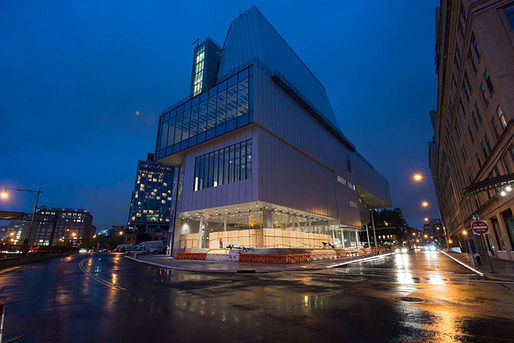
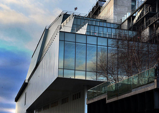
Michael Kimmelman carefully weighs the merits of Piano’s new building for the New York Times, alongside snazzy, interactive documentation. He considers the building from each perspective: from the west, where it looks “ungainly and a little odd, vaguely nautical”; from the north, where it resembles “something else, a factory or maybe a hospital”; and from the east, where it “suddenly hides behind the High Line.” Kimmelman finds: “There’s a generosity to the architecture, a sense of art connecting with the city and vice versa.” But he seems reticent to make any strong claims either in favor or against the new building. “The new museum isn’t a masterpiece,” he states, “But it is a deft, serious achievement.” He notes the careful finishes and the pragmatism of the design. He concludes that, despite its flaws, “the building is growing on me.”
Writing for Vanity Fair, Paul Goldberger is a bit more effusive. While admitting that the exterior “seems like an awkward hybrid: part glass box, part big metal beast,” he declares that he doesn’t just like the building, he “likes it a lot.” For Goldberger, Piano “brilliantly comments on the old Whitney, never copying a single element from Breuer’s building but always evoking it, subtly, inventively, and powerfully.” Still, his main interest is the interior. Goldberger writes, “The galleries offer the best balance I’ve ever seen between the primary mission of allowing you to focus on the art and the secondary purpose of engaging with the city.”
Goldberger finds that Piano’s newest museum is an improvement on his older ones. In part, Piano seems to have discovered that “people want to look at other people; they want to see stuff happening, not stare at the water.” Goldberger concludes that, in opposition to its predecessor, “All [the new building’s] faults are on the outside, and you forget them once you get past the front door, when an exuberant, upbeat spirit takes over. Inside this ungainly box, Renzo Piano has made a museum con brio.”
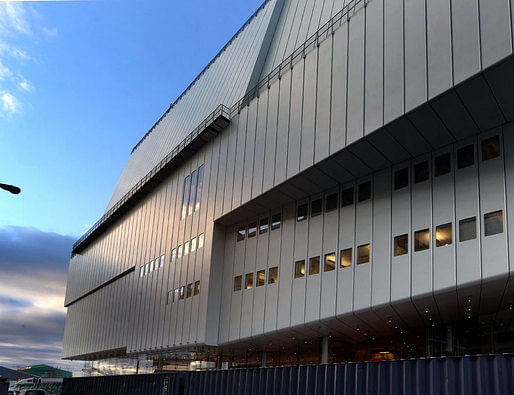
Justin Davidson, on the other hand, writes in a piece for Vulture, “The new Whitney is a wonderful place for people who get easily bored by art.” He contends that the exterior “remains a complicated contraption, ungainly on all sides.” Davidson admits Piano’s expertise in museum-design and writes, “The $422 million building is engineered to absorb punishment, move crowds, and adapt to whatever insanity future creators can dream up.” But he finds that the design is caught between (at least) two imperatives: to display art in its many, varied forms and to simultaneously cater to an audience that may be more interested in taking selfies and panoramas of the city. Davidson writes, “That pair of dueling thought bubbles — come see how much art we have; you hardly need to look at it — is one of several loudly mixed messages that make the museum so disappointing.”
Davidson’s piece also includes a couple noteworthy quotes from Piano, himself:
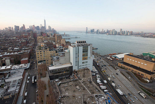
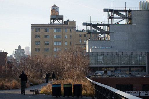
Similarly, Philip Kennicott seems to worry – albeit much less than Davidson – about the urban views overshadowing the work inside. In an article for the Washington Post, he writes, “The building is framing you, and framing the city for you, and you may feel for a moment that you have become part of the picture. Oh yes, and what is all that stuff behind you? It’s called art, and it’s been beautifully presented by the inaugural exhibition — if you can forget the city long enough to really see it.” Kennicott notes Piano’s references to the neighborhood’s grittier, industrial past as well as to the city’s now largely-vanished port economy. He expects the relationship between the building and the adjacent High Line to be fruitful: “the Whitney is now well situated to open its gates and let the currents of the city flush them through its doors.”
For the Wall Street Journal, Kelly Crow writes, “The new home of New York’s Whitney Museum of American Art has a facade that does double duty as a canvas, a vast gallery with no columns, funky elevator interiors and tantalizing hidden passages.” Like other reviewers, Crow pays a lot of attention to the new museum’s ability to accommodate art works, and spends some time explaining the historical developments that have made this so necessary. More than many other reviewers, Crow paints a picture of the museum as integrally attached to the works displayed within, and along, the building. She writes that the new building “has been outfitted with an unprecedented array of materials and architectural elements designed to wow artists as much as audiences.” Crow concludes: “Overall, the effect of the architecture is snugly understated, particularly in a city dominated by skyscrapers.”
Peter Schjeldahl discusses the new Piano-designed building for the New Yorker. He describes it as “a lurching aggregate of shapes in striated steel cladding and glass, with outdoor stairways that connect terraces on three floors” and “so confusing that, pretty soon [he] gave up looking at it.” Still, like others, Schjeldahl notes the pragmatism at the heart of Piano’s design. He finds, “Form doesn’t so much follow function as happily succumb to it.”
Schjeldahl's article also serves to showcase the architect’s perspective, as well:
For a completely different perspective, there’s also Jacqueline Detwiler’s piece for Popular Mechanics, which focuses on the building’s technical feats, in particular air circulation and “off gassing processes.”
Here on Archinect, Orhan Ayyüce started an active conversation a few days ago. He wrote, “The Whitney appears to be a mishmash and the resultant of various ideas and gallery spaces as if they were designed by different curator or artist in mind. Is it a result of indecisiveness or a brilliant way to eject an all iconic "beautiful building" all around the outside that has been the staple of museum architecture?”
Others found similarities between the design and James Stirling’s Faculty of Engineering building at Leicester University. While some, like Nam Henderson, think that the “most interesting factoid” regarding the new museum is the infrastructure beneath it: a natural gas pipeline terminates in a vault beneath the Whitney’s new lobby (and has already drawn protestors).


96 Comments
Block this user
Are you sure you want to block this user and hide all related comments throughout the site?
Archinect
This is your first comment on Archinect. Your comment will be visible once approved.