
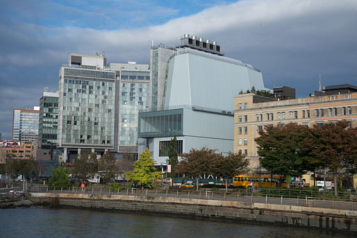
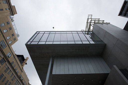
With almost two weeks left before its public opening, the Whitney Museum of American Art’s new Renzo Piano-designed building is already shaping up to be one of the most talked-about buildings of the year. The 200,00 square-foot exhibition space is the long-awaited, and controversial, replacement of Marcel Breuer’s 1966 brutalist (and equally, if not more, controversial) Upper East Side masterpiece. Critical responses have already started proliferating across the Internet. Inevitably, most include comments on Piano’s precedent, as well as the drawn-out design process that included proposals by OMA and Michael Graves to expand Breuer’s original building.
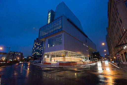
Piano has designed more museums than probably any other contemporary architect: the Pompidou in Paris, the Menil Collection, two buildings at the Los Angeles County Museum of Art, among others. So far, many critics have commented that, with the new Whitney Museum, Piano is putting his experience to good use. The design can accommodate a remarkably diverse range of art works, fitting for an era in which immersive installations and large-scale works tend to draw the biggest crowds. For others, Piano’s attempt to accommodate has produced an ungainly behemoth of a building. Almost everyone talks about the diverse appearance of the exterior of the building depending on your perspective, as well as the multitude of perspectives offered from inside the building.
There’s a lot of commentary already out and more sure to come. For now, here’s a break-down of some of the more interesting perspectives:
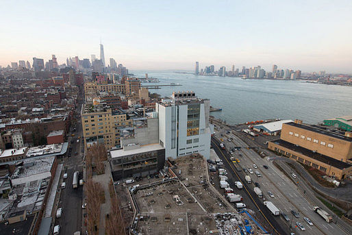
Michael Kimmelman carefully weighs the merits of Piano’s new building for the New York Times, alongside snazzy, interactive documentation. He considers the building from each perspective: from the west, where it looks “ungainly and a little odd, vaguely nautical”; from the north, where it resembles “something else, a factory or maybe a hospital”; and from the east, where it “suddenly hides behind the High Line.” Kimmelman finds: “There’s a generosity to the architecture, a sense of art connecting with the city and vice versa.” But he seems reticent to make any strong claims either in favor or against the new building. “The new museum isn’t a masterpiece,” he states, “But it is a deft, serious achievement.” He notes the careful finishes and the pragmatism of the design. He concludes that, despite its flaws, “the building is growing on me.”
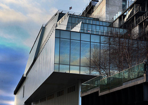
Writing for Vanity Fair, Paul Goldberger is a bit more effusive. While admitting that the exterior “seems like an awkward hybrid: part glass box, part big metal beast,” he declares that he doesn’t just like the building, he “likes it a lot.” For Goldberger, Piano “brilliantly comments on the old Whitney, never copying a single element from Breuer’s building but always evoking it, subtly, inventively, and powerfully.” Still, his main interest is the interior. Goldberger writes, “The galleries offer the best balance I’ve ever seen between the primary mission of allowing you to focus on the art and the secondary purpose of engaging with the city.”
Goldberger finds that Piano’s newest museum is an improvement on his older ones. In part, Piano seems to have discovered that “people want to look at other people; they want to see stuff happening, not stare at the water.” Goldberger concludes that, in opposition to its predecessor, “All [the new building’s] faults are on the outside, and you forget them once you get past the front door, when an exuberant, upbeat spirit takes over. Inside this ungainly box, Renzo Piano has made a museum con brio.”
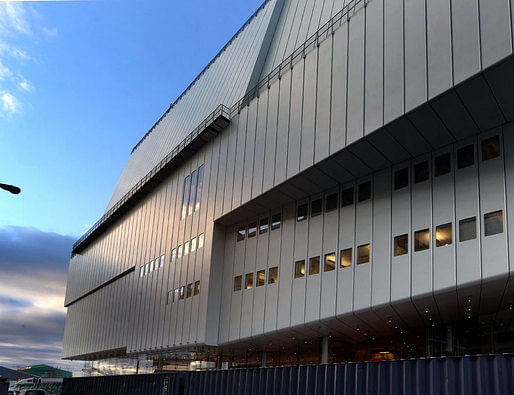
Justin Davidson, on the other hand, writes in a piece for Vulture, “The new Whitney is a wonderful place for people who get easily bored by art.” He contends that the exterior “remains a complicated contraption, ungainly on all sides.” Davidson admits Piano’s expertise in museum-design and writes, “The $422 million building is engineered to absorb punishment, move crowds, and adapt to whatever insanity future creators can dream up.” But he finds that the design is caught between (at least) two imperatives: to display art in its many, varied forms and to simultaneously cater to an audience that may be more interested in taking selfies and panoramas of the city. Davidson writes, “That pair of dueling thought bubbles — come see how much art we have; you hardly need to look at it — is one of several loudly mixed messages that make the museum so disappointing.”
Davidson’s piece also includes a couple noteworthy quotes from Piano, himself:
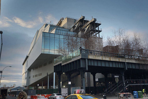
Similarly, Philip Kennicott seems to worry – albeit much less than Davidson – about the urban views overshadowing the work inside. In an article for the Washington Post, he writes, “The building is framing you, and framing the city for you, and you may feel for a moment that you have become part of the picture. Oh yes, and what is all that stuff behind you? It’s called art, and it’s been beautifully presented by the inaugural exhibition — if you can forget the city long enough to really see it.” Kennicott notes Piano’s references to the neighborhood’s grittier, industrial past as well as to the city’s now largely-vanished port economy. He expects the relationship between the building and the adjacent High Line to be fruitful: “the Whitney is now well situated to open its gates and let the currents of the city flush them through its doors.”
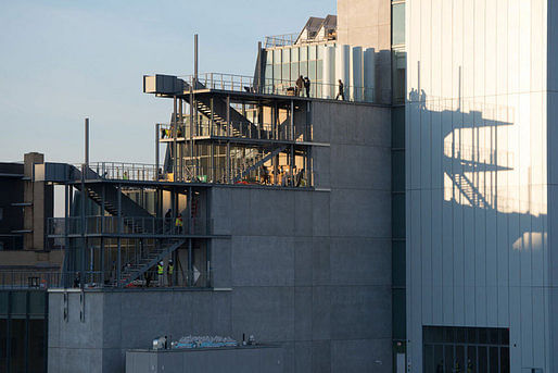
For the Wall Street Journal, Kelly Crow writes, “The new home of New York’s Whitney Museum of American Art has a facade that does double duty as a canvas, a vast gallery with no columns, funky elevator interiors and tantalizing hidden passages.” Like other reviewers, Crow pays a lot of attention to the new museum’s ability to accommodate art works, and spends some time explaining the historical developments that have made this so necessary. More than many other reviewers, Crow paints a picture of the museum as integrally attached to the works displayed within, and along, the building. She writes that the new building “has been outfitted with an unprecedented array of materials and architectural elements designed to wow artists as much as audiences.” Crow concludes: “Overall, the effect of the architecture is snugly understated, particularly in a city dominated by skyscrapers.”
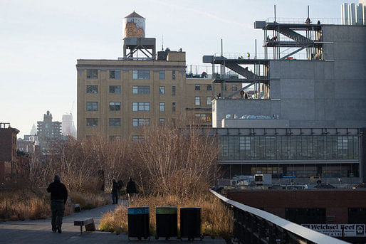
Peter Schjeldahl discusses the new Piano-designed building for the New Yorker. He describes it as “a lurching aggregate of shapes in striated steel cladding and glass, with outdoor stairways that connect terraces on three floors” and “so confusing that, pretty soon [he] gave up looking at it.” Still, like others, Schjeldahl notes the pragmatism at the heart of Piano’s design. He finds, “Form doesn’t so much follow function as happily succumb to it.”
Schjeldahl's article also serves to showcase the architect’s perspective, as well:

For a completely different perspective, there’s also Jacqueline Detwiler’s piece for Popular Mechanics, which focuses on the building’s technical feats, in particular air circulation and “off gassing processes.”
Here on Archinect, Orhan Ayyüce started an active conversation a few days ago. He wrote, “The Whitney appears to be a mishmash and the resultant of various ideas and gallery spaces as if they were designed by different curator or artist in mind. Is it a result of indecisiveness or a brilliant way to eject an all iconic "beautiful building" all around the outside that has been the staple of museum architecture?”
Others found similarities between the design and James Stirling’s Faculty of Engineering building at Leicester University. While some, like Nam Henderson, think that the “most interesting factoid” regarding the new museum is the infrastructure beneath it: a natural gas pipeline terminates in a vault beneath the Whitney’s new lobby (and has already drawn protestors).
96 Comments
I am inclined, a few days later after having read all the reviews but not having visited the building, to also like it very much. I think Orhan actually summed it up, in a sentence I guess I skimmed over the first time I read his write-up:
...a brilliant way to eject an all iconic "beautiful building" all around the outside that has been the staple of museum architecture...
I think this is it for me: It feels like a huge sigh of relief that this isn't another bathtub,or log cabin, or vagina. There's a casualness and ad hocness to it that makes it feel like a part of the city, not a closed icon.
Two things to note; first, the White Star Lines Pier - Where the Titanic was to dock, and where survivors were brought, is just a few blocks to the north. Second, there is a great park in Hoboken, that looks to this portion of the island, and it would be great to see this building, and how it feels from Hoboken, and from the ferry's going to Manhattan. I look forward to seeing the completed building this summer.
Think this shot is changing my thinking a bit, its context.
As for it fulfilling its purpose, seems that it is, art evokes thought, debate, questions & critique, and it’s delivering all four.
It's nice that it is a building. And not a pyramid or some other meme marketing tool.
Though you can sense dissatisfaction among the twitterati that it doesn't "look like" something.
Having been inside and seen the detailing up close. Piano's deftness at reconciled a complex series of demands with applumb is evident. It is as refined in many ways as his other iconic museum projects. There is definitely much to like about the way in which it, unlike so many other museums, makes the city part of the art-viewing experience. The exterior public space extensions toward the highline are beautiful and roomy and should be a great canvas for art installation as well.
That being said, it is beautiful in the way that a beautifully engineered piece of industrial machinery is beautiful. It is an amazing distillation and evocation of precisely engineered response to contradictory and complex demands....and it does so without sacrificing the level of quality and detailing you would expect for a Piano building....but it is not "beautiful" in a traditional sense. The proportions are odd, the exterior disjunctive, the relationship to the city both integral and quixotic. There are strange moves that almost seem formal (a strange "kink" in the south wall of the largest gallery floor) that are beguiling. You expect to "get it" at some point during the experience, but it doesn't always reveal itself with that level of clarity. In some ways, as a work of architecture, it more closely aligns with the concept of the "grotesque' than to "beauty"...Even though, as an experience, you would be hard pressed not to label any particular moment as "beautiful" or expertly resolved.
The experience of the building will obviously be different with artwork in it. I can't wait to see how that experience compares with the building I experienced....all open spaces, flooring being installed...
Wow, thank you for this report, Jason! Lovely to hear a report from someone who has visited it personally and with such attention to the details. I love your use of "grotesque", seems very apt.
Wow, not OMA's finest moment.....
I wonder if the old Whitney will be on the endangered list in 10 years after Chipperfields new wing opens at the Met and the experimental programming bombs.
What has it turned to now….just looking around the house for old bottles, stacks of books, plopping them on the table and proclaiming “architecture!” Working on a design right now….eyeballing my blender.
You need to use those object's topology to find deeper morphoplogies that facilitate transformation of the mundane into the incomprehensibly sublime. You will have succeeded only when the blending metaphor is not readily apparent and must be explained to a dumbfounded yet desperately eager to understand audience. If they call it The Blender you've failed. But if they think they understand you've nailed it.
Sorry, sticking to Netsch's Field Theory....if someone used the word "sublime" to describe my work I think I'd puke:)
The new building is growing on me.
Carrera, can't tell if your work is sublime without some pics.
sticking to Netsch's Field Theory
I'll stick with Heisenberg's uncertainty principle.
Here's another review, by Theodore Dalrymple, and a review of a review:
"Almost as interesting to me as the building itself was Michael Kimmelman's “criticism” of it in the New York Times. I have seldom read a piece of criticism in which the fundamental question was avoided in so pusillanimous a fashion, and in which the writer so delicately refrained from passing aesthetic judgment, presumably from fear of disagreement or appearing reactionary."
http://city-journal.org/2015/eon0422td.html
"The building was a perfect place from which to commit suicide" Apparently this Theodore Dalrymple has no fear of appearing reactionary.
Its just so easy to say that the building looks strange or even ugly. It was my initial reaction as well. But perhaps our initial reactions are not all that important for buildings that could last for centuries.
Thanks Donna,
I'm hoping we'll get another tour before the public opening. if so, I'll continue my report.
I don’t know, anybody who moves about every 20 years should consider renting….wonder about the long time fate of The Breuer building…. Lauder stipulated in his $131 million gift that the building not be sold (“in the near future”) so it’s good that The MET stepped up with an 8 year deal to “operate” it….then what? Don’t think an office or condo developer would know what to do with it….someone that has a penchant for moving should consider adaptable designs.
fineprint of fantasies,
Interesting questions. I have not been inside the new Whitney Museum yet. But they had a preview last night for VIPs so if you look at instagram, you can find candid interior photos.
Both museum designs seem to take inspiration from the scrappier and less pretentious parts of artist culture. They're more like an oversized studio rather than a cultural temple.
The New Museum is about 60k sq ft. The new Whitney is about 200k sq ft. But I think the presence in the city is has very little to do with the size.. The Whitney building is sort of crouched behind the High Line while the New Museum is much taller than its neighboring buildings on Bowery ( but that has changed somewhat since it was built). The meatpacking district is already a place where crowds of tourists linger and partiers spill out into the street and onto the highline. The New Museum's context has a much grittier and scrappier feeling. Its a couple doors down from the Bowery Mission and among various industrial appliance and restaurant furniture stores.
Also the New Museum only has one floor that allows visitors out onto an exterior balcony. Most of the gallery spaces are windowless. The New Whitney appears to have window walls that lead out to balconies on every gallery floor.
Dalrymple nails Kimmelman.
EKE, great link, thanks.
"Its just so easy to say that the building looks strange or even ugly. It was my initial reaction as well. But perhaps our initial reactions are not all that important for buildings that could last for centuries."
In my opinion, if we desire to build things that will last centuries, and continue to be seen as relevant, we should place special priority on beauty, and on creating buildings that align with our nature as human beings.
Buildings are large and complex enough to be both beautiful and ugly. There are so many things that I'm told are beautiful but are actually very dull and basic. How many photos of sunsets do we need in this world, for example?
I would say that the mix of forms is unusual but "ugly" is too strong and far too limiting.
I would venture to say that the New Whitney and the New Museum are as different as institutions can be. As such, there is very little similarity between them except an acknowledgement that, as manhattan is a city defined by verticality, inherently the Museum in New York is a collection of stacked galleries. As such they both also acknowledge the importance of the first floor as an extension of the street as an art(ful) experience.
I think the more interesting to question to ask about the two building's and their institutions is: what cultural impetus has generated the need for this institution and therefore it's building. The New Museum is not based around a collection, instead acting as a repository of temporary exhibitions. The New Whitney is an institution defined by its incredible collection of modern american art. It is a very focused entity that uses it's collections to tell a story, while also highlighting artists or concepts through special exhibitions.
Inherently all museums are their infrastructure.
we should place special priority on beauty
Tell that to FoG.
But really, beauty is entirely subjective. Thus one man's Venus is another's Roseanne Barr. Or vice versa, and without getting into the myriad forms other than visual that beauty can take.
"Anthony Daniels, who generally uses the pen name Theodore Dalrymple, is an English writer and retired prison doctor and psychiatrist."
And we're going to listen to some English prison doctor about architecture? Personally, i'd rather listen to Kanye talk about architecture, his rhymes are much more interesting.
He wasn't writing about architecture, he was writing about criticism. And being both a writer and a psychiatrist makes him well qualified to do so. Not that anything in particular is necessary in order to have an opinion, as you have just demonstrated.
"But really, beauty is entirely subjective. Thus one man's Venus is another's Roseanne Barr. Or vice versa, and without getting into the myriad forms other than visual that beauty can take. "
As I'm sure you can surmise, I don't agree with this. I think beauty is largely objective, and is based upon a shared human nature. It's not entirely objective, and there are of course differences in how it is perceived by certain individuals.
The belief in beauty as a subjective thing is broad, however. It's taught to us in platitudes like "it's in the eye of the beholder". And that belief leads directly to the conclusion that beauty is of little value. If beauty is, as you say, entirely subjective, then it is meaningless. So why hold it as an aesthetic value? This is why aesthetic modernists are uncomfortable with the notion.
Yet there was a time when there was broad consensus on what was beautiful. Or to put it another way, culture preferred to focus on the elements of aesthetics that people generally concurred were beautiful, and not on the elements where there there was no consensus. The belief that beauty is entirely subjective is a very recent one.
Again, I'll reframe it for you; we're going to listen what a Prison Doctor has to say about anything, other than prison behavior? Then again, I see why such a simple mind such as yours would be inclined to listen, or agree with a prison psychiatrist.
A Monument to Tastelessness
The new Whitney Museum looks like a torture chamber.
April 22, 2015
PHOTO BY STEVEN SEVERINGHAUS
On a recent visit to New York City, I had the opportunity to walk around the exterior of the new Whitney Museum, built at a cost of $442 million. It is a monument of a kind: to the vanity, egotism, and aesthetic incompetence of celebrity architects such as Renzo Piano, and to the complete loss of judgment and taste of modern patrons.
Did I miss anything Miles? First paragraph is about ARCHITECTURE. Fourth paragraph in we get this gem "Almost as interesting to me as the building itself was Michael Kimmelman's “criticism” of it in the New York Times".
Go back to your one word crits, at least I don't have to suffer through your verbose insipidness.
So the only people allowed to have valid opinions on architecture are architects? Welcome to the echo chamber.
So opinions are like assholes, and we've all got one, or two, in some cases. However, if we can precisely state that some architects are "valuable" or "shit" based on the "Miles Standard of Determination", then based on "b3tadine's Standard of How Much Shit Can One Prison Psychiatric Physician Spout Before I Want To Kill My Cat", I've determined that Dalrymple is tots stupid. And given what I know about psychiatrists, he's one architectural review away from suicide, or prison.
And EKE, I know that you think that post was about you, don't you, don't you, but it wasn't. It's for my good friend Miles, Sag Harbor Miles.
This is how things like Measles Outbreaks and Scientology happen. We're not just tolerating outside points of view. We're putting them above expert opinions.
I'm not sure anyone was advocating that we put Dalrymple's evaluation of the building above "expert" opinions (whatever that means). I question the notion that you can dismiss an opinion as unworthy because the person holding the opinion is not an "expert".
Buildings should work on many levels. They should provide reasons for experts to want them to be the way they are, and they should also provide reasons for non-experts as well. These may be entirely different reasons, and those reasons should be copresent. Criticism on either level should be considered valid and worthy of consideration, otherwise we truly are working in a closed, professional environment where we design buildings primarily to secure the praise of other insiders, whose livelihood depends upon stroking us. Is that what you want?
If Dalrymple had praised the Piano building, would you have criticized him as a "non-expert"? Be honest.
The Brian Lehrer show had a brief but pretty good segment on the building earlier this week. He had on Art critic Jerry Saltz and Architecture critic Justin Davidson. Saltz loved the building while Davidson had some very valid criticisms. These were two experts who disagreed and were able to articulate their points without hyperbole and with a knowledge of the history of art, architecture, NY and the Whitney to back it all up.
I'm not convinced that non-experts are picking up on details or aspects of the building that experts are missing or ignoring.
Ah, "expert" opinions. What exactly qualifies an expert? The echo chamber, a paid column, self-aggrandizement, agreement with the POV expressed?
EKE, some guys like skinny chicks, some guys like fat chicks, some guys like all women -where is the objectivity? Your aesthetic standards are yours, not mine, and therefore subjective. Our experience colors our perception, and since no two experiences are the same - even shared ones - every view is different and subjective. Thus your echo chamber and the value of contrary opinions where we are exposed to wider perspectives.
Ken, Dalrymple is using his opinion of the building, quite possibly exaggerated for effect, and one that is entirely valid whether you agree with it or not - to frame an incisive commentary on Kimmelman's wishy-washy critique.
So EKE when my mom calls me the next Frank Lloyd Wright, or Rembrandt, we should value that opinion on par with those of Clement Greenberg? Thanks, she'll want to know Artforum will be contacting her soon.
I like reading & listing to all points of view, it’s essential. Don’t really care where it comes from; there is always something to learn. Don’t think these things are widely read, mostly us guys, but it’s needed to keep us on our toes….you can take a bad painting off the wall but we’re stuck with buildings, well we used to be stuck.
1/2 a Piano is better than no Piano but it is still 1/2 a Piano.
" What exactly qualifies an expert? The echo chamber, a paid column, self-aggrandizement, agreement with the POV expressed? "
Knowledge, insight, perspective and communication skills are some of the things that separate a expert from a non-expert.
What Makes For Good Criticism
I think it wise that architecture critics take their time about this new Whitney Museum, especially its exterior. If the interior works fine as a museum, so much the better, Renzo Piano is know for his skill in this respect. But, a museum that looks like an overgrown sugar factory, or the Linden Cogeneration Plant? When Piano veers from his Miesian-based designs (e.g. the New York Times tower), I'm never quite sure what he's up to, or what he means to say. Put another way, what motivates his forms, and his formal choices? Sure, he could use the site as a rationale and source for modernist contextualism, however, in what way does this design say "museum," or "Whitney Museum," in particular, apart from its presumed references to the paintings of George Sheeler? At least Breuer's design for Madison Avenue had a gravitas, and material dignity commensurate with a great institution, and the museum as a building-type.
If the interior works fine as a museum, so much the better
Failure on this point (primary function) would be a critical failure of the entire project.
At the Pompidou Center Piano took form follows function to its logical extreme. The Whitney seems to be a more tempered and refined approach to that concept. The resulting aesthetic is certainly mixed, providing both joyous surprise and consternation.
I like that the building seems to honestly reflect its function rather than hide it in some absurdist geometry or bizarre form rationalized by a psuedo-phiosophical manifesto.
Miles Jaffe, I agree with most of what you say here. Museum commissions are coveted by architects, but so many don't carry out the assignment well, especially with regard to the crucial exhibition spaces, which shouldn't be venues for architects showing-off.. Thankfully, we didn't end up with some bizarre, narcissistic concoction a la Wolf Prix. Compared to Prix, Piano is downright down-to-earth. What's needed now, is research into Piano's architectural sources, and the intent of his downtown, industrial symbolism. If Piano's rationale for these ultimately appear correct, and emerge as shrewd good-judgment over time, so much the better.
"What's needed now, is research into Piano's architectural sources, and the intent of his downtown, industrial symbolism. If Piano's rationale for these ultimately appear correct, and emerge as shrewd good-judgment over time, so much the better."
What does that even mean?
"What does that even mean?"
My interpretation: Why did Piano make it look that way? And are his reasons justified? Time will tell.
What does that even mean?
I'm with you, Matt. One of the good things about this work is that it is not intellectualized with some philosophical garbage. And that is a problem for some as they aren't any readily available isms to hang the work on.
Miles hates philosophy and intellectuals. There. Plain spoken. Zero nuance.
Jaffeism
Architects post-construction smoke is legendary….used to walk around our stuff with clients pointing out all kinds of theory on stuff I had no clue would happen…like I knew it would happen (laughing to myself)…save me from Piano’s post-smoke.
Sorry Miles. My last comment was a bit too harsh.
I agree with Davvid's take on what I've said above. This is not Frankfurt School philosophy nor gratuitous intellectualization, merely architectural criticism, and in a proposed historical context (what other context could there be?). Put another way, I intend my remarks to be in the American tradition as advocated by curator and educator Robert Storr for art criticism per se.
I'd add that Renzo Piano's built work does not represent the formal inventiveness of, say, Le Corbusier at Chandigarh. Very few modernist architects are capable of designing on that level. Contemporary architects who venture into high-wire form-making are always taking a risk. There's something handsome about Piano's new Whitney Museum, but does industrial symbolism really work for museum architecture?
It occurs to me that Piano wanted this building to look like it had been there along, but, this, of course, is not the case at all. This makes the interpretation of Piano's architectural rhetoric in this case a necessary endeavor.
NB: In my previous post, the second-to-last sentence should read:
It occurs to me that Piano wanted this building to look like it had been there all along.
This is a great read about the new Whitney Museum through the lens of Art Critic Jerry Saltz... very informative in general about the current state of contemporary art, and a very fresh perspective on the Museum as a container for it. I am excited to go view the first exhibit in person.
http://www.vulture.com/2015/04/jerry-saltz-on-new-whitney-museum.html
Block this user
Are you sure you want to block this user and hide all related comments throughout the site?
Archinect
This is your first comment on Archinect. Your comment will be visible once approved.