
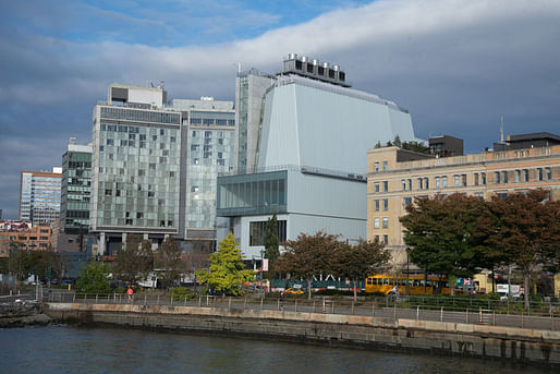
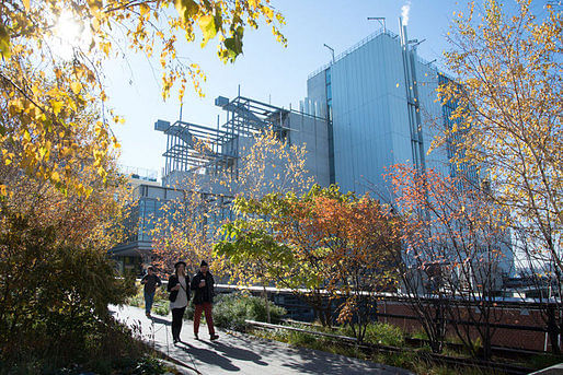
With almost two weeks left before its public opening, the Whitney Museum of American Art’s new Renzo Piano-designed building is already shaping up to be one of the most talked-about buildings of the year. The 200,00 square-foot exhibition space is the long-awaited, and controversial, replacement of Marcel Breuer’s 1966 brutalist (and equally, if not more, controversial) Upper East Side masterpiece. Critical responses have already started proliferating across the Internet. Inevitably, most include comments on Piano’s precedent, as well as the drawn-out design process that included proposals by OMA and Michael Graves to expand Breuer’s original building.
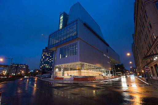
Piano has designed more museums than probably any other contemporary architect: the Pompidou in Paris, the Menil Collection, two buildings at the Los Angeles County Museum of Art, among others. So far, many critics have commented that, with the new Whitney Museum, Piano is putting his experience to good use. The design can accommodate a remarkably diverse range of art works, fitting for an era in which immersive installations and large-scale works tend to draw the biggest crowds. For others, Piano’s attempt to accommodate has produced an ungainly behemoth of a building. Almost everyone talks about the diverse appearance of the exterior of the building depending on your perspective, as well as the multitude of perspectives offered from inside the building.
There’s a lot of commentary already out and more sure to come. For now, here’s a break-down of some of the more interesting perspectives:
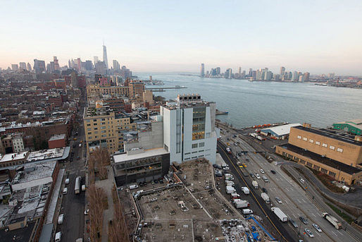
Michael Kimmelman carefully weighs the merits of Piano’s new building for the New York Times, alongside snazzy, interactive documentation. He considers the building from each perspective: from the west, where it looks “ungainly and a little odd, vaguely nautical”; from the north, where it resembles “something else, a factory or maybe a hospital”; and from the east, where it “suddenly hides behind the High Line.” Kimmelman finds: “There’s a generosity to the architecture, a sense of art connecting with the city and vice versa.” But he seems reticent to make any strong claims either in favor or against the new building. “The new museum isn’t a masterpiece,” he states, “But it is a deft, serious achievement.” He notes the careful finishes and the pragmatism of the design. He concludes that, despite its flaws, “the building is growing on me.”
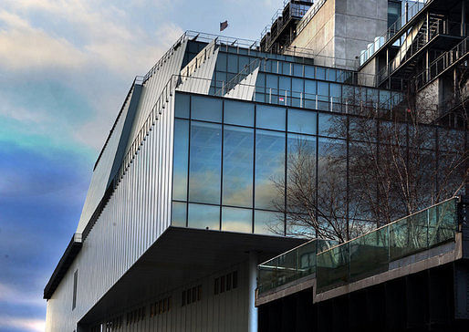
Writing for Vanity Fair, Paul Goldberger is a bit more effusive. While admitting that the exterior “seems like an awkward hybrid: part glass box, part big metal beast,” he declares that he doesn’t just like the building, he “likes it a lot.” For Goldberger, Piano “brilliantly comments on the old Whitney, never copying a single element from Breuer’s building but always evoking it, subtly, inventively, and powerfully.” Still, his main interest is the interior. Goldberger writes, “The galleries offer the best balance I’ve ever seen between the primary mission of allowing you to focus on the art and the secondary purpose of engaging with the city.”
Goldberger finds that Piano’s newest museum is an improvement on his older ones. In part, Piano seems to have discovered that “people want to look at other people; they want to see stuff happening, not stare at the water.” Goldberger concludes that, in opposition to its predecessor, “All [the new building’s] faults are on the outside, and you forget them once you get past the front door, when an exuberant, upbeat spirit takes over. Inside this ungainly box, Renzo Piano has made a museum con brio.”
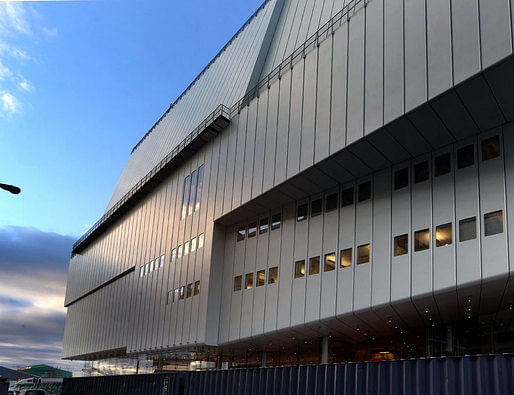
Justin Davidson, on the other hand, writes in a piece for Vulture, “The new Whitney is a wonderful place for people who get easily bored by art.” He contends that the exterior “remains a complicated contraption, ungainly on all sides.” Davidson admits Piano’s expertise in museum-design and writes, “The $422 million building is engineered to absorb punishment, move crowds, and adapt to whatever insanity future creators can dream up.” But he finds that the design is caught between (at least) two imperatives: to display art in its many, varied forms and to simultaneously cater to an audience that may be more interested in taking selfies and panoramas of the city. Davidson writes, “That pair of dueling thought bubbles — come see how much art we have; you hardly need to look at it — is one of several loudly mixed messages that make the museum so disappointing.”
Davidson’s piece also includes a couple noteworthy quotes from Piano, himself:
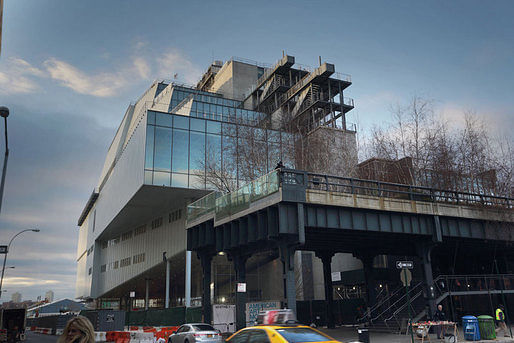
Similarly, Philip Kennicott seems to worry – albeit much less than Davidson – about the urban views overshadowing the work inside. In an article for the Washington Post, he writes, “The building is framing you, and framing the city for you, and you may feel for a moment that you have become part of the picture. Oh yes, and what is all that stuff behind you? It’s called art, and it’s been beautifully presented by the inaugural exhibition — if you can forget the city long enough to really see it.” Kennicott notes Piano’s references to the neighborhood’s grittier, industrial past as well as to the city’s now largely-vanished port economy. He expects the relationship between the building and the adjacent High Line to be fruitful: “the Whitney is now well situated to open its gates and let the currents of the city flush them through its doors.”
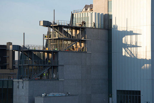
For the Wall Street Journal, Kelly Crow writes, “The new home of New York’s Whitney Museum of American Art has a facade that does double duty as a canvas, a vast gallery with no columns, funky elevator interiors and tantalizing hidden passages.” Like other reviewers, Crow pays a lot of attention to the new museum’s ability to accommodate art works, and spends some time explaining the historical developments that have made this so necessary. More than many other reviewers, Crow paints a picture of the museum as integrally attached to the works displayed within, and along, the building. She writes that the new building “has been outfitted with an unprecedented array of materials and architectural elements designed to wow artists as much as audiences.” Crow concludes: “Overall, the effect of the architecture is snugly understated, particularly in a city dominated by skyscrapers.”
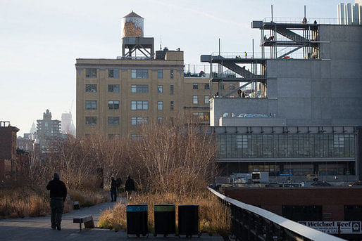
Peter Schjeldahl discusses the new Piano-designed building for the New Yorker. He describes it as “a lurching aggregate of shapes in striated steel cladding and glass, with outdoor stairways that connect terraces on three floors” and “so confusing that, pretty soon [he] gave up looking at it.” Still, like others, Schjeldahl notes the pragmatism at the heart of Piano’s design. He finds, “Form doesn’t so much follow function as happily succumb to it.”
Schjeldahl's article also serves to showcase the architect’s perspective, as well:
For a completely different perspective, there’s also Jacqueline Detwiler’s piece for Popular Mechanics, which focuses on the building’s technical feats, in particular air circulation and “off gassing processes.”
Here on Archinect, Orhan Ayyüce started an active conversation a few days ago. He wrote, “The Whitney appears to be a mishmash and the resultant of various ideas and gallery spaces as if they were designed by different curator or artist in mind. Is it a result of indecisiveness or a brilliant way to eject an all iconic "beautiful building" all around the outside that has been the staple of museum architecture?”
Others found similarities between the design and James Stirling’s Faculty of Engineering building at Leicester University. While some, like Nam Henderson, think that the “most interesting factoid” regarding the new museum is the infrastructure beneath it: a natural gas pipeline terminates in a vault beneath the Whitney’s new lobby (and has already drawn protestors).
96 Comments
I'm sorry, but when a critic says, "Let’s start with the building. I don’t care what it looks like.", they've lost me.
Dear EKE, Who said that? Certainly not I. Discovering what a building looks like, and what the forms of a building signify can, ironically, take considerable time. This is true of virtually any visual artwork. Matisse, as a juror for an exhibition in early 20th-century Paris, complained that the paintings presented were depictions of "little cubes." He was describing Picasso, and nascent Cubism, of course, but, can we really blame Henri Matisse, one of the first truly Modern artists for not understanding what Cubism was all about at that time? An assertion along these lines hardly makes sense. After all, we're all Modern and Postmodern by default. It's the environment we're in, and we all have to make the best of it, as makers and/or critics. C'est la vie, already.
I think the Piano building would have worked better aesthetically speaking if he had referenced an artist more inline with what I think he was trying to do. Someone like Stuart Davis for example.
If one is going to reference Sheeler and not speak to the underlying subtext of isolation, despair and loneliness emblematic of this type of heavily stylized realism, it is just not going to be as successful as it could be. This is why I think the Breuer building works so well. Shit it even has the paranoid sensibility of George Tooker with those cyclops windows.
It is just a fucking crying shame that a building that I like so much and has so much going for it doesn't work (aesthetically) and a building that I loath does. Fucking A.
Sometimes I hate this fucking profession.
Hyperallergenic
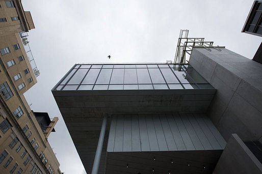
"Some feel that Piano’s privileging of interior spaces and back-of-house amenities over outward appearances has resulted in a clunky, inelegant building, but I disagree. With its open, glassy entryway and dramatically bulging, cantilevering upper floors raised on a narrow cement base and a row of massive steel pillars — leave it to an Italian architect to smuggle a stylized Roman colonnade into a contemporary art museum — the new Whitney manages to simultaneously look squat and featherweight, like a plus-size ballet dancer on pointe or a supertanker in a dry dock. The impression that the bulk of the museum is somehow floating makes climbing from its lobby up into the galleries feel like boarding a spaceship."
'Nerd, I don't know how you get from either building to Davis or Tooker but you bring up a good point, which is that a rich experience will create all kinds of different references for different people. In that respect you bring the reference to Sheeler. The creation of a rich experience is a powerful expression of architecture.
What I don't get is how you relate the ultimate success of the work to the references Piano inspired in you. For you personally, yes, but in the larger context of contemporary architecture, no.
"Dear EKE, Who said that? Certainly not I."
That was a direct quote from the critique of the Whitney by Jerry Saltz, linked in the post immediately before mine.
EKE,
My guess is that Saltz, the Whitney and Piano are on the same page. That the building is primarily about the experience of the art and the city.
NB: That should be Charles Sheeler, and not "George Sheeler," (who was that?).
A note on criticism: liking a new building and wanting to like a new building are not the same thing. There's nothing wrong with the intuition that a hung jury, for the moment, would be a good thing . . .
"EKE,
My guess is that Saltz, the Whitney and Piano are on the same page. That the building is primarily about the experience of the art and the city. "
That would be believable if it were demonstrably impossible to both accommodate the function of the building, and at the same time create a beautiful object. I'm pretty sure that's not the case.
EKE,
Throw the word beauty right out the window. It really doesn't clarify anything. I'm sure Piano and his MANY art-expert clients see beauty in his work. I've always thought Piano's work was a bit clumsy and under-resolved. But I realize thats just my own point of view. Many people love Piano's work.
Objectness is something that is extremely problematic for architects today (see Gehry, Hadid, Mayne, Guggenheim Helsinki Competition etc etc). Piano seems to intentionally avoid creating buildings that read as a bold singular objects. His building almost always read like assembled parts and components. This is part of why I'm not a huge Piano fan. Although that strategy has allowed him to avoid the dreaded "ego" charge that follows other top architects.
I never understand ideas around the word "beauty". Is Claudia Schiffer more beautiful than Emme, or my mom? What does beauty mean, when it is a completely subjective, and irrational idea to base a critical discourse on? Picasso more beautiful than Rembrandt?
beta, you didn't know!
Well that was interesting
wait for it...
math joke....
the Golden Mean and Pi are IRRATIONAL numbers.
therefore Beauty is irrational.
Carrera, close this case and Thayer-D get the kids to move along.
"Throw the word beauty right out the window. It really doesn't clarify anything. I'm sure Piano and his MANY art-expert clients see beauty in his work."
I'm not sure of that at all, actually. Not a single critic that I read really addressed the aesthetics of the new Whitney in any definitive way, and certainly didn't say that they found it to be beautiful. Including the art critic Saltz quoted above, who as much as admitted it was ugly when he said he didn't care what it looked like on the outside.
What if Piano employed the Golden Mean and some other fancy traditional trickery that is usually translated in traditional terms as beauty?
I don't get it EKE, what is this beauty thing?
If we define it objectively it is irrational (see math example).
If we define it subjectively it is absolute.
Does it matter?
funny thing is, im with eke when it comes to the criticism of pianos functionalism, with davvid when it comes to throwing the term 'beauty' out the window, cringing at phi, but still totally love proportion.
but those freemasons....
fuck those guys.
I met & worked with (collaboration) Minoru Yamasaki, and he talked about beauty all the time... looking at his work I assumed I knew what architectural beauty was... think it's lace like, soft, somewhat transparent.... have looked over Piano's portfolio and found that mostly he follows the surroundings... this thing we are talking about follows the meatpacking vernacular..... none of it is architecture, kind of like the Walmart shopping center of its day, he just mirrored it.... Yamasaki believed in beauty like it was an obligation, talked all the time about feeling obligated to plant a rose in beds of weeds. Architecture doesn't mean beauty, but architecture can be beautiful... but isn't in this case, deliberately.
Okay? Case closed.
This is a big subject with which to burden a mean little thread on Piano's new museum. Perhaps a thread of its own on beauty, if I have the time for it down the road.
Of course it matters. I think the appreciation of beauty is of crucial importance to human happiness.
The definition of beauty has vexed philosophers ever since the advent of language to attempt to describe it. Perhaps it's a bit like asking, what is "red"? I can come up with rational, mathematical descriptions for it... Red is what the brain calls input from the human visual system in response to electromagnetic radiation between x and y wavelength. But that doesn't really fully explain it, does it? It doesn't explain the feeling I get when I see a searingly red apple on a tree, on a summer day, and it's just magnificent. Try to explain "red", in words, to someone who is blind.
Can I be sure that everyone experiences it the same way? Certainly, my experience of "redness" has a subjective component. But that doesn't mean that experiencing "red" isn't something I share with other human beings. When I say "red", it has definable meaning to other people. The appreciation of color is part of our collective nature as humans. I think the appreciation of beauty is similar.
Olaf-
Your sacred geometry mashup was pretty great. Of course, it's a blending of the sublime and the ridiculous.
I'm particularly interested in the image comparing the bifurcation sequence of the Mandelbrot Set to a human cardiac rhythm. Do you have a source for that image? I'd love to read more about it.
EKE, I think we should throw beauty out the window because it doesn't clarify anything, not because it doesn't exist. Debating beauty just doesn't get us anywhere.
EKE, yeah that image was one of the more interesting ones, I tried to go full spectrum on where this can lead. here is the link
http://www.interferencetheory.com/Blog/files/801d13b7fdeabed29a1bc17b4a6ac80e-0.html
looks like an interesting website
Davvid - if we are talking about how it looks like then i guess you do have to use the word beauty, or as per Carerra, note Renzo Paino looks at the surroundings and whether the surroundings look like this or that is another subject?
Rather than talking about beauty why don't we talk about proportion, composition, materials, their relation to each other and the surrounding environment, etc. That's what I find missing in these discussions, analysis and debate over the various components that make up the building and how they fit together. Aren't these the elements of beauty?
Miles I guess the argument could then be made, if Piano was addressing the context, then which proportions did he respect?
Should industrial NYC Chelsea's proportions be respected?
From what did these proportions arise? Do they matter? They are the result of many things that only culminate in the architecture - industry, building code, zoning, personal taste, economics...
unlike most the buildings in that area, Piano had a lot more control over composition and therefore I guess we should be analyzing his composition first based on the assumption he was respecting the context?
materials, again, Piano had a lot more freedom here, most buildings in that area are brick ,but the High-Line is steel, etc...
but universal beauty? most urban contexts are the result of anything but universal beauty, so we really are just looking at this building in it's context....
Olaf, you omitted function, as in form follows ...
Not since I was a kid, I'm afraid. My grandmother had apple trees. Of course, I was using it as an example of beauty in nature transcending the mechanistic explanation of the phenomena. We have all experienced these moments, weather we choose to recognize them and value them, or not.
More recently for me? Driving down one of thoses streets on the west side of Los Angeles, planted on both side with jacaranda trees, which bloom in a riot of purple blossoms when the weather turns warm in the spring. The sun was bright and the air was crystalline clear, and the violet color was electric. And at that moment, I felt incredible peace and a profound sense of my place in the universe, and a rightness about things, and gratitude.
I tend to place Piano and Tod Willams Billie Tsien in the same category of architects who have a slightly old school sensibility about materials and construction. They don't reach for timely iconic forms underpinned by edgy theory or technology, the way that OMA, BIG or Zaha might. And they don't try to conceal the components that reveal the construction of the building. Its as if they are intentionally trying to be unhip, un-minimal, un-strange, un-iconic. Given the opportunity to make a bold clear statement, they often demur.
Beauty is a very useful word and concept, speaking generally, but, for now at least, I would need to read-up on the aesthetic literature in order to attempt some sensible commentary on beauty as phenomenon or idea. There's a sense in which everyone knows what they mean by "beauty," but it's my impression that after this, it becomes an invariably difficult concept to engage. I'm not trying to say that beauty is not a significant nor useful concept at all. It would be difficult to adequately describe much of the world without reference to beauty. As a place-holder for more difficult intellectual work, I'm rather fond of Luis Barragan's observation that "Beauty is the Oracle that speaks to us all."
I haven’t been here long, but long enough to figure out that many here are smoking way too much weed….last night I believe a group of you were in Olaf’s bedroom at Olaf’s moms house…room filled with smoke….I know this because at exactly 10:57 last night EKE got up to take a piss and the minute he left Olaf collapsed face down on his keyboard….EKE fell asleep in the bathroom and later at exactly 1:18AM he came back to the bedroom declaring he had a “red” dream.
So it's uncool to expose the components that reveal the construction of the building, or to not have timely iconic forms underpinned by edgy theory or technology?
Miles,
I do think its slightly "off-trend". But thats a positive thing if you are of the mindset that architecture should rise above fleeting trends.
Another difference that I think I'm noticing is in the types of lighting used in art museums and galleries. Piano and TWBTA seem to use track lighting with halogen/incandescent spot lights while Herzog & deMeuron and Sanaa seem to use a more even fluorescent lighting more. There are some exceptions though.
Carrera you a funny guy....was at a Christening today in North NJ...the family was a Carrera, the priest really got into what it means to be a man of god thing...
i'm out of here and over to beauty, I'm awaiting EKE to get back from his piss break, don't want to smoke this bowl all by myself.
I'm in. :)
Me too, if only to get off this page onto one without 186 photographs that take far too long to load.
love those photos Olaf!
As far as the Dalrymple piece goes; this seems patently untrue/hyperbolic...
"The façade—practically without windows—looked as if it could be the central torture chambers of the secret police"
Seems lot a fair bit of glazing to me... Although perhaps, depending on what side you are looking from...
That guy is a clown Nam. He spent too much time in The Tombs.
agreed, although what is "The Tombs"? Also, that "lot" should read 'like"...
The Tombs
:)
The Diane von Furstenberg store on 12th has a display of Renzo's study models.
Didn't have time to get closer, but the building looks good in context from street level.
Theodore Dalrymple, The New Whitney: A Reply, Against the fashionable tendency to regard ugliness as beauty
http://city-journal.org/2015/eon0430td.html
Oh yay. More opinions from some guy who probably disapproves of most of the art collected by the Whitney.
You missed it again, it's a commentary on criticism.
Note also that the author refrains from saying whether he (as against, presumably, most people) finds the building shockingly ugly. Nor is there any explanation as to why the ability to read “thin slivers of sense” (would it be better or worse if they were thick slices instead?) from “the great industrial bricolage” should—whatever to do so actually means—be a virtue in a great public building ostensibly dedicated to art.
If this evasive and cowardly verbiage is “balance,” let us be unbalanced.
I had the chance to do a full tour of the Whitney on Friday. I'm going to write up my account with some photos. look for it soon.
Block this user
Are you sure you want to block this user and hide all related comments throughout the site?
Archinect
This is your first comment on Archinect. Your comment will be visible once approved.