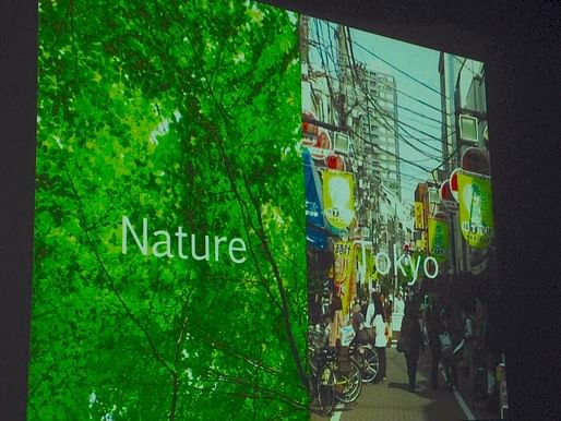
Introducing his Serpentine Pavilion in 2013, Sou Fujimoto described the structure as "between architecture and nature", suggesting an architectural form ethereal enough to change at any given moment, depending on perspective or approach, between the artificial and organic. That phrase has since been adopted to title a series of Fujimoto’s lectures, "Between Nature and Architecture", serving as a general guide to both his style and methods. His latest lecture, held last night at SCI-Arc, showcased a variety of his works that play on this concept, which is still developing over time as the relatively young architect (b. 1971) expands his influence and portfolio.

This past April, Natalie Hein covered his talk at the Cooper Union, where the focus tended towards his architecture’s ability to complicate apparent binaries – forcibly inserting ambiguity and personal choice into how a building is perceived and used. While his SCI-Arc lecture had an (understandably) similar vibe, it also touched on issues of privacy in the public realm, and how program complicates the theoretical specificity of architectural work.
For instance, when Fujimoto was selected to design the Serpentine Pavilion, he submitted two proposals that were scrapped by the planning committee before they selected his (now iconic) bramble of white steel, often related to a cloud for its ability to appear weightless and with fluctuating transparencies. In the inception phase, the pavilion was a “Frank Gehry-like” curvature on the landscape, which was then turned into a three-dimensional grid structure. But that form was too regular for Fujimoto. While the final pavilion’s weightlessness comes across even in photos, it wasn’t totally apparent in the early design phases, even to the architect: “we didn’t know what we’re making, because in the computer screen, we only see the thousands of lines, but couldn’t see the space – couldn’t see the depths of the areas, the distances. It was a very scary thing, to realize… [there was something] we couldn’t see.” Realizing the design in a physical model allowed the architect to see the shifting densities and trim them at will, leading to the structure’s amorphous final form. Function then followed, as the amorphous shape gave way to amorphous utility, to be experienced as a stage, a seat, a table, a staircase, depending on the user.
There is a clear trend, perhaps obsession, with transparency in Fujimoto’s work. There’s his public toilet in Ichihara, Japan – a single “western-style” toilet encased in a glass cube, plopped in the middle of an oval garden, surrounded by a wooden wall. Designed as part of a city-wide art festival, the toilet (which does actually fulfill its public role as a “ladies only” facility) is wrapped up in layers both physical and emotional. While it’s difficult to write about architecture that is intended to be experienced in such a specific state, I don’t think it’s presumptuous to say that the safety of a normative enclosed bathroom space is nearly demolished by this transparency – the glass cube makes a bowel movement into a jewel-box display – but then there’s the outer wall, which provides eventual privacy, with the inbetween garden as an added atmospheric experience. Tranquility was the intention, but the actual effect may be more that of a sitting duck. Transparency doesn’t mean sacrificing interiority, the box still protects you from (most of) the elements after all, but it makes the visual experience chafe against the emotional one. Of course there’s the added element of humor whenever a toilet appears, but taken with the rest of Fujimoto’s projects, any humor just feels more like a bonus than the intent – it’s the meshing of interior and exterior he’s after, often accomplished by transparent boundaries.
This theme is recapitulated in the mostly glass House NA, in the ambiguous interior/exterior spaces of House N, the almost duck-like bookshelving skeleton of Musashino Art University library, and the light-funneling portals of the (unrealized) Souk Mirage/Particles of Light master plan. Fujimoto insisted that “I don't have strict style for my architectures, but I just have the basic thinking, and then climate conditions, programs, and scales make it happen.” But what gives those factors their due influence is the architecture’s transparency. The resulting permeability suggests an architecture capable of change and adaptation, through time and function.
No Comments
Block this user
Are you sure you want to block this user and hide all related comments throughout the site?
Archinect
This is your first comment on Archinect. Your comment will be visible once approved.