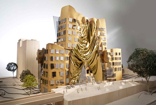
World-renowned architect Frank Gehry has unveiled plans for his first building in Australia - a state-of-the-art business school to be built in Sydney. The building will feature a wrinkly facade built using a combination of brick and glass. "The hardest thing to do with modern architecture is make it human, give it character, give it feeling, historically the great artists of our history have always been fascinated with the fold. Michaelangelo did many drawings, Leonardo Da Vinci did many drawings on that topic, and I've been fascinated with that topic."
Do you fold like Gehry does? ABC
20 Comments
How amusing.... a state of the art business centre where students go to learn the fundamentals for a succesful career in business.... and what better place to do it than a building that looks like an architectural recession, a portrait of a company that is in financial collapse....
Gehry should be a comedian not an architect, i think he is taking the p*ss
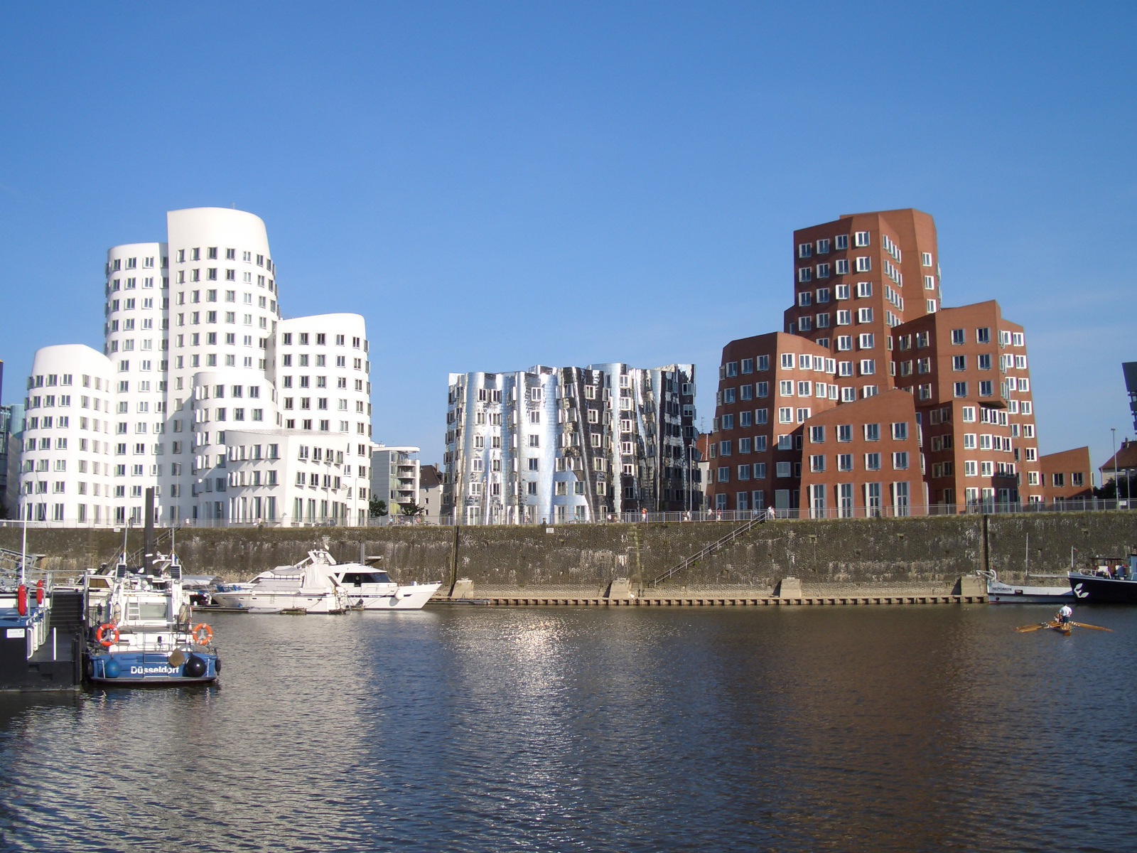
Sydney has such a strong architecture scene, that I am surprised Gehry and his team designed something that is such a willful aesthetic-based operation as opposed to something that capitalizes upon either its sense of place or climate (for instance...) as most other contemporary Sydney architecture does to great effect. It will be interesting to see how the UTS Faculty of Architecture responds to this -- Otherwise I am afraid Gehry's team has recycled their own built Dusseldorf condominium design with a few more wrinkles:

Folds, wrinkles, warps, rips, explosions caught in mid-thrust, the 'shapes of entropy'... none of these communicates stability, just the opposite. So why are these gestures so prevalent? You could say software, of course. But I think it is more than that, something else, more basic than tools.
I think that the fluidity of capital has an expression. It doesn't differentiate shapes like older industrial capital, like a factory, functional and discreet. The metaphors of expression are different; abstract, more fluid, chaotic, opportunistic....
That's what I think I see and I am open to anyone else interpretation. I think this is a good subject to speculate on
eric chavkin
The comments after the original article are fantastic.
like..."there's just something about Gehry's semi-apocalyptic aesthetic that appeals to the part of my brain that likes the look of sand castles after they've just been crushed by a thonged foot to the hummed theme music off Godzilla."?
"A lot of junk is built in cities around the world and nobody really complains," he (Mr. Gehry) said, (and added,) "this is a small building. I don't think it is going to destroy the town, I promise."
Something about this project actually makes me feel good about all the strip mall renovations i've been working on recently. Usually I'll defend FOG, but this is just horrifyingly bad.
"The hardest thing to do with modern architecture is make it human, give it character, give it feeling, historically the great artists of our history have always been fascinated with the fold. Michaelangelo did many drawings, Leonardo Da Vinci did many drawings on that topic, and I've been fascinated with that topic."
The interest in surface folds was a technical problem written about and explored during the Enlightenment. Mostly it was about drawing shadows and light and how reflected light affected shadow and surfaces. There were formulas for deep shadows, shadows within ambient light, reflected light and shadows, multiple shadows.... The rendering of the complexities of shadow play on surfaces were virtuoso effects by 'master' architects and draftsmen. With software the intricacies of surface light and shadow are easily visualized.
Why Gehry is addressing this 17thC technical drawing problem may have less to do with software and have more to do with a popular comparison with other past 'masters' like Michelangelo or Da Vinci.
The implied historical connection is of course weak and the justification for the surface folds is not about Baroque precedent and more along the lines of rationalizing his idiosyncratic architecture.
At this moment any Gehry designed building is recognizable as his. His architecture has a signature. You don't have to be a connoisseur to see this.
Gehry is now the leader of a pack of name-brand designers whose architectures have been reduced to stylistic variations of forms: Blobs, warps, folds, neo-constructivist, bio-morphic,et al.
What drives these forms to the shapes they take is what I am interested in now as I write.
Any ideas on this?
eric chavkin
eric, make that 'pack' a factory load!
it is not the sands of venice beach anymore..
we need to look into many things to answer your question.
start from architects' education to branded environments they operate in. there are hundreds of other reasons in between those two.
what drives those forms to shapes is the whole language system architecture adopted and continues to expand upon.
it defines architect's visible work and identity. everything people luuuve about architecture is packed into those shapes which are easy (or hard) to produce and be very profitable in the hands of some talented 'shaper.'
i really think gehry is a masterful and skillful architect but as a business man he caves into demand. his clients are ceo's aware of marketing impact of name brand architecture.
now, all that is starting to have a negative impact these days as the priorities of architecture are fast changing.
my triptych newscast titled .... @ .... was reflecting on that dissent with somewhat similar projects which all came this month in the popular media. all with almost identical bylines, clients and gestures.
...what drives those forms to shapes is the whole language system architecture adopted and continues to expand upon....
Stylistic Variations: Distinctions without Difference
There is no common agreed upon language, no modernist vocabulary to draw from, no classical orders to refer to. Individual expressionism rules the vocabulary and this has contributed to the present visual cacophony. The signature forms and shapes that are identified with individual architects are little niche brands within the visual design marketplace. Many distinctions but not much difference. Again, stylistic variations that point to array of 'brand' choices that are too much the same.
This new vocabulary is not a collective International Style but an aggregate of individual gestures. I look back to 20s expressionist architecture especially German expressionism and see a similar flurry of designs that were very interesting. Much of that work in the 20s was for Utopian causes. But I don't see Utopia here.
The manipulation of gestures seem empty, like a staged show and architects performing as stage monkeys to bring in the audience.
eric chavkin
we know the "stage monkey" but who is the audience? that is the diffi'cult' part to deal with. mass media is geared to sell & sell. the audience consumes. they don't want you to criticize their purchase. they just like it the way they paid for it.
it looks nice enough to me.
why not just take him at his word? why so easily dismiss him? perhaps he IS interested in shadow and light.
and anyway if you think the gestures are empty, what exactly does a manipulation of gestures that is "full" look like?
i get that we are looking for a new way to be architects, but am not sure we get far by putting gehry down.
utopia is tempting i suppose, but its pretty inflexible as models for thinking go, isn't it? i think i prefer gehry just doing his thing and not worrying about truth too much.
?
'It looks like a dried out piece of Swiss cheese'
one of the best bits of architectural criticism of the year!
Love it!
Exit wound;;
I like your collection of sarcastic architecture. Tough too find much self-conscious examples. I have better luck with graphics and advertising. I also like parody, satire, irony, sardonic, caricature and pun. After my move I'll put up my group too.
and Jump. you are right. There are no 'empty' gestures. I probably meant interchangeable. Rhetoric got a hold of me...
happy new year
eric chavkin
EEW
Not all of these are sarcastic, in a critical sense.
The Rbt Venturi museum extension uses an anamorphic pov to create the squeezed image effect.
Tigerman has a lot of humor.
http://www.artic.edu/aic/collections/artwork/102963
and I also like Site
http://thescoutmag.com/blog/architecture/409/the_best
Know any European examples?
eric
Right on 4kitect:
I'm afraid the effect of the result overtakes the stated intention of the Architect in this case. It is imposible not to see some kind of programmatic expression in a "state or the art business school" given the "state of the business art" over the past three years.
While it's easy for this to drift into the realm of sarcasm, wit, irony, etc., what are we to make of Gehry's stated intentions, as jump asks us to do?
Insofar as concepts like typology, tectonics, and context are looked upon as quaint and out of date anymore, where else can this go...?
Is it that bourgeois got bored with straight line and need to turn to ....?


At this kind of definition, I think it will go to same place where 80's style went.
................... V ..................
If anybody is inclined to explain it in less guttered ways, I am all ears and grateful for the profound intellect.
I wager it leaks. Any takers?
Honestly, I did not like it!
Block this user
Are you sure you want to block this user and hide all related comments throughout the site?
Archinect
This is your first comment on Archinect. Your comment will be visible once approved.