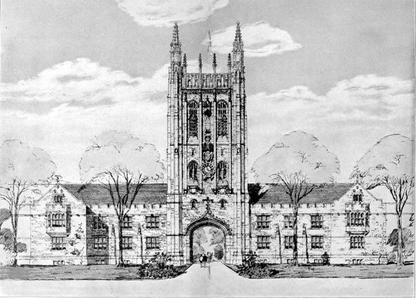
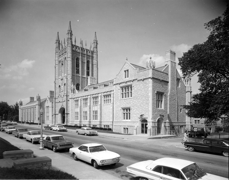
This in an interesting design, isn't it ? The tower of a cathedral, lowered to less than half of its intended height, is grafted onto a modest if handsome 2 1/2 story gabled stone-faced block -- and then pierced, thus (apparently) making this the most elaborate gatehouse in college campus history. Was this object built ?
Thanks. Note considerable relaxation, rearrangement and extension, as compared to the drawing. The element closest to the camera could be the "attached bishop's residence" of this cathedral/monastery/ classroom block. . .built like a [stone] shithouse, no doubt !
BlueGoose, can you post a larger fragment ? (Just post at a larger size and we'll see the left end of the image. Or choose a detail.) It would be fun to see the texture of that drawing. What are the media ?
file, that's most interesting. Were you involved with the project ? Is that a cast footing, with the leg pinned to it ?
SDR - you can right-click on the image above and the image's URL will appear in a dialogue box - you can copy that URL into your browser and peruse the original image to your heart's content.
no point in taking up more space (and bandwidth) here with another copy of the image when it's so easy to do what I suggest in the previous paragraph.
Hm. Well, my iMac's mouse doesn't do "right-click" -- I can drag an image to my "desktop" and thence to the the photo utility, where I can manipulate it -- but I don't think you're suggesting that. I created the photo(s) myself, so have no need to look at them elsewhere. I've enlarged portions of that drawing that I thought would be of interest. Have you a further suggestion ?
This is the work of Thomas Silva, when he was a second-year student at Cooper Union, in 1983-84. The project is called "Men's Shelter in the Bowery," and is published in "The Education of an Architect" (Cooper Union / Rizzoli; E Diller, D Lewis, K Shkapich, eds; 1988/1996). The Dean and Associate Dean at the Irwin S Chanin School of Architecture of Cooper Union at the time were John Hejduk and Richard Henderson, respectively.
eye candy
its odd that alot of the hand drawings are like circa 1980 or earlier. Funny how its been completely replaced to a significant degree.
Here's one that's not so old:

British Columbia Institute of Technology
The Technology Center
Design for a Photovoltaic Tower
I like your dotted outline.
check this guy out.

Two words- BIC pen.
University of Missouri Memorial Union

This in an interesting design, isn't it ? The tower of a cathedral, lowered to less than half of its intended height, is grafted onto a modest if handsome 2 1/2 story gabled stone-faced block -- and then pierced, thus (apparently) making this the most elaborate gatehouse in college campus history. Was this object built ?
Yes ... apparently it was constructed ...

Thanks. Note considerable relaxation, rearrangement and extension, as compared to the drawing. The element closest to the camera could be the "attached bishop's residence" of this cathedral/monastery/ classroom block. . .built like a [stone] shithouse, no doubt !
This website provides more information about the evolution of the design and the construction process ... Meet Me At The Union
Thanks. Thirteen billiard tables (and ten toilet stalls) in the ground floor of the initial plan !
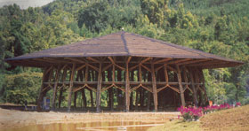
ZERI Pavillion - EXPO 2000 - Hannover

BlueGoose, can you post a larger fragment ? (Just post at a larger size and we'll see the left end of the image. Or choose a detail.) It would be fun to see the texture of that drawing. What are the media ?
file, that's most interesting. Were you involved with the project ? Is that a cast footing, with the leg pinned to it ?
Bertram Goodhue
img]http://www.sjparish.net/Organs/goodraw.jpg[/img]
Again...Goodhue:

nevermind...
Thanks, EKE. (I think it's good to see a bit of detail, anyway -- look at those shadows with stone coursing in "reverse". . .)
Magnificent.
(and the young man making a date for later with the Vicar. . .)
Leah Beeferman
- nope, it's just something I stumbled across on the web - you can read a lot more about it here: ZERI Pavillion
Thanks, file. Bamboo !


Following EKE, here's another Goodhue drawing, from 1915 -- a design for Westchester, New York, if I read the inscription correctly.
How about this abstraction of foliage ? Surprising ?
SDR - you can right-click on the image above and the image's URL will appear in a dialogue box - you can copy that URL into your browser and peruse the original image to your heart's content.
no point in taking up more space (and bandwidth) here with another copy of the image when it's so easy to do what I suggest in the previous paragraph.
Hm. Well, my iMac's mouse doesn't do "right-click" -- I can drag an image to my "desktop" and thence to the the photo utility, where I can manipulate it -- but I don't think you're suggesting that. I created the photo(s) myself, so have no need to look at them elsewhere. I've enlarged portions of that drawing that I thought would be of interest. Have you a further suggestion ?
SDR - ah, I see. Sorry for the erroneous assumption.
Here's the original URL:
http://pub.ucsf.edu/missionbay/imagedb/images/2002-06-19-19a.jpg
I believe on a mac it is either apple or ctrl click to do the same thing that blueGoose was describing.
i've always enjoyed the artist paul noble and his imaginary towns, built with buildings that spell out their purpose:

wtf

Thanks, guys. I'm getting it. I misunderstood your point, B G. Looks like the Mission Bay rendering was done to the methods of Steve Oles. . .
What a great image for the thread, bossman; is that a slice of the original or was it proportioned like that ? This guy is strange. . .
slice...what is the syntax to adjust image size again?
Add width=420 after the URL (with one space) and before the [/img]
Yow. (Well, it's good to see it both ways.) Who IS this man ? There's something a bit Brueghel about that smaller one. . .
i don't know just some crazy guy. i first came across his work in the Vitamin D book
more from paul noble:

damn flickr
http://flickr.com/photos/centralasian/2117604087/in/set-72157603479939034/
http://flickr.com/photos/centralasian/2118381740/in/set-72157603479939034/
sweet madness. I like this detail
http://flickr.com/photos/centralasian/2118381638/in/set-72157603479939034/
Stadium Square; Cleveland, Ohio, 1927

From an article entitled "When Bad Ideas Happen to Good Suburbs"
This is the work of Thomas Silva, when he was a second-year student at Cooper Union, in 1983-84. The project is called "Men's Shelter in the Bowery," and is published in "The Education of an Architect" (Cooper Union / Rizzoli; E Diller, D Lewis, K Shkapich, eds; 1988/1996). The Dean and Associate Dean at the Irwin S Chanin School of Architecture of Cooper Union at the time were John Hejduk and Richard Henderson, respectively.
huh. i had martin finio on a review once.
Douglas Darden
Is that couple walking toward us, or running in blind panic. . .?
Block this user
Are you sure you want to block this user and hide all related comments throughout the site?
Archinect
This is your first comment on Archinect. Your comment will be visible once approved.