
Sep '11 - Jan '13

My portfolio hasn't seen very many changes over the years. The smaller, landscape oriented one was my first ever that I submitted with my application for the third year of the U of I architecture program. The one pictured next to it was one that I submitted during my fourth year for a scholarship application. There have been other versions of these same with updated projects and then a few spin-offs of these basic layouts for different portfolios for class projects, etc. At the time I finished these I thought they were manifestations of years of school, weeks (maybe months) of all-nighters and caffeine benders, and hours revising and proofreading until they were nearly flawless. I look at them now and I see a lot of pros and cons and lessons learned.

This first portfolio taught me a lot about using Adobe InDesign, in my opinion, an absolute must for digital portfolio design. I had started the layout in Photoshop, but quickly changed to InDesign thanks to the suggestion of one of my TAs. It shows a strict adherence to an organizational scheme that was over-bearing and ineffective. I found myself constrained so much by my desire to follow a layout based on the golden ratio that I vowed I'd never use it again. I did like that I fit one project to a spread, because it allowed for a very straightforward reading. Speaking of reading, there was just too much text. Take that and combine it with a poor font choice and the rigid layout and you're left with a pretty lifeless portfolio.

This portfolio is better, as it should be after a few more years of solid design experience (it still has a bad font choice). The overall organization relied on a three-column grid that was allowed to be broken depending on the project. Each project would typically take up two spreads, as fitting everything I wanted to on one was just too cramped. I followed a professor's advice and included a fairly standard set of metrics for each project; course, semester, project duration, instructor, team members (if applicable), design problem and design solution. This usually resulted in a page of descriptive text which I offset with a full-bleed, procedural image on the opposite page. These full page images can be intriguing but in the end they aren't the project, that's on the next page.
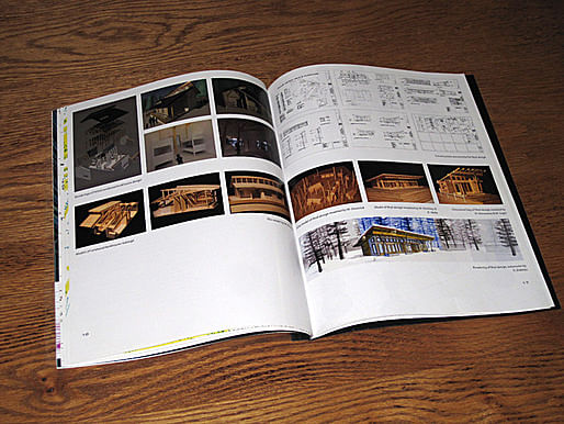
Turning the page showed the bulk of images for each project. The pages in the photo above are an excellent example of the three-column grid, plus a lack of organizational hierarchy ... in other words, nothing grabs your attention. Not all of the project in this portfolio are this way, but the majority of them are. However, the major downside to this layout, and it took me a job interview earlier this spring to figure it out, is that the first spread of each project shows you absolutely nothing. All the eye candy is hidden. I suppose this would be ok if the portfolio was 100 pages long and had five or six spreads to show and explain everything one project phase at a time, but for a short portfolio with only a few pages per project I lose your attention the second I open up to the first page of a project and say, "So this is ..."
I'm still tweaking a few things on my next portfolio and I don't have any images to show for it just yet (more of that to come soon). I can tell you that it will follow the layout of the second portfolio here somewhat. Projects will be one or two spreads. The text will be condensed and spread out so that it isn't overwhelming. The basic project description will move to the bottom of the left page and the main image(s) will be in the top on the right. Images will not be afraid to 'spill over the gutter' allowing the spread to be a spread, and not just two pages next to each other.


Commentary on looking for work, portfolio and resume design, networking, social media and the job search, interviews, dealing with rejection and the joy of landing a job.
No Comments
Block this user
Are you sure you want to block this user and hide all related comments throughout the site?
Archinect
This is your first comment on Archinect. Your comment will be visible once approved.