New York, NY
Without fundamentally changing the traditional pre-war layout of this East Side apartment, we transformed it from a dated, heavy space into an airy, modern home that fits the needs and tastes of its owners.
The original apartment had numerous low and asymmetrical beams building that made the rooms ceilings feel low and the rooms cramped. Heavy wallpapers and many contrasting patterns no longer served the lifestyle and taste of its owners, a retired couple whose children are now grown. We re-arranged two of the children’s rooms to guest rooms with a shared bath, and converted the third child’s bedroom to a den. We worked closely with the owners to determine which pieces of furniture to keep, and in many instances how those pieces could be reimagined.
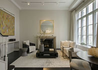
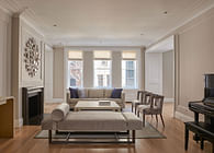
We revised the plan architecturally to emphasize a clear axial relationship between the living room, the gallery, and the dining room, and then used colors, textiles and finishes to unify the three spaces. Instead of three separate and differently decorated rooms, the spaces now flow with each other and seem more spacious. Carefully detailed plaster moldings accentuate the heights of the ceilings and the continuity of the spaces.
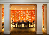
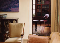
The gallery, re-shaped to grander proportions, displays a wonderful console designed by the mid-century Italian furniture maker, Paolo Buffa, still with its original peach colored marble top. The console is flanked by a custom bench and chairs designed for the space by Rodman Paul Architects. The walls and concealed closet doors are covered with a custom Tree-of-Life Gracie wallpaper handpainted on a silver leaf tea paper background.
A coffered ceiling in the dining room provides a new setting for the clients’ 19th C silver chandelier. The silver leaf tea paper extends into the dining room, also providing warm reflections for a pair of silver sconces from Carlos De La Puente Antiques. The clients’ Sheraton style mahogany chairs and breakfront, originally dark mahogany, were painted and glazed a warm gray to further lighten the appearance of the room. The breakfront had been a topic of much debate, but after removing its pediment, and adding lighting and pink silk lining, it became the signature element of the room.
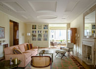
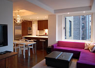
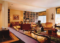
The living room ceiling features spherical vaults and beaded trims in an homage to Sir John Soane’s yellow drawing room. The walls are covered with a vintage Gracie silk wallpaper which extends the warm gray of the gallery into the living room. The furniture includes some custom pieces designed by Rodman Paul Architects along with a beautifully veined antique Louis XVI fireplace mantel from A & R Asta and a custom Mitchell Denburg carpet.
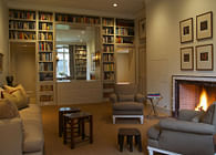
The den is anchored by an Oriental carpet, originally located in the living room, now recut to fit its new home.
In the master bedroom, we completely rearranged the plan to provide for walk-in closets, added storage, and an expanded master bathroom. The textiles and wall coverings were picked to create a unified and appearance, extending from the bedroom into the bathroom. The master bath was designed with cerused oak cabinetry and a custom-designed tile floor in onyx and green and white marble.
As with any prewar apartment renovation, there were unexpected challenges – hidden ductwork forcing plan changes, and small steel columns hidden in wall thicknesses. The only way to deal with things of that sort is to view each challenge as an opportunity to find a new, and hopefully more creative, solution. In the end, the plan has to look and feel completely natural, as if it had always been designed that way.
As with all apartments in a co-op buildings, we worked with the managing agent, the building architect, and the co-op board, when necessary, to ensure a smooth path from design through review and construction.
Status: Built
Location: New York, NY, US
Firm Role: Architect
