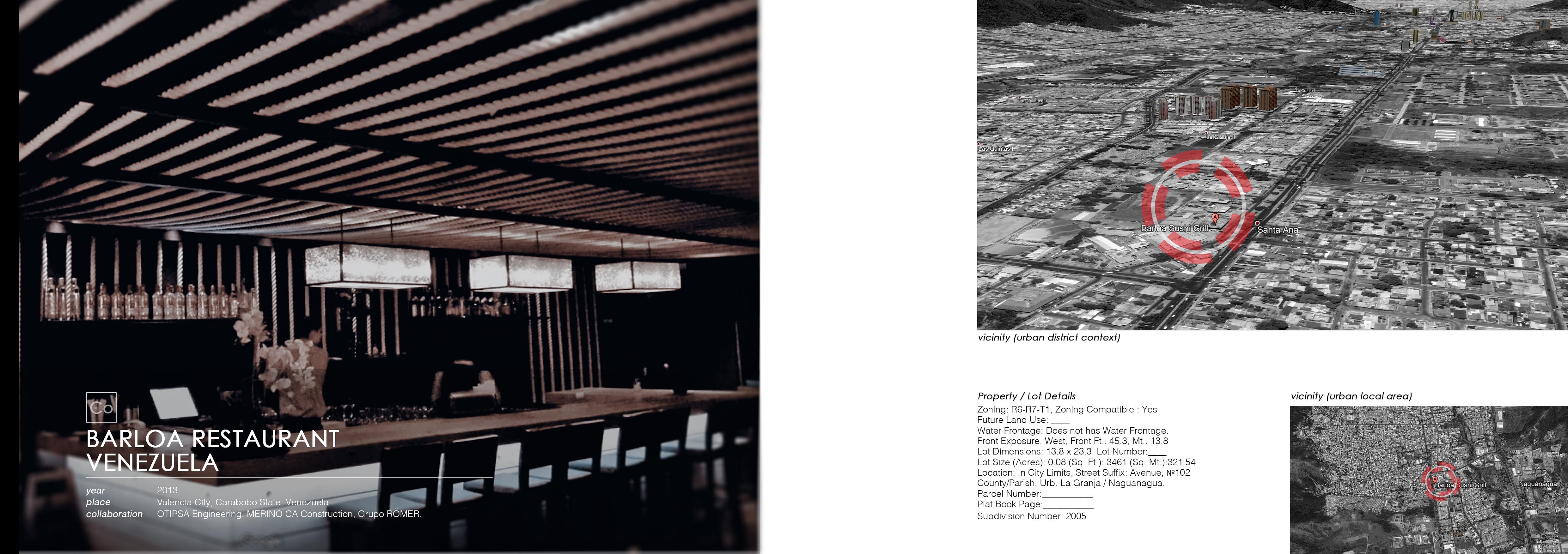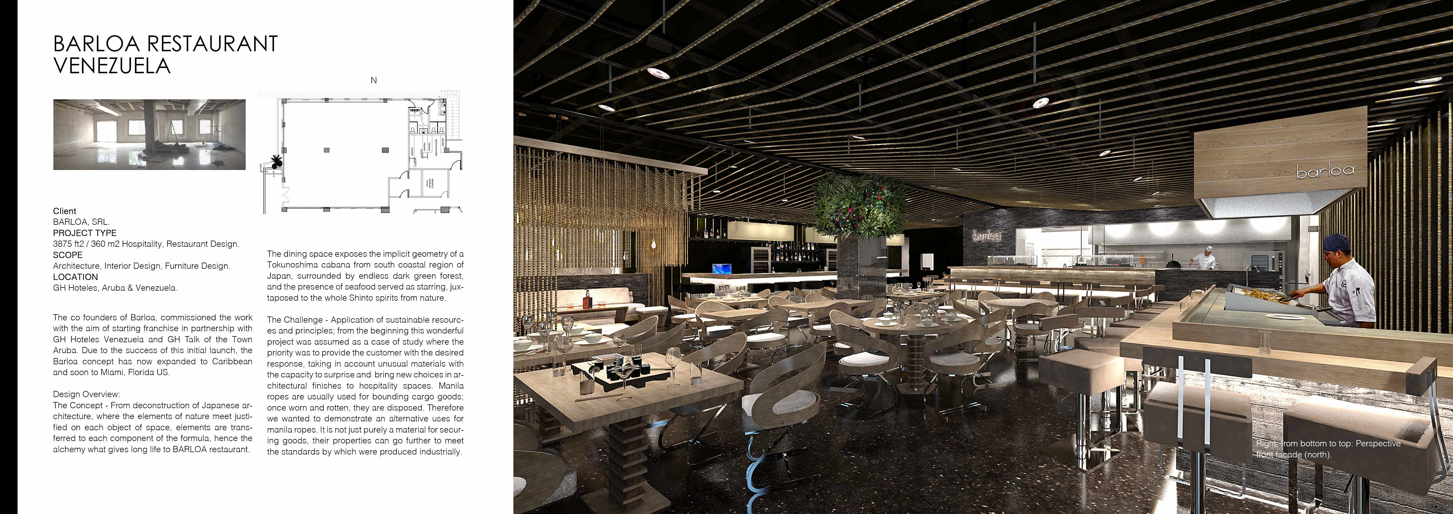
Client BARLOA, SRL.
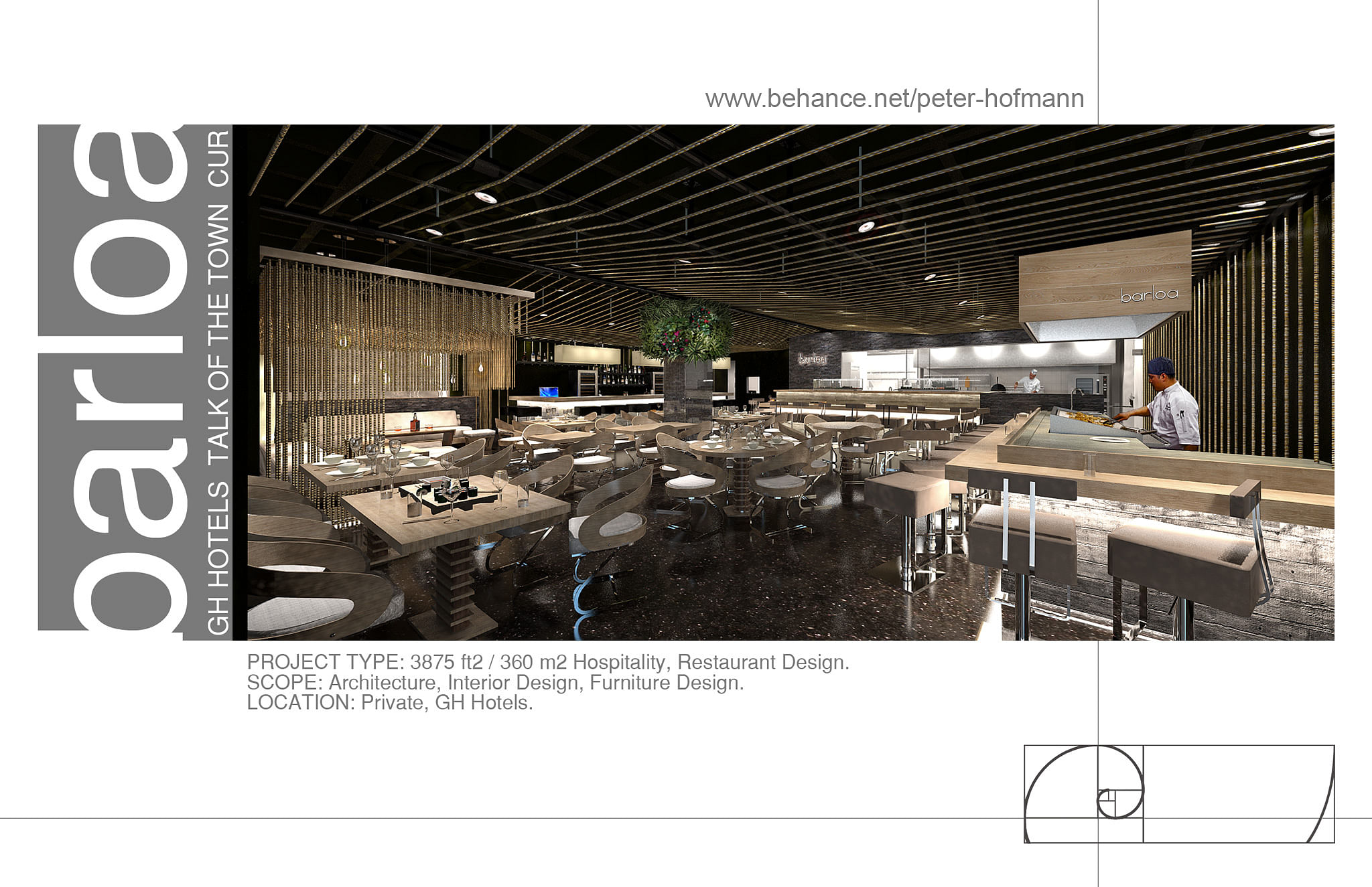
PROJECT TYPE 3875 ft2 / 360 m2 Hospitality, Restaurant Design.
SCOPE Architecture, Interior Design, Furniture Design.
LOCATION GH Hoteles, Aruba & Venezuela.
The co founders of Barloa, commissioned the work with the aim of starting franchise in partnership with GH Hoteles Venezuela and GH Talk of the Town Aruba. Due to the success of this initial launch, the Barloa concept has now expanded to Caribbean and soon to Miami, Florida US.
Design Overview:
The Concept - The avant-garde trend applies to the whole restaurant; from deconstruction of Japanese architecture, where the elements of nature meet justified on each object of space, elements are transferred to each component of the formula, hence the alchemy what gives long life to BARLOA restaurant. The dining space exposes the implicit geometry of a Tokunoshima cabana from south coastal region of Japan, surrounded by endless dark green forest, and the presence of seafood served as starring, juxtaposed to the whole Shinto spirits from nature.
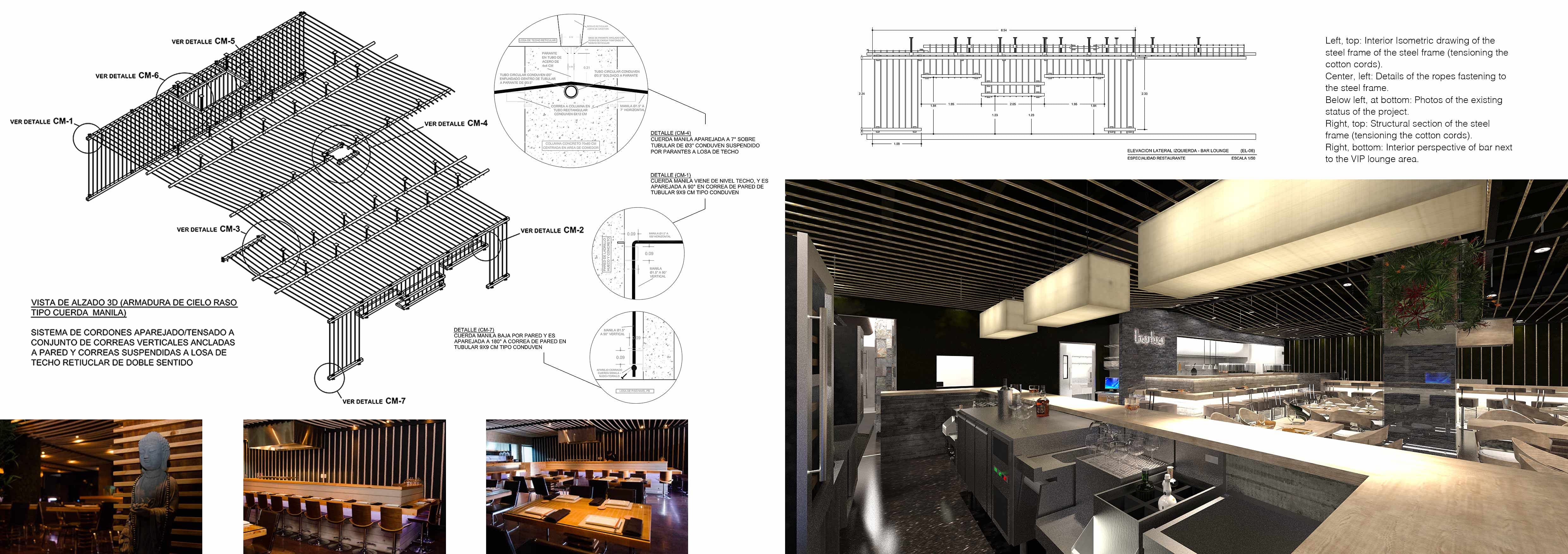
The Challenge - Application of sustainable resources and principles; from the beginning this wonderful project was assumed as a case of study where the priority was to provide the customer with the desired response, taking in account unusual materials with the capacity to surprise and bring new choices in architectural finishes to hospitality spaces. Manila ropes are usually used for bounding cargo goods; once worn and rotten, they are disposed. Therefore we wanted to demonstrate an alternative uses for manila ropes. It is not just purely a material for securing goods, their properties can go further to meet the standards by which were produced industrially. The cotton and manila ropes as the scenic material also strengthens the abstract concept because of its name 'Barloa' given by the owners from the former restaurante baptized with the same name in 2007 placed on a wooden platform next to a luxury pier for yachts which, in turn, this name means in traditional maritime spanish tongue determines the action to insure and tie of boats together in the high seas. Thereafter we chose to investigate and translate our interpretation of ‘bounding’ with the use of manila and cotton ropes. The ropes held in tension at specific points depict the shape of Japanese cabana or a hut.
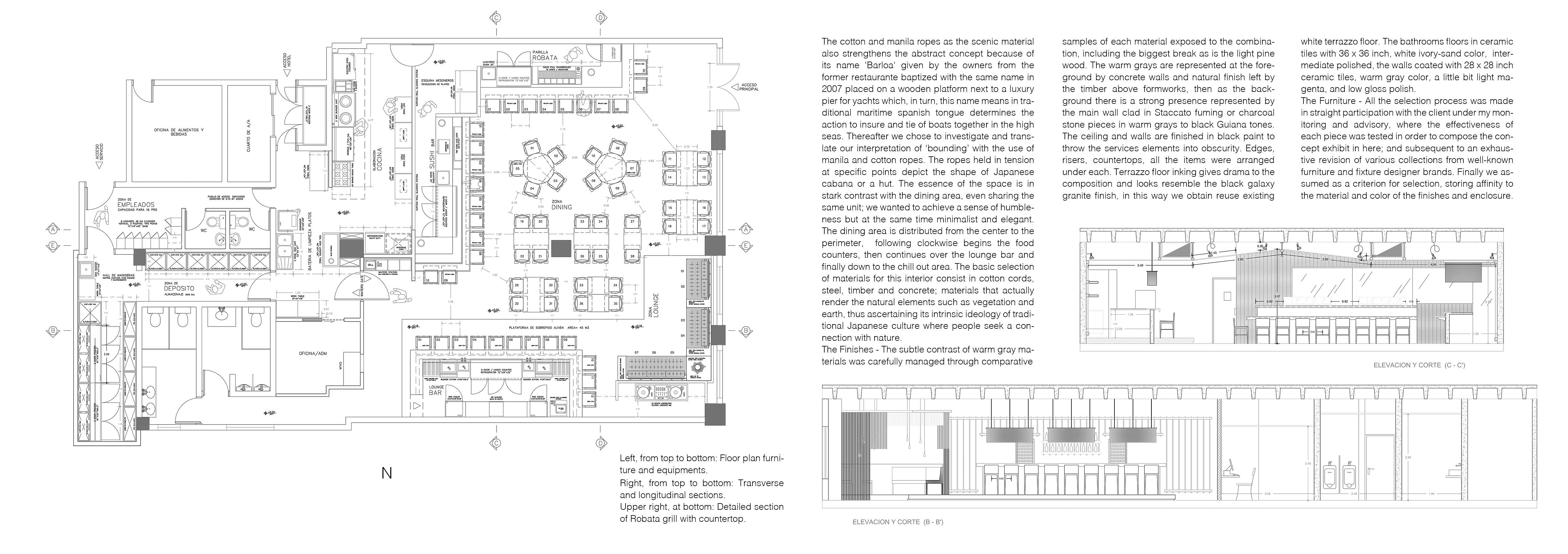
The essence of the space is in stark contrast with the dining area, even sharing the same unit; we wanted to achieve a sense of humbleness but at the same time minimalist and elegant. The dining area is distributed from the center to the perimeter, following clockwise begins the food counters, then continues over the lounge bar and finally down to the chill out area. The basic selection of materials for this interior consist in cotton cords, steel, timber and concrete; materials that actually render the natural elements such as vegetation and earth, thus ascertaining its intrinsic ideology of traditional Japanese culture where people seek a connection with nature.
The Finishes - The subtle contrast of warm gray materials was carefully managed through comparative samples of each material exposed to the combination, including the biggest break as is the light pine wood. The warm grays are represented at the foreground by concrete walls and natural finish left by the timber above formworks, then as the background there is a strong presence represented by the main wall clad in Staccato fuming or charcoal stone pieces in warm grays to black Guiana tones. The ceiling and walls are finished in black paint to throw the services elements into obscurity. Edges, risers, countertops, all the items were arranged horizontally coated with pine wood, and LED lighting is the one corresponding to these elements arranged under each. Terrazzo floor inking gives drama to the composition and looks resemble the black galaxy granite finish, in this way we obtain reuse existing white terrazzo floor. The bathrooms floors in ceramic tiles with 36 x 36 inch, white ivory-sand color, intermediate polished, the walls coated with 28 x 28 inch ceramic tiles, warm gray color, a little bit light magenta, and low gloss polish.
The Furniture - All the selection process was made in straight participation with the client under my monitoring and advisory, where the effectiveness of each piece was tested in order to compose the concept exhibit in here; and subsequent to an exhaustive revision of various collections from well-known furniture and fixture designer brands. Finally we assumed as a criterion for selection, storing affinity to the material and color of the finishes and enclosure.
A secret within the bathrooms - Art printed in large format - Analyzing Asian artists, has been selected as appropriate to the design two well-known works from the contemporary painter and graphic artist "Takashi Murakami" from Japan. His art expresses humor and sarcasm, while it is universal and versatile. The art chosen for the men's bathroom is the texture "Jellyfish Eyes" and the women's bathroom black and white version of high resolution texture "Flowers".
Status: Built
Location: Carabobo, VE
My Role: Architect, Interior Designer, Construction Supervisor.
Additional Credits: OTIPSA Engineering, MERINO CA Construction, Grupo RÖMER.