
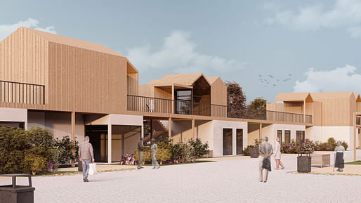
Buildner has shared the results of its Beyond Isolation: Senior Housing Competition.
The design ideas challenge awards cash prizes for solutions to the growing societal issue of isolation and the need for better-designed spaces in which elderly citizens can age in place, a topic represented recently by Mæ's winning John Morden Centre entry for the 2023 RIBA Stirling Prize and other significant architectural awards programs.
According to the brief: "This competition aims to reconnect seniors with their communities by inviting participants to create innovative housing systems that actively integrate elderly residents into the social fabric. The jury will be looking for designs that not only provide housing but also incorporate features that enable seniors to engage with their surroundings in meaningful ways."
Participants were given the choice to select a site or location and were encouraged to explore added functionalities such as retail components and hubs for social exchange to create a sense of community and connection for seniors.
1st Prize Winner: La Vie; Shared living room by Nasim Mollazadeh Sorkhabi, Niki Haddad Razavi, Negin Shokry, Sara Davari (Germany)
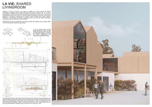
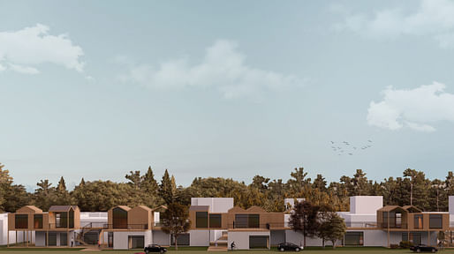
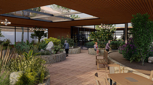
Jury comment: "The presentation is clearly sophisticated and complete with a range of high-quality renderings and thoughtful line drawings and diagrams that include hand sketches. There are two primary suggestions we can offer: First, the project would benefit from a final layer of annotation. Several of the renderings would appear more complete and be able to communicate more information if design concepts, dimensions, spatial labels or materials were placed directly on the images, including the primary image on the introductory page as well as the urban-scale elevation. Second, the text would benefit from the use of key bold words both for visual hierarchy and to more clearly communicate the ideas they describe. The text blocks are lengthy and appear to float on the sheets without a clear logic to their layout."
Read a full interview with the design team here.
2nd Prize Winner: Threshold for Happiness by Carmen De Martin Hernandez, Adrian Gutierrez Hato, Teresa Dorado Jimenez, Manuel Merino Fernandez-Andes (Spain)
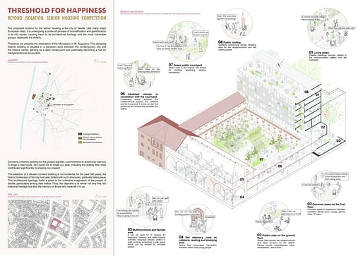
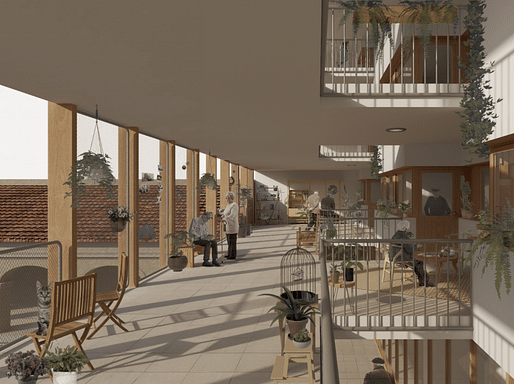
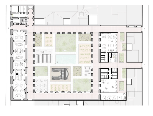
Jury comment: "The project makes use of an intelligent layout with a supportive vertical band on the left hand side of each sheet describing key ideas with descriptive text and diagrams, balanced with a larger primary image or set of drawings on the right hand side. This organization makes it very simple for a reviewer or reader to find information and to connect concepts with imagery. The linework included in the presentation is quite advanced and illustrative, though would benefit from heavier lines and more variation within the lines. As drawn, the linework is very light on the sheet, in some cases nearly disappearing altogether, and it is at times difficult to understand much of the information without zooming in and studying the drawings in detail. While not all information needs to be understood at the scale of the sheet, a reader should be able to understand all key concepts, much like the way a magazine or newspaper conveys information with select images and texts."
Read a full interview with the design team here.
3rd Prize Winner + Buildner Student Award: Re-Sanatorium by Karolina Maria Rorat, Ewa Helena Maniak, Zofia Zuzanna Zwijacz from Warsaw University of Technology and Politechnika Warszawska (Poland)
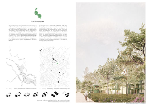
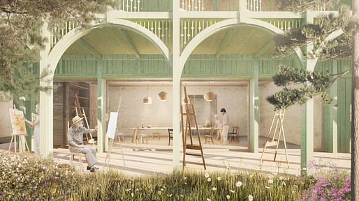

Jury comment: "The project is complete with an array of excellent renderings, drawings and diagrams. The renderings are especially rich and full of detail to convey an amazing amount of information that also gives one a very clear sense of the aesthetic and architectural ambitions of its author. The drawings and diagrams are equally excellently detailed leaving little doubt or question to the reader as to the project’s intentions. The texts would benefit from being broken into smaller blocks, distilled to the very fundamental concepts. At the same time the renderings would benefit from additional information and the author is advised to pull text from the paragraphs and onto the drawings as annotation. The plans would benefit from the use of human figures for scale. Finally the large section would benefit from dimensional annotation, additional labels, and more emphasis or darker linework used for the animated human figures. At the moment these become lost in the drawing and highlighting these could provide additional richness and sense of scale."
Read a full interview with the design team here.
Buildner Sustainability Award: Tatami Castle by Koh Noguchi, Jintatsu Asada, Tung Hua Chen of the Architectural Association School of Architecture (UK)
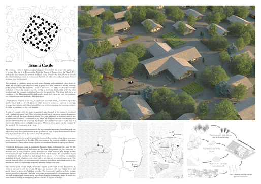
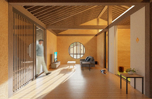
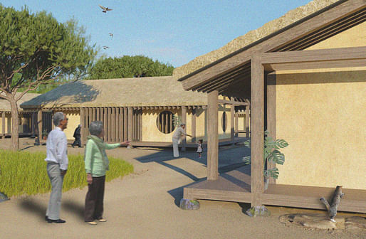
Jury feedback: "The presentation does well to begin at the urban level and use each sheet to describe the project incrementally in more detail, zooming in to illustrate the architecture of each residential unit. It would benefit from an additional constructive detail, for example of the envelope and thatched roof, to ‘complete’ the project and communicate it as a work of architecture. The introductory text is far too lengthy for easy comprehension as is necessary in a competition of this type. While the background and proposition is unique and complex, the author is suggested to find a way to communicate these ideas more succinctly and perhaps mixing text with diagrams, or simply removing the text that is already described in drawings. The overall plan drawing on the second sheet is superb and unique, though would be strengthened with additional annotation as well as human figures to communicate both a sense of scale as well as to describe spaces of communal activity."
Read a full interview with the design team here.
The Architect's Chair / Edition #3
Register by Wed, Jan 15, 2025
Submit by Tue, Feb 18, 2025

The Last Nuclear Bomb Memorial / Edition #5
Register by Thu, Jan 16, 2025
Submit by Wed, Feb 19, 2025

Land Art Generator Initiative 2025 Fiji: Climate Resilience for Island Communities
Register/Submit by Mon, May 5, 2025
Museum of Emotions / Edition #6
Register by Thu, Jan 23, 2025
Submit by Tue, Apr 29, 2025
No Comments