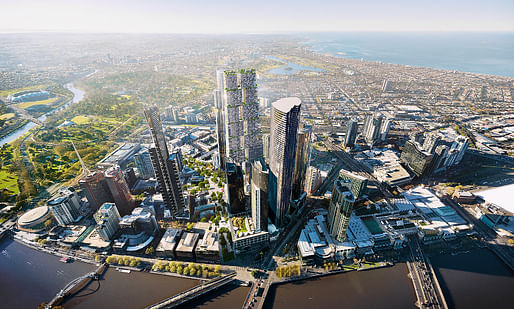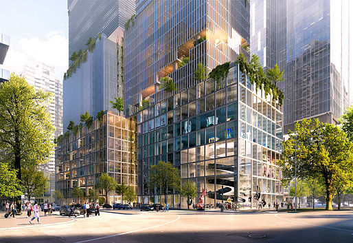
Bjarke Ingels Group have proposed "an evolution of the skyscraper", named The Lanescraper, for the Beulah Tower competition. Their design focuses on building a social infrastructure unique to Melbourne as a city. Taking advantage of the location which provides access to both the Yarra waterfront and the Arts Precinct, The Lanescraper aims at providing a multi-use experience for the public.

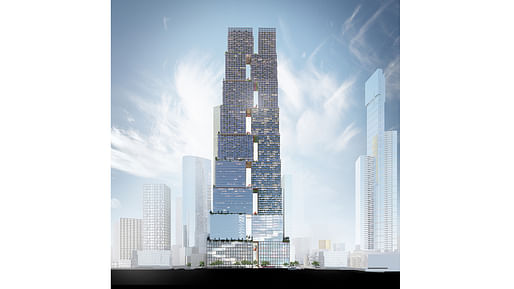
The firm's scheme includes two cores due to the high aspect ratio of the site boundary. This allows for more efficient layouts with optimized walking and access to upper levels. By having two cores (one larger and one smaller), the structure also creates more negative spaces in-between the two.

The stacked blocks between the cores extend upwards and interlock to provide connectivity and structural rigidity. In doing so, the towers taper inwards which allows for negotiating space between its surrounding buildings and minimizes overshadowing the public spaces below.

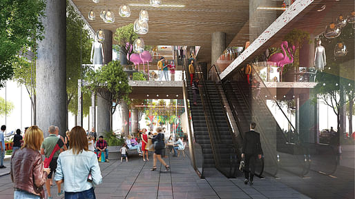
In the core's in-between spaces, BIG presents a series of laneways from top to bottom. Each of these spaces will provide a unique experience as continuous promenades of interconnected public and social spaces.

Project Data
Name: THE LANESCRAPER
Code: SBANK Date: 30/07/2018
Program: Commercial
Status: In Progress
Size in m2: 238000
Project type: Competition
Client: Beulah International
Collaborators: Fender Katsalidis, ARUP, Jan Gehl, GTA Consultants, bloomimages, Brick Visual Location
Text: Melbourne, Victoria, Australia
Location: (-37.8227,144.938) Awards:
Project Team
Partners-in-Charge: Bjarke Ingels, Brian Yang Project
Leaders: João Albuquerque Project
Architect: Ovidiu Munteanu
Team: Mariana de Soares e Barbieri Cardoso, Aleksandra Domian, Miaomiao Chu, Naysan John Foroudi, Xinying Zhang , Antonio Sollo, Helen Chen, Sarkis Sarkisyan, Teodor Cristian Fratila, Augusto Zamperlini
BIG Engineering: Andy Coward, Duncan Horswill
BIG Ideas: Bart Ramakers, Kristoffer Negendahl
BIG Landscape: Alessandro Zanini, Mattia Di Carlo, Nandi Lu, Ulla Hornsyld

Land Art Generator Initiative 2025 Fiji: Climate Resilience for Island Communities
Register/Submit by Mon, May 5, 2025

The Architect's Chair / Edition #3
Register by Wed, Jan 15, 2025
Submit by Tue, Feb 18, 2025

The Last Nuclear Bomb Memorial / Edition #5
Register by Thu, Jan 16, 2025
Submit by Wed, Feb 19, 2025

250,000 € Prize / HOUSE OF THE FUTURE 2024/25
Register by Wed, Apr 30, 2025
Submit by Mon, Jun 2, 2025
6 Comments
Again the same "news". Slow days, huh.
horrible building, wouldn't want to take the elevator to the 35th floor. Didn't they use the same building in NY already?
I like this. The outdoor spaces are cool.
Is the one next to it wearing a concrete tutu?
best one yet. It's what OMA used to do instead of the crap they submitted
the video shows a series of random stacked tower shapes. I remember seeing this process at the height of OMA and thinking it was awful.... Rem was great at S, M, L but he never figured out XL. Neither did his students.
It also seems like the process is his interns trying to do a bunch of BIG self-parody and see which one he likes .. I’m sure he’s too “busy” to design himself.
thats what happens after 4 days and nights of cuttin blue foam