
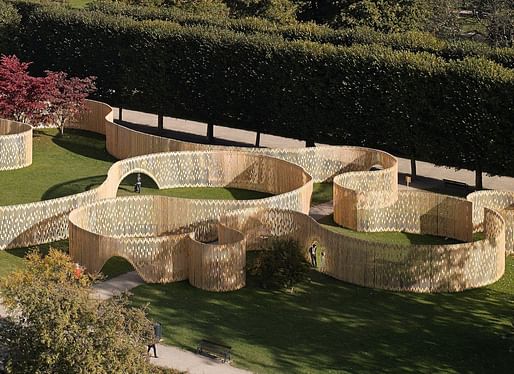
The "Trylletromler" pavilion by Dutch firm FABRIC has attracted plenty of public attention in King's Garden, Copenhagen since its public opening this past September. The installation was built after FABRIC won a temporary-pavilion design competition earlier this year. (Check out our previous coverage here on our sister site Bustler)
The concept of Trylletromler comes from the Danish word for the 19th-century zoetrope device, which gives the illusion of movement in a still image. Based on this idea, the pavilion's fence is built as a paradoxically transparent maze that creates the illusion of motion as one walks through it.
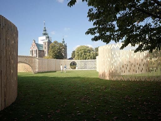
Here's a more detailed project description and some recent photos we received from FABRIC:
"...The Renaissance garden design of Rosenborg Castle is the oldest known example of garden design in Denmark. The design draws heavily on principles of Euclidean geometry. This language of absolute space was long regarded as the construction principle of the world. The architecture, urbanism and landscape design that were derived from it, were essentially aiming to create order out of chaos using absolute shapes: line, square, triangle, sphere and cone. In a later stage baroque elements were added, such as mazes and diagonal paths. Also Kavalergangen and Damegangen, two tree-lined avenues, were introduced. After these alterations the garden was never drastically changed. This classical representation of space was meticulously maintained until today.
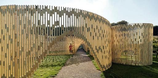
This is the context for the question to design a pavilion, which is accessible to all public, appears innovative in its spatial expression and is challenging by its idiom. While remaining removable the design had to be realized within a very limited budget. FABRIC therefore introduced a new spatial concept in the royal garden in Copenhagen by stretching the understanding of the ‘pavilion’ towards the most elementary architectural element in garden design: the fence.
This new understanding of space provided by questioning strict order in the garden design and give way to ambivalence and hybridity is a ' blurring strategy' . This strategy addresses three independent paradoxes by provoking the notions inside and outside, by introducing a maze that is paradoxically transparent and by creating an illusion of motion.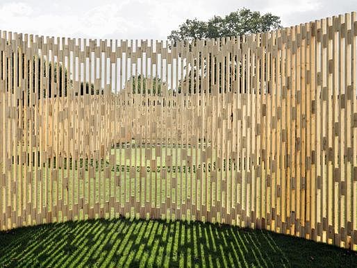
First of all, the fence as a freestanding structure is designed to restrict movement across a boundary. By folding and wrinkling the fence on the location, it produces new meanings of being spatially included or excluded.
Secondly, openings in the fence create routes through the pavilion. Most openings in their appearance resemble a partly raised curtain, making the fence look very light. By avoiding openings on obvious routes on sightlines, visitors are forced to find their way through the sequence of circle shaped spaces. And not all the openings are accessible to everybody. Some openings only allow kids into the pavilion, escaping their parents gaze as they explore the pavilion. The fence so to say acts like a see through maze
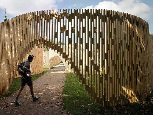
Thirdly, the fence gives new meaning by its potential to create the illusion of motion via the so called moiré patterns while moving along the fence. The fence is made out of three thousand standard pieces of Nordic timber, which are joined using an irregular pattern of wedges. The repetitive openings between the bars of the fence and their connections create a continuous moving image. When one thinks of a fence made out of sticks with narrow vertical slits arranged on a circular layout the image of a Zoetrope - or ‘wheel of life’ - jumps to mind. This 19th century device triggers an impression of movement within a still image.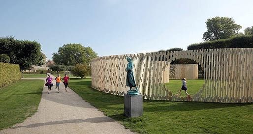
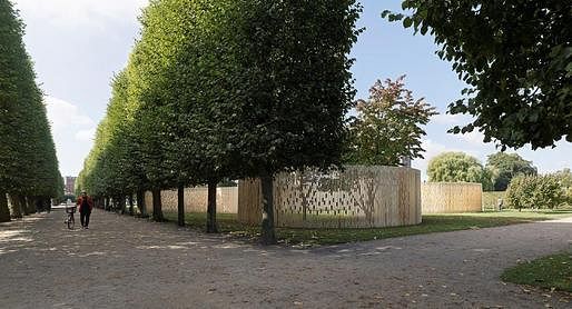
Based on these three principles an intriguing floor plan was designed using a composition of ten perfect circles. The plan design reacts to given circumstances such as the exit of the rose garden, the statue by the water, sightlines towards the castle, existing tree lines and the position of solitary trees.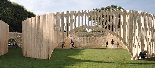
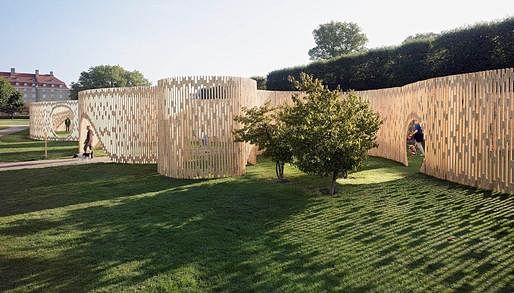
The maze like structure has in fact only one detail for all its connections. The entire structure built with 2967 standard pieces spruce of 38 millimeters thick and 68 millimeters wide. The narrow side of the uprights is placed forwards, while the cross-links are made of the same wood rotated ninety degrees. Each cross-link has a height of 200 millimeters and is planed under an angle on one side, so a circular structure arises. The fence is prefabricated in segments of one meter, which are screwed together at the site and anchored into the ground. The result is a 308 meter long winding wooden sculpture. Because the spruce is used untreated, all the material can be fully reused after the deconstruction of the pavilion.
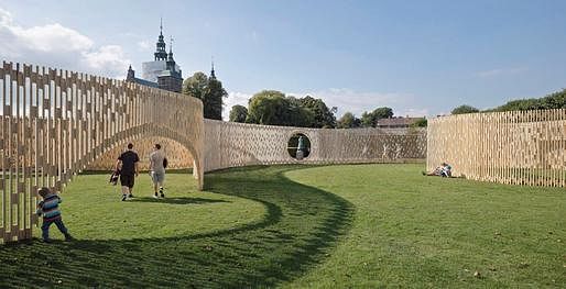
The spatial quality offered by the pavilion is supported by the many rooms and directions users can explore. According to the jury the project therefore demonstrates the best desire and ability of architects to challenge and give new meaning to the concept of the pavilion..."
Click here to learn more.
Browse through the thumbnail gallery below to see more photos.
All photos by Walter Herfst, courtesy of FABRIC.
No Comments
Block this user
Are you sure you want to block this user and hide all related comments throughout the site?
Archinect
This is your first comment on Archinect. Your comment will be visible once approved.