
YONGSAN INTERNATIONAL BUSINESS DISTRICT “PROJECT R6”
Seoul, Korea
CLIENT Dreamhub Project Financing Vehicle Co., Ltd.
PROGRAM 47,800 m2 (514,500 sf) of luxury housing for short-term residents, 27,000 m2 (290,600 sf) of retail, and 929 parking stalls
AREA 115,500 m2 (1,240,000 sf)
CONSTRUCTION BUDGET Confidential
STATUS Commenced 2011; completed Schematic Design 2012; completion expected 2016
DESIGN ARCHITECT REX
KEY PERSONNEL Tiago Barros, Adam Chizmar, Danny Duong, Luis Gil, Gabriel Jewell-Vitale, SeokHun Kim, Armen Menendian, Romea Muryń, Roberto Otero, Se Yoon Park, Joshua Prince-Ramus, Lena Reeh Rasmussen, Yuan Tiauriman
EXECUTIVE ARCHITECT Mooyoung
CONSULTANTS Barker Mohandas, Buro Happold, Front, Level Acoustics, Magnusson Klemencic, Scape, Shen Milsom Wilke, Tillotson Design
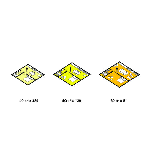
YIBD “Project R6” is an urban boutique residence for short-term business people, young urban professionals, and foreign residents. Due to the transience of its target users and the short durations during which they are home, R6’s unit sizes are small, including 40 m2, 50 m2, and 60 m2 residences, with the majority being 40 m2.
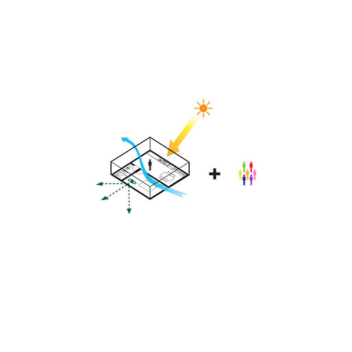
To meet the trends of its users and compensate for its small unit size, R6 must engender a strong sense of community and its residences must be highly attractive, providing generous views, daylight, and cross-ventilation. Maximizing daylight and cross-ventilation are also paramount to providing a highly sustainable residence.
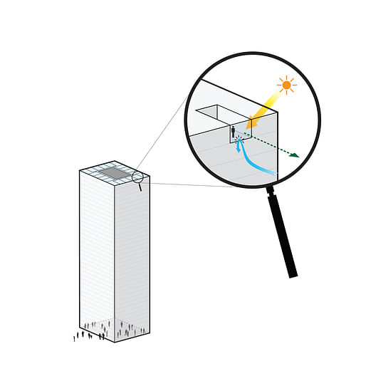
In a standard housing tower, 40 m2 to 60 m2 units would create poorly dimensioned and oppressive residences, offering constrained views, little daylight, and poor ventilation, and community would be limited to activities at the tower’s base.

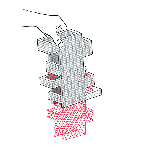
By pulling layers of the typical housing tower in opposing directions, the small units maintain their size, but are stretched…
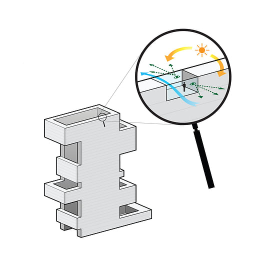
…into favorable proportions that provide views and daylight from both sides, excellent cross-ventilation, and…
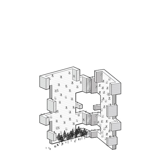
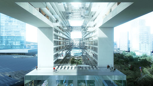
…a strong sense of community through the creation of a central courtyard, roof terraces, and conversation/reading/play pods.
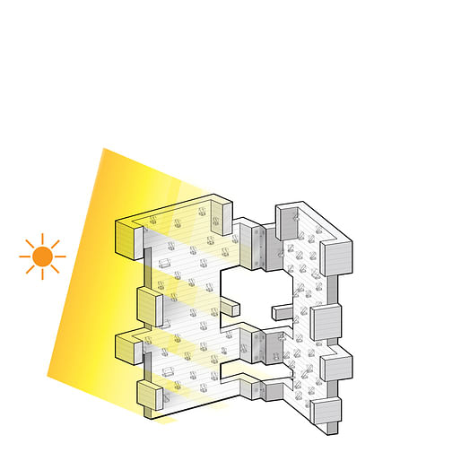
The stretched layers are strategically positioned to guarantee unobstructed daylight into all units, and…

…to create adequate continuity of the building’s primary structure: a concrete-encased steel mega-brace that encircles the courtyard.
The mega-brace supports a shelf-like matrix of walls and floor slabs that define each unit.
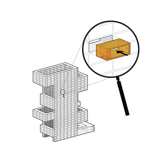
Into each shelf is inserted a wooden shell containing a bathroom on one side and a kitchen on the other.
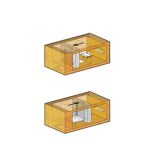
A movable wall—using standard compact shelving technology—shifts within the unit to define a bedroom (adjacent to the bathroom) or a living room (adjacent to the kitchen).
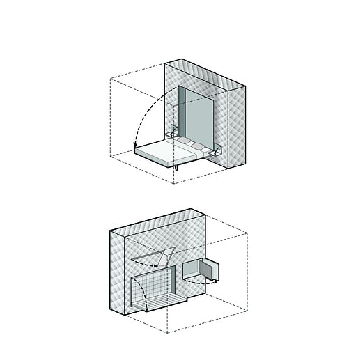 The wall includes a bed, nightstands, couch, television mount, task lights, and storage.
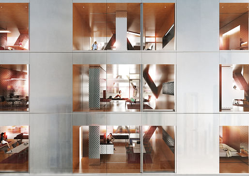
A high-performance façade—composed of frameless, triple-glazed IGUs with two surfaces of low-E coatings—emphasizes the remarkable exterior views,...
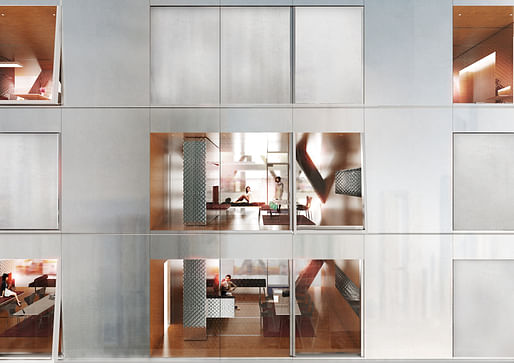
...while interior black-out and shade roller blinds control sunlight and glare.
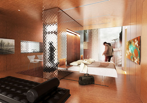
Movable wall in bedroom position, looking out to Seoul
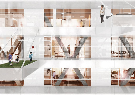
The floor to ceiling interior façade—also composed of frameless IGUs and equipped with black-out and shade roller blinds—provides spatial relief and a sense of community,...
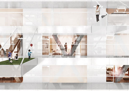
...while maintaining privacy.
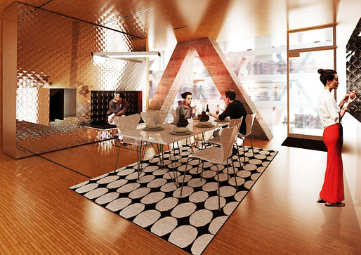
Movable wall in living room position, looking into courtyard
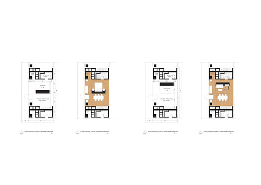
Typical 40 m2 unit, with moveable wall in bedroom position and in living room position
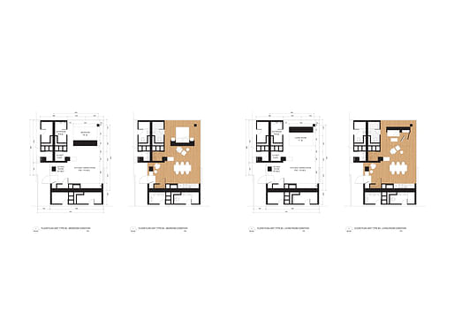
Typical 50 m2 unit, with moveable wall in bedroom position and in living room position
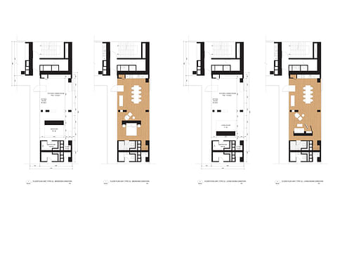
Typical 60 m2 unit, with moveable wall in bedroom position and in living room position
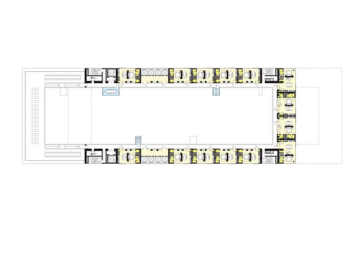
Typical residential “brace plan” with terrace
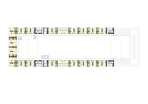
Typical residential “horseshoe plan” with terrace
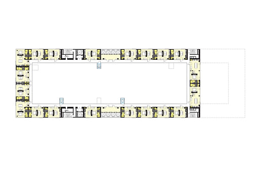
Typical residential “loop plan”
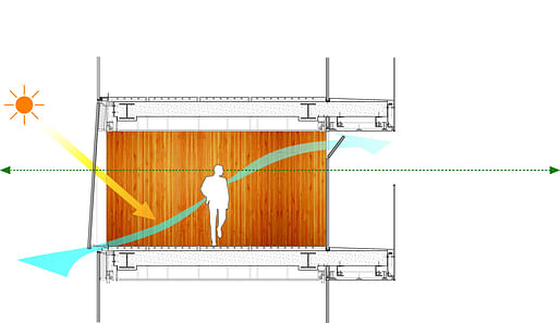
The resulting architecture provides views and daylight from both sides, and excellent cross-ventilation.
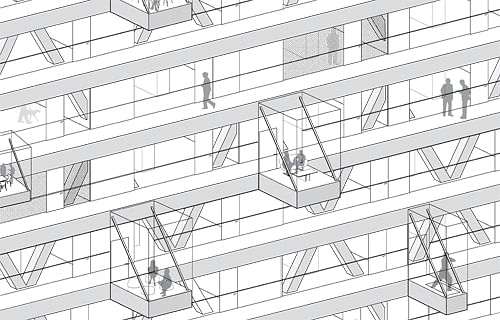
Community and spatial relief are further generated by conversation/reading/play pods extending into the courtyard. The pods playfully assume the varying widths of the walls behind such that no views are blocked and privacy in the units is maintained.

View across courtyard
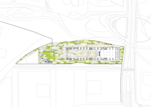
Site plan
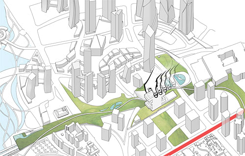
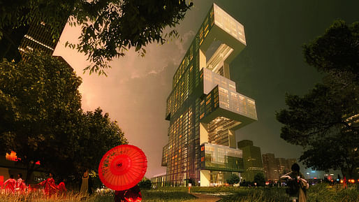
Block R6 is a narrow parcel bounded by the planned Mountain Park—including Children’s Interactive Spray Park, Rail Road Museum, Outdoor Amphitheater, and Yongsan Station Esplanade—and the central park of the planned development Zone B3, adjacent to Hangang-ro. By placing the building to the south of Block R6, all units command great views and the building forms a gateway to YIBD from Hangang-ro.
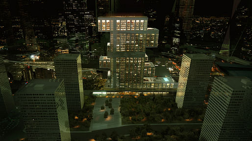
View from Hangang-ro
20 Comments
Nice Project!!! Good to see that there is still thinking in Architecture.
Like it!
Fantastic design process. Creative yet logical.
Too bad the iconography of final product is kind of over the top pompuous.
Awesome stuff. REX never fails to deliver
dumb question - how is lots of glass "sustainable?" if it's typical double-glazed IGUs (ooo... insulated glass - how fancy), the R value is only about 3. plus the amount of exterior exposure on this building is ridiculous. Unless they invented some new quintuple pane IGUs filled with aerogel for this building, it's thermal performance is going to be far less than even a dumb glass box.
oh - I see - cross ventilation at 20 stories - and they're bringing in air at the updraft! fantastic!
I like the concept, sort of a hotel super lobby en plein air surrounded by rooms, but something does not convince me:
Stairs, instead of being parallel to the main façades of the building could be rotated perpendicular, saving residential surface ($$$) and contributing to the rigidity of the structure.
Grouped elevators don’t seem to perform well in terms of circulation: at each level, units far from the cores could show a lack of accessibility, units close to the cores could manifest a lack of privacy due to the passage of other residents reaching/leaving their apartments.
Early concept renderings (check out REX website) featured distributed exposed elevator, a more efficient and dramatic solution in my opinion.
Another tooooooooooo big for one building project in Seoul. Would have been nice if the scheme had several buildings on the site rather than one. Something about the layout reminds me of a prison.
More stacked/offset boxes....groundbreaking
I don't see anything new here. The hyper-rational process has become staid. The objectives of light, air, visibility--the modernists dealt with these things on their own terms as a problem of their age, but hasn't the world and people's needs change/developed since then? REX's process animation-cartoon-like drawings make it look too easy and simple not in a reductive way, but rather linear thinking. I understand this is one kind of a blog post, but I wish they showed all the different iterations of the project and presented it in a way that allowed for multiple interpretations.
....so nowadays people like dark, airless, cloistered spaces? I think those three ideals (among others) have stuck around because they relate more to human nature, rather than fleeting needs or design trends. In dense urban environments, those three resources you mentioned are incredibly rare and highly contested. REX has figured out a way to maximize access to them, while embracing the more contemporary "developed" needs you mentioned, like the placeless lifestyles of the international business elite, or the requirement for highly variable living spaces. Seems pretty clever to me.
Light, air, and visibility? is that all there is to architecture/human nature? Humans change as much as fleeting design trends do. I don't think its clever it's a missed opportunity.
Light, air, and visibility are basic criteria for a work of architecture, and it is hard if not nearly impossible to argue against that, but I don't think they should be the only criteria for design. If they are the only criteria for a design, then where is the nuance and subtlety? What is the quality of light you are looking to achieve? Does everyone get the same view? I am looking for REX's position on light, air, and visibility, but I don't see it. They've presented the project in a way that does not invite discussion or opinion in that they address basic needs on basic terms withholding complexity.
aaron:
rex's basic schtick (i.e., building on their p.r. statements about the "hyper-rational") is that their approach is based only in this kind of basic objective criteria. nuance and subtlety may, in fact, be considered in this project but they'll never let on; it's for users to discover or not.
if you're wanting qualitative commentary - much less any admission that there's a heavy designer hand at work - you'll have to go somewhere else. they're pretending that they've time-traveled back to a new objectivism or something, i guess, without acknowledging that - even then - authorship and ego were very much in play and that the objective in objectivism was pretty much a fiction.
Aaron, would you have commented differently on the project if all of the conceptual diagrams weren't shown?
I imagine that when these kinds of diagrams aren't shown, the viewer becomes more critical of the building's actual form, and beauty. Can projects like this (and so many others, like BIG's) stand on their own in the real world (without conceptual diagrams present to justify their wacky massing)?
... For many of these 'hyper-rational' projects... probably not.
Aaron hit it on the head,
My take on the diagrams - its REX's way of trying to catch up with Bjark'e augmented reality presentations.
They do project some justice, but it still looks like something made by AECOM
I think it's a problem when the diagram becomes form. Diagrams are by definition abstract and rushing to form inevitably something gets lost. It's hard to imagine what their next move would be or how they would critique themselves and change the design. The renderings themselves are diagrammatic in the way that the windows and materials resemble flat textures applied to the surface of form which diminishes the impression of space. I understand that this is early in the project and the design still has to be resolved, but is it really necessary to show photo-realistic renderings at this stage? I find the most interesting projects are ones where the building itself is an abstraction.
Sorry. That was my response, above.
I love the idea of the interior space function being malleable due to this moving wall unit. Very fun and not too expensive to build, either.
It's a big building, very big, but I guess not out of place in context?
I totally agree with Aaron Lim analysis. I shall add a comment about the cultural relevance of REX. Like others young "global practitioners" (think of Big, JDS etc.), REX grew out of OMA. The iconography of their work (presentation model, graphics and so on) as well as their post-corbusean pragmatist attitude, are a derivative of Mr Koolhaas' legacy.
The problem is that Mr Koolhaas's being around for 35 years, and he still dominates the global architeture scene. I think it's time to turn the page. His grand-children should know that little grows under big trees. They should also realise that the age-old idea of the monadic megastructure it isn't (always) the right answer.
In terms of sustainability, does some cross-ventilation offset the environmental impact of this building providing only 1/3rd the density of any other building of comparable footprint? Will the hollowed core/ courtyard really provide a sense of a community, or will it feel like a hotel atrium? The playful diagrams mask some dangerous assumptions, in my opinion.
Block this user
Are you sure you want to block this user and hide all related comments throughout the site?
Archinect
This is your first comment on Archinect. Your comment will be visible once approved.