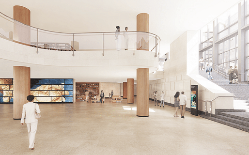
Selldorf Architects has released a revised plan for the controversial overhaul of the Sainsbury Wing at London’s National Gallery following a torrent of criticism that has grown online after their initial designs were unveiled this summer.
The Architects’ Journal is reporting on the revisions, which appear to have entailed the retention of certain ground floor elements in the lobby and changes to the originally proposed placement of existing structural columns, as well as to the materials used in the balustrade and lobby walls.
"I don't think of these changes as a compromise. I see them as a welcome development," Annabelle Selldorf told AJ. "In the resubmitted plans, much more of the existing fabric will remain, creating a clearer dialogue with the original building. And yet the original goals remain intact."
"I took from this reaction hat people truly care about the building. And when when you perceive that, you have to listen," she added. "That’s a good thing. I am entirely positive about it. People think that architecture is a lonely quest in which there’s only one way of doing. But architecture is collaborative. And if you’re not willing to learn from what other people see, you don’t go very far."

Selldorf has said repeatedly that she has been counseled by the wing's original co-architect Denise Scott Brown over the proposed design, which generally opens up the ground and first-floor plans vertically in a "destructive" move critics say effectively undoes the original experience intended for gallery visitors. The firm has also stated that its amended design was "made as a result of stakeholder feedback."
Their new plan will once again be submitted to the City of Westminster for planning approval by the end of the year.
3 Comments
Has Denise Scott-Brown publicly commented on all of this?
According to twitter she was not happy with the previous iteration, and said so, but I haven't seen anything official from her/the firm.
I wasn't happy when the original decision was made to build VSBA's extension scheme as we all knew it was a politically correct design decision. I acknowledge however that Scott Brown and Venturi had an architectural position. Selldorf has created a kind of neutered, uninspired asthetic that according to the images doesn't seem to recognize or respond to anything about the original extension. This is happening to too many interesting works including the State of Illinois Center in Chicago, the beauty of idiosyncrasy is eroded in the name of "getting real".
Block this user
Are you sure you want to block this user and hide all related comments throughout the site?
Archinect
This is your first comment on Archinect. Your comment will be visible once approved.