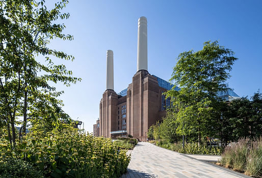

The project as whole also creates a highly managed territory of the sort that you tend to get in single-owner developments which, despite some funky moves by a Frank Gehry-designed apartment block, is fundamentally predictable. It threatens to cage the beast that is Gilbert Scott’s masterpiece, as might the array of retail logos inside. But, between the blandscape outside and the brandscape within, the power station is cussed enough to assert its own character. — The Guardian
The £9 billion final boss of Greater London adaptive reuse projects (along with the Barbican) is a story of inside and out for Moore, who sees the program’s housing element as an “awkward” mismatch when compared to WilkinsonEyre’s tastefully “sober” and restrained interior retail spaces that come dotted with “outbreaks of cautious fantasy.”
The Observer critic also opined that it does offer a “striking contrast” to the mixed architecture of nearby Vauxhall and Nine Elms, adding its survival can be attributed to the growing influence of heritage considerations in British planning schemes. “If only some of the thoughtfulness applied to old buildings could be applied to the planning of new ones,” he lamented, “we might be getting somewhere.”
5 Comments
Sorry to disrupt this meaningful conversation about the project but I couldn't help.
It falls right in all the way to the title.
"Enjoy if you listen to Pink Floyd, if you don't, fuck it"
*Attributed to Jimmy. Gahaha!
Animals.......the floating pink pig. Greatness!
For a counter story, read Wainwright,
‘Every square inch monetised’ – is Battersea Power Station now a playground for the super rich?
Approach the area from most directions and all you see is the chimneys – if you’re lucky. The developers of the 42-acre site have achieved the miraculous feat of hiding one of the biggest buildings in London, almost completely surrounding the great brick cathedral of electricity with bloated blocks of luxury flats. Many more are on the way.
What a contrast in opinions and two good reads. From the photos, the starchitect designed luxury condos look pretty par for the course for a redevelopment project. You see similar forms and styles in post-industrial chic projects worldwide. The aerial views are the most unflattering but the pedestrian views look pretty cool, especially when the chimneys are in frame.
Block this user
Are you sure you want to block this user and hide all related comments throughout the site?
Archinect
This is your first comment on Archinect. Your comment will be visible once approved.