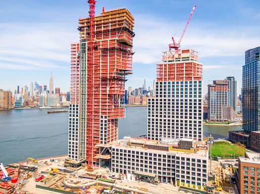

Roughly 18 months after breaking ground in November 2019, two residential towers of the OMA-designed Greenpoint Landing development in Brooklyn have structurally topped out at 300 feet (North Tower) and 400 feet (South Tower) respectively.
The project was first introduced by the developers Brookfield Properties and Park Tower Group in March 2019 and is expected to deliver 745 units of mixed-income housing — 30% marked as Affordable and 70% Market Rate — on Greenpoint's transformed, formerly industrial waterfront.
"These towers, our first in Brooklyn, have reached an important milestone made possible by the perseverance of Brookfield, Park Tower Group, BBB and the entire construction and design team during an unprecedented time," Jason Long, OMA Partner-in-Charge, commented on the recent milestone. "It’s exciting to see our collective efforts take shape on Greenpoint’s dynamic skyline."
Key collaborators on the project are Beyer Blinder Belle as the executive architect and unit interior designer, Marmol Radziner as interior and landscape architect as well as James Corner Field Operations in charge of waterfront landscape architecture.
29 Comments
OMA NY's steady decline into BIG-lite
At least in the 1920's the almighty dollar left us with memorable buildings but I can't imagine how lining the shores of NYC with this kind of junk will make a more humane and sustainable city. At least the structural engineer had fun.
What the half-assed fuck
Man, the developer's gonna be pissed when Player One completes those lines and the building vanishes.
Somehow the YIMBYs will point to this and say 'see, this is why architecture doesn't matter'
after cutting blue foam for 72 hours straight, the intern designer team decided to go home. and they forgot to turn it right side up, oh well. The following day, BIM crew took it as done, finished it and posted it.
I like the negative space between the buildings more than the buildings themselves.
it's like oma is trying to make some cynical statement with intentionally bland facades that defeat any excitement the contorted form creates.
what bland facade, look at the diagram ;-)
source
definitely better without windows. what a simplistic way to provide daylight :D
Yes yes more negative space please! 100% negative space!
this is an embarrassment for "architecture." i can't imagine anything worse for greenpoint, let alone the city.
I was hoping that this would get more interesting as it developed, but it's not improving. This is a shockingly dull project. It's just developer schlock that will further gentrify North Brooklyn.
Who knew it could be gentrified any further?!?! As James Murphy said, "And the boring collect."
Form follows economics.
luxury pods for salarymen
It doesn't even follow structural logic nor economics ... there was an attempt at bravado but it turned out to be a one liner.
“Ask a prick what it wants, and it says, I want to build an awkward poorly functioning structure. But think of the poor structural engineer prick. I still want to build an awkward poorly functioning structure” - Lou Kahn, Developers are like Bricks vol.2
"f**k context" Rem Koolhaas
Make love to the context!
There's almost no Rem DNA left in OMA NY. The design quality is Gensler level.
This project has Rem written all over it, the project could easily fit within the City of the Captive Globe.
.
Nah that's just the formal husk. The design process was a poor man's BIG - cut this, twist that, hey sun path. At least Koolhaas had wider observations of the city to go along with his formal explorations.
I'd rather wait for Rem's upcoming coffee table book to post-rationalise the project's BIGness than to jump to conclusions based on the clear information provided by the architects themselves.
Yeah he's past that. For that condo with the funky corner condition, he basically showed up to make an ad for the developer. And that was a more interesting project than this one. Koolhaas' energies are from the NY office, which are Shigamatsu and Long's own practice effectively.
Heck, given the way local condo AORs work with starchitects, I bet Handel, BBB, SLCE or whoever worked on this contributed more to the project that OMA - who probably was tasked with just the massing.
I'm sure OMA had more tasks, seems like they've also been tasked with the angle of the facade pattern.
If you want a palette cleanser of what architecture can be, look at lina bo bardi sesc pompeia
Block this user
Are you sure you want to block this user and hide all related comments throughout the site?
Archinect
This is your first comment on Archinect. Your comment will be visible once approved.