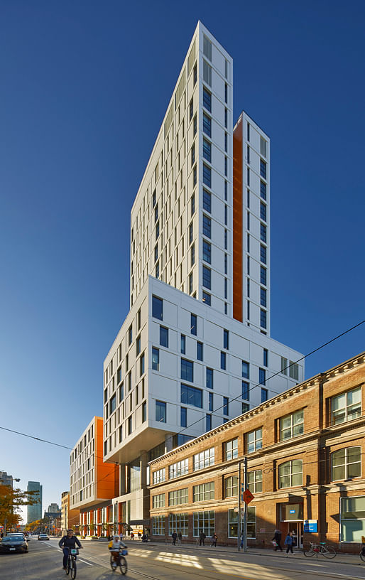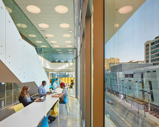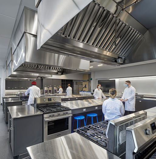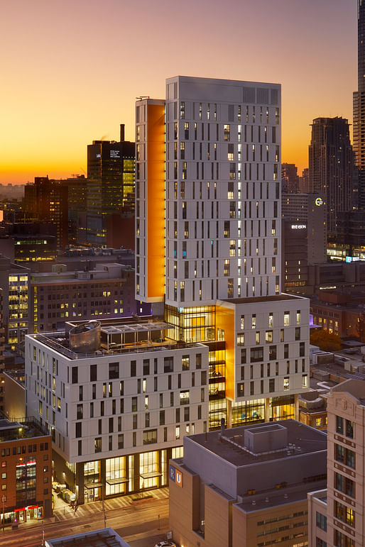
The Daphne Cockwell Health Sciences Complex (DCHS) at Ryerson University is a 28-story "vertical campus" that facilitates interdisciplinary academic discourse on a confined urban site. The structure was a winner of the 2021 Best Tall Building Award by the Council on Tall Buildings and Urban Habitat (CTBUH).
Designed by Perkins&Will, the nearly 300,000-square-foot building was completed as part of Ryerson’s 2008 campus master plan to guide its expansion through new development and renovations.

"Daphne Cockwell Health Sciences Complex demonstrates Ryerson University’s position as active city-builders," said Andrew Frontini, design director of Perkins&Will's Toronto and Ottawa studios, in a statement." We found a wonderful fit with Ryerson where our teams were both incredibly motivated to work alongside communities and stakeholder groups to create a state-of-the-art living and learning space. It was critical that we introduce a building that not only connects to, but also enhances the fabric of the surrounding downtown neighborhood. This type of consolidated yet integrated design is a vibrant and viable solution for urban campuses of the future."

The building is clad in white aluminum panels complemented by vibrant orange accents. The two primary volumes that make up the massing have been lifted to create an active streetscape and seamless public spaces from the ground level to the roof.
"The DCHS Complex uniquely expresses public space throughout the building, creating connections to the adjacent campus at the ground floor and illustrating student life in a vertical axis," said Ryan Bragg, principal of Perkins&Will's Vancouver studio, in a statement. "This expression reinforces the concept of a vertical campus, successfully integrating the academic and social lives of Ryerson students."

The first eight stories hold four integrated academic departments: the Schools of Nursing, Midwifery, Nutrition, and Occupational and Public Health. The building also features a Digital Fabrication lab along with flexible research facilities and university administration offices.
At the upper levels, residence dorms house up to 330 students, enabling students to further immerse themselves in their programs. At the pedestrian level, a public atrium serves the surrounding city, with a cafe and spaces to socialize and study.

30 Comments
the massing is nice. i like the pop of color and lower ratio of glass to opaque material. interiors look pretty bland. and i have questions from a contextual standpoint, but haven't been to toronto.
Toronto is pretty blah for context in general and this is in a decently high commercial and tourism area. It works and it's like only 3 blocks from the main office towers and 1km from the CN tower.
"The building is clad in white aluminum panels complemented by vibrant orange accents."
What could possibly go wrong?
Many things, I guess, the orange could clash with some of the students' outfits. That's something to consider but if you're suggesting the AL panels could, say, cause massive fires like that in the UK... do note that such cladding has been prohibited on buildings taller than 3 storeys for quite some time in Toronto (all of Ontario, actually).
P+W is also a firm which is acutely aware of the challenges of the materials they use.
Then why pick such challenging materials, especially if they'll never age gracefully? #rhetoricalquestion
Such a disingenuous question (not that I am surprised). Can I assume you are always given a budget that allows you to live out your masonry fetish?
#hashtagjokeforthekids
It could have been 100% unitized curtainwall...
Not all aluminum panels are ACM if that's what the implication is here.
I'm curious why you think aluminum panels are such a "challenging material"?
Yeah, what are the challenges of aluminum panels?
...asks the person who sarcastically asserted it was so
I believe that was you. "P+W is also a firm which is acutely aware of the challenges of the materials they use." So please do tell us...
Read more carefully.
---------------------------------------------------------
---------------------------------------------------------
Sarcastic assertion that things will go wrong.
---------------------------------------------------------
---------------------------------------------------------
Sarcastic assertion that the chosen materials have challenges so obvious as to be rhetorically unnecessary to explain.
I merely pointed out that P+W is acutely aware of the challenges in the work they do, not that I was (as opposed to the positions taken by both you and Volunteer.)
So please do tell us...
Sorry, I thought you knew what you where talking about.
why be so obtuse if you have a specific problem? is there much point in commenting with so little to contribute?
Thayer, you're projecting again. I genuinely, as a fellow professional, would like to hear what you have to say about the challenges of this material. Instead you're waging a losing battle against sentences and what they mean.
My professional opinion is that employing aluminum panels for aesthetic reasons considering the panels will not age be expensive to maintain is irresponsible. I thought I made that clear and thought you knew these reasons as well. On the other hand, it's not a crime against humanity if the building is meant to be temporary .
That professional opinion needs some more clarification if you want any of the other professionals here with differing opinions to take you seriously.
up
and what is the issue with AL panels? We've used them in a bunch of different applications and in all sorts of high to low budget buildings. Not everything can be stone.
Your right, and not everything should be stone, especially when cantilevering like crazy. That said, Perkins and Will is one of the best at this style imho.
It's funny to contrast the comments on this (and the project itself) with the recently posted Studio Gang tower. Granted, different program, but they are both towers in second-tier cities.
The Studio Gang project is no great shakes but I can't believe anyone who calls themselves an Architect would rather have a bunch of stacked aluminum clad shitboxes than something that challenges what architecture can be.
"what architecture can be" is a pretty shitty statement and it's something best left on the 1st year design studio floor. Buildings don't exist in a vacuum and can't always be pushing against the invisible and ever-changing definition of "Architecture". Sometimes a building is just that (a means to an end via program and budget) and as much as I typically like SG's work, I honestly prefer the Perkins aluminum box over it.
Edit... Important to note that I have no idea how they will manage ice and snow from those vertical faces and horizontal edges... sheer walls of slick AL panels tend to collect ice here and I can imaging the frighten pedestrians below getting pelted.
totally agree.... sometimes a building is just a building, not Architecture.
i'd rather see a city of these white boxes than a childish attempt and tree mimicary any day. not to mention, the studio gang project does nothing interesting in terms of massing, which this project attempts.
the gang project is an extruded triangle with some ugly ass lipstick full of cartoony holes. you call that architecturally progressive?
I didn't say it was progressive, I said it was challenging.
The SG project is at the level of an early undergrad studio project (perhaps an interesting jumping off point, but needs work). This at least shows refinement and thought beyond, "Let's make it look like trees!!!1!"
The P+W project isn't trying to be anything other than what it is and seems to have been well executed, there is beauty in that, and I think that deserves respect and recognition even if it might not be everyone's taste. The SG project is still just unrefined and trying too hard to be "Capital A" challenging-what-architecture-is-meant-to-be architecture. It falls so short of that obvious intent that it's comical.
Another way to look at it is, I'd be proud to have worked on the P+W project. Maybe not my life's greatest work, but I'd be happy with the result.
I'd be ashamed to publish the SG project as more than just an initial concept idea.
yes, challenging to the eyes.
SG's design "challenges" the profession only at the most basic, visual level at this stage of its conception. Perhaps it will force its designers and fabricators to innovate new methods as it becomes more fleshed out but at this point, its main design feature is a visual pattern.
Block this user
Are you sure you want to block this user and hide all related comments throughout the site?
Archinect
This is your first comment on Archinect. Your comment will be visible once approved.