The Ibsen Library, designed by Kengo Kuma & Associates in collaboration with Mad Arkitekter and BuroHappold, was commissioned in celebration of the renowned playwright Henrik Ibsen, who was born in Skien, Norway, the location of the new library.

Selected as the winning entry of a design competition, the Ibsen Library introduces a new cultural hub to the city of Skien that houses a robust program to engage the surrounding community.

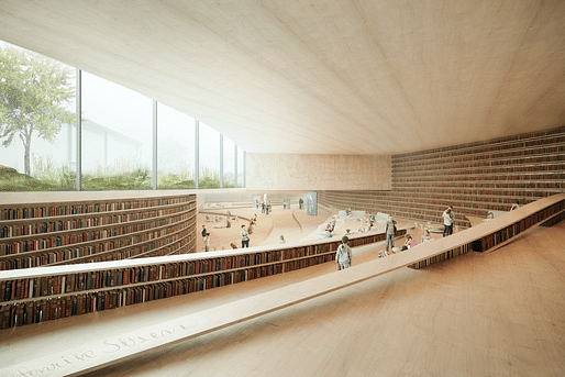
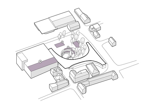
The footprint of the library covers the entire site boundary, giving it a generous floor area at the ground and underground levels. Both levels have open plans with no fixes walls and low bookshelves that act as soft dividers. The ground floor is seamlessly connected to the park on the outside, encouraging a connectedness between the indoor and outdoor environments.

The underground level offers adult and children-focused program with an outdoor amphitheater the raises up toward the exterior ground level.

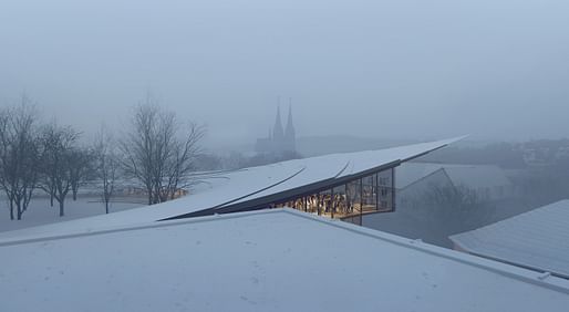
The entire curvilinear facade is covered in tall glazing, providing a expansive views to the surrounding landscape. Also operable, the windows can be opened during comfortable seasons to allow natural ventilation through the spaces.

Wood is prominent throughout and the roof utilizes a wood shingle commonly present in traditional Norwegian buildings.

19 Comments
This is quite possibly the craziest cantilever I've seen.
me too, and i love it.
The lens length is also super dramatic, not sure it is as large as this image depicts it...
especially imagining the snow loads!
The section of the roof is much more triangular in reality
We need details!!!
Edit: Didn't realize that cantilever was a render from Mir, not a photo.
There are a few pipe columns that don't appear in the rendering/ and photoshopped out of the picture.
Can Archinect confirm that it is the completion and not the building itself that has been completed?
*Competition LOL
https://www.e-architect.co.uk/norway/ibsen-library-skien according to this website, the completion was completed and winners announced. These are all renders from Mor.
High quality renderings, but I'm calling BS on that storefront.
Eh.... not typical for sure... but if you don't have severe lateral load issues for earthquakes or wind.... then money is the main thing constraining this.
Look at something like the Rolex Learning center... (not a an of SANAA based on their business practices, and I think the building has some poor design aspects, but the windows are a good point for comparison)
They could probably build this, or close to it if they want to pay for it.
Sure, but the wood ceiling wouldn't be so perfect even if they did. (I'm not being serious here.)
These are renderings by Mir and Kengo Kuma & Associates. The lead image caption has been updated to provide clarification.
kudos to the people making these visuals, they tricked some of their most critical audience :)
so they designed a big plain roof to welcome more snow load?
That cantilever is NOT buildable in any fashion. I am really disillusioned with dramatic, sexy imagery via digital rendering of environments that cannot be realized. When, and if this building is complete, it will look quite different than the renderings. Fantasy Architecture should not be winning competitions.
.
(Jean Nouvel, Lucerne)
am pretty sure it will be built just as it looks. There is not a culture of weird fakery in japan for design renderings. And Kuma is a pragmatist. Not a fantasy-driven concept guy. Just my two cents from the (pretty close) sidelines. Wait til its built I suppose...then bitch.
Block this user
Are you sure you want to block this user and hide all related comments throughout the site?
Archinect
This is your first comment on Archinect. Your comment will be visible once approved.