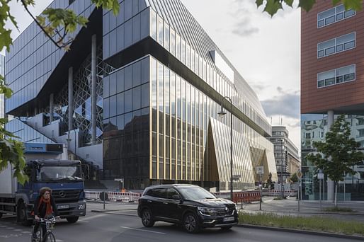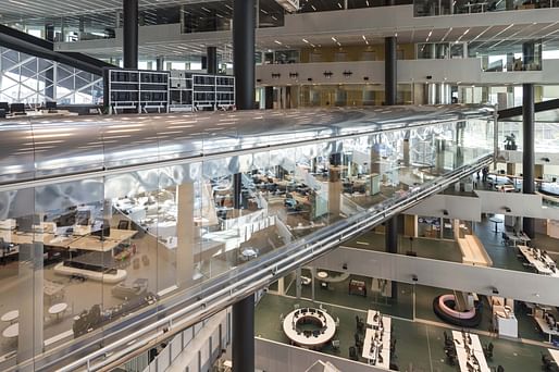
Axel Springer, Europe's largest publishing house, has opened its newest building, designed by OMA, on the campus of its existing headquarters in Berlin. The new structure is bisected by a diagonal atrium that opens up to the existing Axel Springer buildings, creating a series of terraced floors that form a "valley" to focalize an informal center stage within the building.

Each floor contains a covered area where traditional work environments are houses along with uncovered terraces throughout. The common space is formed by the interconnected terraces, seeking to offer an alternative to the formal office space.

Additionally, the public can access the building on three levels: the ground floor lobby, the meeting bridge, and the roof-top bar. The meeting bridge is a viewing platform where visitors can observe the daily inner-workings of the publishing house. The ground floor contains studios, event and exhibition spaces, and canteens and restaurants.
12 Comments
Putting off real GSD vibes with those terraces.
This one is really good. It blows the wheels off the "let's add exposed brick and black iron to a dumb box and that will make it cool" approach to office design that is gripping the USA these days.
Rotterdam OMA still produces quality work.
It's interesting. Whats more interesting is how they get clients that are OK with not maximizing FAR, GFA etc.
Its the HQ for a big company. Sometimes there are the best clients who are happy with a signature project and are the only tenants. Many great office buildings are commissioned by big corporations as marks of prestige. This is thankfully one of those projects.
i love the pneumatic office tube that runs through the middle. do they shoot interns through there?
it's where people work during quarantine...
highly intellectualized kitsch.
Looks like the grown up version of the Seattle Public Library. Hopefully this incites more progressive corporate architecture. Though there are certainly a lot of question here (who gets to work in the tube!). Anyone who has worked in a large open space knows there is a very different social atmosphere -- with positives and negatives. I'd still prefer this over any bland office space.
Obviously the tube is for the manager overlords to look over their minions....
Yes, the tube gives the project a sinister perspective.
I also like the return to the inverted exploration of early OMA. As opposed to the empty formal stacking and twisty shapes and boring interiors we see with today's supposed avant garde.
This looks really good. Love it.
Block this user
Are you sure you want to block this user and hide all related comments throughout the site?
Archinect
This is your first comment on Archinect. Your comment will be visible once approved.