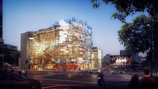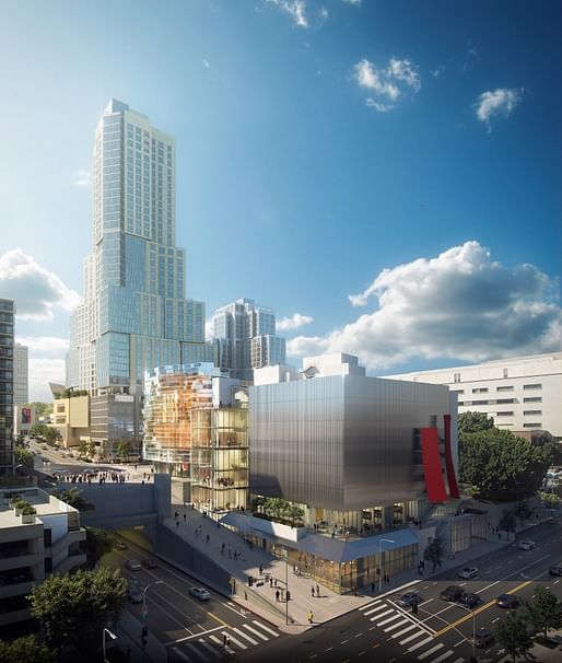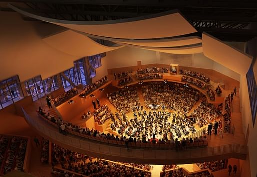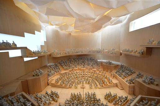

Gehry Partners has unveiled a set of renderings for the firm's $310 million Colburn School concert halls, a pair of performance spaces that aim to add a public arts component to Gehry's forthcoming $1 billion mega-development, The Grand.
The renderings, published by The Los Angeles Times, come as construction on The Grand moves passed the halfway mark and, less cheerfully, as fundraising for the concert halls hits a major roadblock as a result of the COVID-19 pandemic. Project backers with the Colburn School tell The Los Angeles Times that development on the project is currently stopped amid these funding issues.

The multi-faceted project is marked by a pair of performance halls that are meant to engage with public spaces surrounding the development both visually and through sound.

The project includes a circular 1,100-seat concert hall as well as a rectangular 700-seat theater for dance, chamber opera, and experimental performances, The Los Angeles Times reports, and is designed so that sound from the performances can "leak" out of the building onto the surrounding sidewalks and public spaces. The design will also feature platforms that can be accessed by the performers from within the structure so that outdoor concerts and performances slated for an adjacent plaza can blend indoor and outdoor formats.

The Los Angeles Times classical music critic Mark Swed wonders aloud if the project pause has the potential to turn The Grand into "a giant commercial enterprise that in the worst of all possible worlds," likening the project's impact, which is developed by Related Companies, to the developer's infamous Hudson Yards project in New York City.
Despite the official pause on the project, Colburn School officials have indicated that they would revive the project if the project's financial picture improves.
8 Comments
So the silver box is one of the two parts of the design?
correct, one part is the silver box the other is the glass box shown in the cover image
Before I read the article I genuinely thought they paused during construction and those were photos of the scaffolding.
I like it.
You dont like the new lightpoles, while you like this unnecessary junk. Care to explain?
Those interior physical model shots are great. Really enable you to understand the space.
Not so sure if I am convinced by the exterior renderings though...
I am curious which the intent is, since the ceiling in the physical model appear to have a very Gehryesque quality, while the ones in the rendering appear to be more traditional.
By almost any measure, Hudson Yards is exponentially worse than any of this.
Block this user
Are you sure you want to block this user and hide all related comments throughout the site?
Archinect
This is your first comment on Archinect. Your comment will be visible once approved.