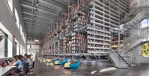

In a HyperAllergic opinion piece, Sarah Rose Sharp details the shortcomings of the recently completed Mui Ho Fine Arts Library at Cornell University, where "Architect Wolfgang Tschapeller says the library was designed with books in mind — but the grated floors fail to account for slushy snow boots, skirts, assisted mobility devices, and more." The Detroit-based writer outlines how users "inclined to wear skirts are feeling even more on display than the 100,000 books" held within the space.
Sharp writes that the slatted gratings at the upper levels, which are meant to allow air and light through the space, instead encourage indecorous sight-lines. Additionally, the perforated surface presents challenges for guests wearing heels as well as those with assisted mobility devices, writes Sharp.
According to the article, second-year graduate student Nicole Nomura, told Metropolis, "Knowing that I have to think about what I’m wearing as I enter the library is off-putting to me. What was Cornell thinking?"
10 Comments
Isn’t the great starchitect Steven Hall’s new library also not user friendly to the handicapped?
Yes it is.
https://archinect.com/news/article/150168636/accessibility-lapses-at-hunter-s-point-library-continue-to-draw-ire-online-and-in-person
It's sad.
I'm really sorry to see a library project that prioritizes real books being subverted by a non-functional architectural design concept.
Somebody will be hired to renovate this thing right out of existence in 20 years or so.
Looks like an Amazon warehouse.
The see-thru floors is an obvious flaw that should be fixed. As is the inaccessibility. Though there is a huge gulf between this (bad all around) project and Holl's new LIC Library which is mostly extraordinary save an inaccessible corner area that could be reworked (with a small lift on the opposite side). This Amazon library seems flawed beyond repair. I don't have much patience for those that don't distinguish between the two.
I personally didn't like the Holl library at all - it seemed more preoccupied with views and gratuitous circulation than providing reading spaces. The library seemed stringed along the ramps and stairs as an afterthought. It's all spectacles and looking at each other/outside.
I agree. Holl seems preoccupied with creating big, empty interior spaces with lots of ramps, stairs, and vistas. All of his recent buildings seem to have such spaces. They seem mainly designed to be photographed.
Coming late to this after listening to Episode 33 of Building on Air where it is discussed in the Fun and Angry segment.
http://www.kdunn.info/buildings-on-air-audio/2019/11/27/episode-33-november-16-2019
So I looked a little more closely and yes, I'm in agreement with most that it's bad. It's a bad design. It's a frivolous concept that becomes a technical and functional nightmare.
Also, the exterior is so poorly handled - we've been doing single pane plate glass windows in historic buildings since the '70s and they still and always look like crap. I know the industrial sash shown below likely isn't original, but there's a scale grain that looks appropriate to the building. Compare the two images. So disrespectful.
Yuck.
All the "work" in the project is directed towards the levitating library stack- fenestration was an afterthought (not sure they used the word versus just calling them windows). The interior is rather drab as well. The interior is bright, but honestly, it's little more than dingy blue-white light. The only "punch" is in the stacks- by necessity. The lack of attention on paid to the load bearing walls- outside and in- make the space a little drab.
One other thing to keep in mind when considering the project-
As a legacy project-
-not for the alum who designed it,
-not for the Dean that made it possible,
but as part of the Cornell Library system, the primary goal of the project was to make a space for second largest architectural library collection in the United States whole (much was in storage), and easily available to researchers on and off campus- at least this was the reasoning.
You'll note that the interior shot above illustrates the overwhelming majority of the seating available in the space- which is not adequate for research purposes. Also- before you make the justification that students have desks in studio- that is not the case for PhD's, nor is it the case for visiting scholars.
The old library had issues, but was far more accommodating of patrons.
Utter incompetence demonstrated by an academic whose website is full of unbuilt work. How he got the commission is anybody’s guess.
Q: Does he do more damage as a teacher or as an architect?
Block this user
Are you sure you want to block this user and hide all related comments throughout the site?
Archinect
This is your first comment on Archinect. Your comment will be visible once approved.