
The latest proposal for the LACMA campus, under the watch of famed Swiss architect Peter Zumthor, was unanimously approved by county supervisors earlier today.
However, it is this latest iteration that received the harshest criticism: LA Curbed's Alissa Walker shared a general sentiment when she commented that it "looks like a hermetically sealed freeway overpass that goes across the road," while the Los Angeles Times' Michael Kimmelman pointed out its fatal flaw: "it offers 10,000 less square footage than what it will replace!"
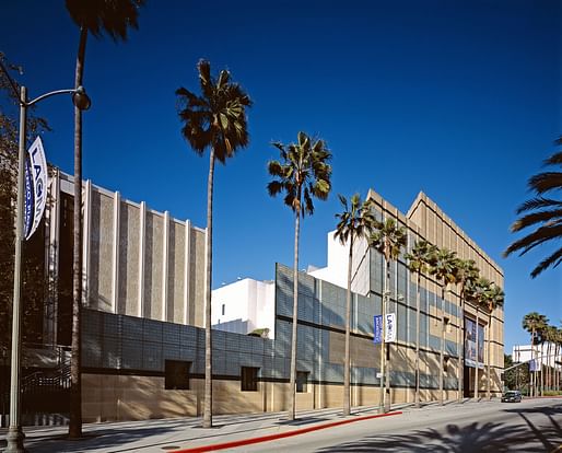
This might be a good time to take a closer look at what it threatens to replace: the original buildings on campus, built in 1965 and designed by modernist architect William Pereira, and a street front building erected in 1986, designed by Hardy Holzman Pfeiffer Associates.
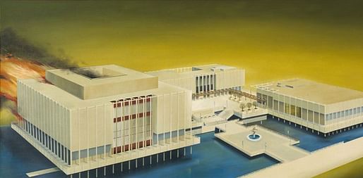
Christopher Hawthorne recounts that the original buildings designed by William Pereira were willfully omitted from David Gebhard and Robert Winter's landmark book Architecture in Southern California, because its authors "thought it was too ugly" to include. Nonetheless, they were the symbol of the West Side's version of the encyclopedic museum, a demonstration of civic architecture that came to define the center of "Miracle Mile," the stretch of cultural institutions on Wilshire. They became iconic so quickly, in fact, that Ruscha responded to their completion with an equally iconic painting, titled "The Los Angeles County Museum on Fire."

21 years later, the Hardy Holzman Pfeiffer Associates-designed addition that would come to represent the façade of the museum from Wilshire was completed. "In the far-reaching expansion," Mary Lou Loper wrote in the Los Angeles Times, "museum-goers henceforth will enter through the new partially roofed Times Mirror Central Court, nearly an acre of space bounded by the museum's four buildings: the Ahmanson, the Hammer, the Bing Center and the new Anderson Building." Like its predecessors, it has a monumental presence that is softened by desert tones, withe addition of a billowy white entrance.
Whatever form the controversial Zumthor design takes, it should be remembered that the buildings it intends to erase were themselves controversial upon completion.
The Pereira—"thought it was too ugly" to include. You have to wonder what critics will say about the Zumthor version thirty years from now. I'm guessing they'll find the Zumthor ordinary and boring, perhaps unsubstantial once it gets roughed up a bit. I'm also inclined to say the Pereira is an adequate expression of modernism, adequate enough to be preserved, at least for the purposes of memory and comparison.
Taste just feels ephemeral now, if not fickle. It's beyond my means, but I'd be curious to hear a debate about the merits of one vs. the other.
What most needs study is an examination of those running the show and making these decisions.
All 13 Comments
Hello?! Most important aspect of this whole process is that Brad Pitt spoke at the hearing in support of the Zumthor proposal. Why doesn't your coverage include that fact, Shane?! ;-)
Such a supporter of modern architecture, curious what Brad's position is on DS+R's FolkMoma building.
$650m for -10,000 s/f
That's $650,000 per s/f removed. You'd think they could remove a lot more with that kind of budget.
I liked the first black version of the Zumthor LACMA. It was fun and weird--more dynamic as a composition. This version looks scaled back and watered down. If they were worried about the heat, they could have just made the top a different color -- and kept the rest. If you are an architect, you have to be able to separate the constructive criticism from that which makes the project not worth the trouble.
I can't speak about the old LACMA, but it doesn't seem to be eliciting much support. The gold standard in LA is still the Getty, which is miles ahead of either of these.
If you are an architect, you have to be able to separate the constructive criticism from that which makes the project not worth the trouble.
Do you think Zumthor is not able to do that?
It looks like he scaled back the sq ft to please every criticism, now it’s much less than the original. In a way, it needs something even more bold, like sinking Wilshire or expanding to another floor or something. And the project now has lost all the fun of the original. So what’s the point of spending 600m
"..under the guise of famed Swiss architect Peter Zumthor"
Do you mean guidance?
Its okay, LACMA is historically known for paying for the fucking ugliest buildings - so this is just the next in line. Also their failed floating rock.
They should put this money toward their collection instead...but maybe they just cant make good decisions...
Well now I'm paranoid.
Is it pronounced Zoom-thor, or Zum-thor (or something else?)
it's pronounced TSOOM-TOR. unlike in english, the Z in german is a hard "ts" sound. the H after the T is completely silent as german doesn't have the english "th" sound.
That rendering above makes it look like a glorified Motel 6. Is that a giant parking lot in front of it or was it just made to look that way? The design seems to highlight everything that is wrong with LA and not in a good way.
A parking lot would actually be useful. It looks like it's just a bunch of empty, unshaded paving that you scurry across to get from the remains of Renzo's Piano's master plan to Zumthor's new folly.
OMG I JUST WATCHED THIS VIDEO AND NOW I FULLY SUPPORT ZUMTHOR'S VISSION FOR LACMA:
https://www.nbclosangeles.com/news/local/LACMA-Brad-Pitt-Diane-Keaton-funds-art-museum-los-angeles-508334751.html
I'll mop up the area around my desk chair ans soon as my heart stops racing.
That must be some video!
The Pereira—"thought it was too ugly" to include. You have to wonder what critics will say about the Zumthor version thirty years from now. I'm guessing they'll find the Zumthor ordinary and boring, perhaps unsubstantial once it gets roughed up a bit. I'm also inclined to say the Pereira is an adequate expression of modernism, adequate enough to be preserved, at least for the purposes of memory and comparison.
Taste just feels ephemeral now, if not fickle. It's beyond my means, but I'd be curious to hear a debate about the merits of one vs. the other.
What most needs study is an examination of those running the show and making these decisions.
Any design located here will suffer because of the monstrous high rise that dominates the area. MACMA would be better off buying that high rise and holding a unique competition to remodel it for their purposes! Then they would dominate the Miracle Mile.
From the post linked above.
The interior is impressive, however—and voluminous and overwhelming. Smaller paintings will be lost. If this gallery is representative, how much art can the museum actually display?
Is this textured concrete? Regardless, holes will have to be drilled to hang paintings. Over time maintenance and keeping up its appearance will be a challenge.
Nor do I see tracks for lighting. If from the ceiling, it will take some powerful bulbs. Not all art can stand natural light, and there doesn't seem to be enough. (I worked in a museum, years ago.)
Status, trendiness, and architectural statement look to exceed function.
The last paragraph in this article is its saving grace. You literally blessed the efforts of all of the architects. Not that these statements would put an end to those who disapprove of Zumthor's LACMA. No doubt they will hold on to their strong opinions. But they can't change the story of all of the buildings. It's history now.
As I understand it the floorplan has never been published, in fact the rumor is that it has never been finished. As much as I disliked some LACMA additions and enjoyed others, the dismantling of the fine permanent collection is an act of vandalism. The County and the museum have lost their way. The fact that celebrities endorsed it should mean so much less than it was. Poor Los Angeles.
more like poor NOT Los Angeles. we be gettin' a ZUMTHOR!!!
Block this user
Are you sure you want to block this user and hide all related comments throughout the site?
Archinect
This is your first comment on Archinect. Your comment will be visible once approved.