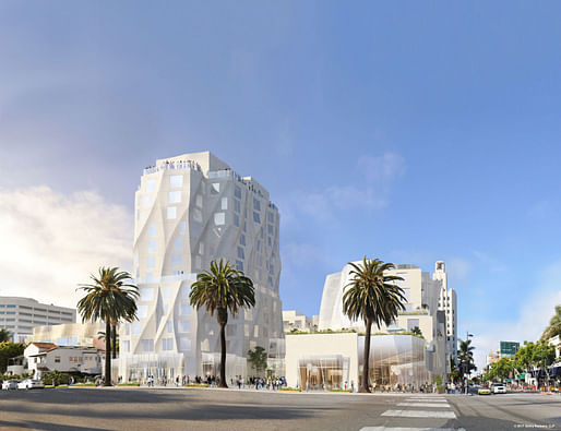

A developer looking to erect a hotel tower designed by Frank Gehry on Santa Monica’s iconic Ocean Avenue has reworked its plans and released a new rendering of the project.
Originally proposed five years ago as 22 stories, the hotel has been reduced to 12 stories—or 130 feet—to comply with the city’s new development plan for downtown. It’s just one part of a larger project that would also include a museum, shops, ground-floor open space, and 79 apartments.
— Curbed LA
The newly released rendering shows the Gehry-designed hotel tower as a considerably shortened and reworked version of what was originally proposed in March of 2013 — before the city's new height rules and design guidelines for downtown Santa Monica were implemented. For comparison, check out the rendering of the original proposal below.
"The design team has received significant input from the community outreach process, the planning department, and the Architectural Review Board," it reads on the project's website.
"The extensive outreach process used in developing the approved DCP informed the revised project, resulting in a lower maximum height appropriate to the Downtown context. A slender tower is oriented in an east-west direction, maximizing views to the oceanfront from areas to the east."
"The building street fronts are modulated to enhance activity by allowing for a variety of experiences at the sidewalk. Breaks in the building façade help maintain a scaled relationship to pedestrians and the adjacent context."
The website also lists a number of project revisions that resulted from community and city feedback and the reworked Downtown Community Plan (DCP), such as the removal of condominiums and increase of rental units and affordable units, addition of family units, reduced hotel program, reduced floor area ratio and average building height, and improved pedestrian access.
6 Comments
Yo, Frank. PoMo is dead.
And buried. Last rites were held in 1997.
Sort of a post-earthquake look to a pre-earthquake building. Or they could always go to the files and get the photos of Dresden and Coventry after the bombing raids. Same thing.
They should've combined the base of the short one with tower of the taller one, im(h)o.
I wonder what it might look like had he designed the details poetically and not just splashed them across the massing. Same language, different composition.
Block this user
Are you sure you want to block this user and hide all related comments throughout the site?
Archinect
This is your first comment on Archinect. Your comment will be visible once approved.