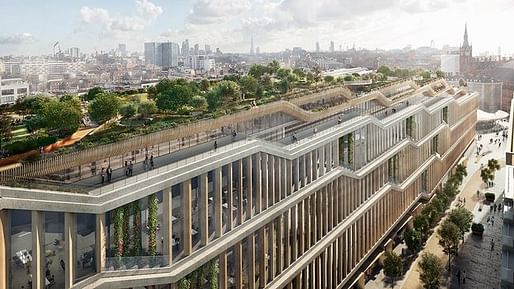
Back in 2015, the 11-storey, AHMN-designed scheme for Google's headquarters was deemed "too boring" by Google CEO Larry Page. Heatherwick Studio and BIG were brought in to add some pizazz to what was an admittedly fairly straightforward, boxy design. Today's freshly unveiled renderings show a more visually nuanced building than their predecessor, but the structure does not push design boundaries in the overt way that many associate with BIG and Heatherwick.

Indeed, the abundance of bordered, angled bay windows creates the effect of a colonnade; viewed from the exterior, the building resembles a kind of Parthenon mash-up. Floor-to-ceiling glass windows and a roof garden quickly place the building in its modern context, but this is a building that takes pains to join a conversation, not start one.

Thomas Heatherwick explained in a statement that "The area is a fascinating collision of diverse building types and spaces and I can't help but love this mix of massive railway stations, roads, canals and other infrastructure all layered up into the most connected point in London. Influenced by these surroundings, we have treated this new building for Google like a piece of infrastructure too, made from a family of interchangeable elements which ensure that the building and its workspace will stay flexible for years to come."

The interior renderings showcase an open plan design that encourages the highly desired employee collisions via "continuously cascading work environments" in the form of timber floors hung between concrete floor plates. The juxtaposition of soft and hard materials, along with alternating ceiling heights that occasionally open up to warehouse-like spaces, creates both intimate spaces and the potential for striking vistas, dual ideal platforms for idea generation. However, much like the exterior, the interior works quietly. This isn't an exercise in showmanship, but rather one of conservative craftsmanship.
3 Comments
It's odd that the "visionary" project and this more "conservative" approach end up looking the same: oversized open spaces, suburban feel. Seems like the point of the architect here is to offer some kind of repeating structural theme that can extend into infinity, much different than a wedding cake effect not really a architect as designer of spatial experience. The experience is always: large open space with a roof garden. (That last rendering looks like Berke's Cummins was on their mood board--but that building is MUCH better).
"...but this is a building that takes pains to join a conversation, not start one."
I LOVE this turn of phrase and even more I love the idea behind it. Does *every* building need to be a conversation starter? Is that a good way to communicate?
Are those vertical louvers, or columns? Nothing really "classical" going on there, except in a very trivial sense.
Block this user
Are you sure you want to block this user and hide all related comments throughout the site?
Archinect
This is your first comment on Archinect. Your comment will be visible once approved.