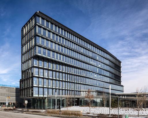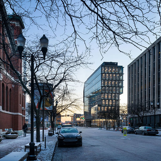
Nine glassed-in, metal-fin bearing stories make up the new Deborah Berke Partners-designed Cummins Indy Tower, which officially opens this month. With its "projections and inflections," the building simultaneously juts and struts through the metropolis, creating a slender and ecologically conscious corporate HQ.

Referring to Cummins' past collaborations with architects like Eero Saarinen and Kevin Roche, Deborah Berke notes that “over the decades, Cummins has demonstrated a commitment to great design that benefits its employees, its customers, and the community. This building carries that legacy forward with an environmentally sustainable design that dignifies the work going on inside while enhancing the urban realm.

The building’s articulated facades and distinctive form serve a purpose—to create a comfortable, light-filled work environment for employees that adds to the vitality on Market Street. Adding some muscle to the great bones of downtown Indianapolis, the park is a public amenity that does double duty as a robust piece of green infrastructure.”
It's a beautiful building. I was on a construction tour with the local AIA and also attended the public opening to showcase the art that was commissioned and/or installed.
The quality of light throughout is wonderful. The views out are fantastic, but it's SO narrow that it also reads as transparent and glowing on the street looking in, from all directions.
The extruded angles wrapping the parking garage are lovely, and the whole place is a testament to Cummins' attitude towards technology and beautiful design being able to co-habitate.
The sitework is gorgeous, too. Definitely a great amenity for the city. If I teach again in the future I'll definitely use this as a good example of one of my personal pet peeves that tends to get ignored in school: the treatment of the ground plane as a significant aspect of the overall design.
IT is a beautiful building but I feel that the office tower/low rise building connection is a tad awkward in the axon rendering
Difficult to judge a building from just a render and two photographs, all taken from great distance. Here's the lobby, nice chandeliers:
Front, Inc. as facade architect and Ratio as architect of record deserve some credit too.
archanonymous, here the entire credit list, via dberke.com:
Deborah Berke Partners– design architect and interior designer
Ratio Architects – architect of record
Land Collective – landscape architect
Robert Silman Associates – design structural engineer
Fink Roberts & Petrie, Inc. – structural engineer
Syska Hennessy Group, Inc. – design mep engineer
Circle Design Group, Inc. – mep engineer
Atelier 10 – sustainability consultant
Front, Inc. – facade consultant
One Lux Studios – lighting designer
F.A. Wilhelm Construction Co., Inc – construction manager
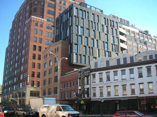
I'm not sure that renaissance refers to the building as a style as much as a catalyst for increased investment in that part of the city- or as a signifier of change. The Porter House by SHoP is another example.

It was one of the first significant "interventions" in the meatpacking district and helped to make the Highline viable - proof of a desired user group moving into the area).
So perhaps Cummings is proof of life and a renaissance in downtown Indy.
Your comment is accurate, Marc. But it's also more complex than that.
Cummins, the company, is very Hoosier in that it's somewhat humble, one could say, but very serious and concerned with doing things well and right the first time, rather than just making a quick buck.
Cummins' dedication to good design - both on their own very pragmatic work on engine technology AND on the more poetic side of beautiful aesthetics - has had a large but largely unrecognized influence on design in the US at large. For Indianapolis, to have Cummins bring some of that attitude of quality and serious investment in a community to THIS city, not just to their own little Athens on the Prairie down in Columbus, is, in fact, sparking some of the local business community to take a closer look at design, public space, art...all of those hard-to-quantify aspects of human community and commerce that are seeing a resurgence in *some* parts of the economic world right now.
(Assuming trump's Republican-led destruction of the NEA/H doesn't destroy it all in the goal of saving a trillionaire a dollar on his taxes, of course.)
I'm sure the 'renaissance' of the meat packing district had more to do with it's incredible housing stock, it's location near many desirable neighborhoods, and it being in Manhattan. That being said, if this is a sign of Indianapolis's 'Renaissance', then I'm all for it. Just took a gander in google maps and it looks like a lovely town. It has enough historic fabric to give it that magical 'sense of place' that so many people are looking for. Hopefully they will infill before tearing down too much more.
To the building in question, I can see that it's nicely crafted for it's type, but that's what will make it very unlikely it will be repeated (assuming a street of these is desirable). I'd like to see architects working out a design vocabulary and construction method that would address the hardi-plank apartments going up. Like Indy's fabric, it's the quality of the humble buildings that make a place special.
All 27 Comments
It's a beautiful building. I was on a construction tour with the local AIA and also attended the public opening to showcase the art that was commissioned and/or installed.
The quality of light throughout is wonderful. The views out are fantastic, but it's SO narrow that it also reads as transparent and glowing on the street looking in, from all directions.
The extruded angles wrapping the parking garage are lovely, and the whole place is a testament to Cummins' attitude towards technology and beautiful design being able to co-habitate.
The sitework is gorgeous, too. Definitely a great amenity for the city. If I teach again in the future I'll definitely use this as a good example of one of my personal pet peeves that tends to get ignored in school: the treatment of the ground plane as a significant aspect of the overall design.
It is really stunning. Love it.
Super nice. Let the renaissance begin
Renaissance? Really? Nice building, but nothing to bring on a renaissance.
This is what good architecture is supposed to be. Good. You either have 'it" or you don't. I see so much garbage design posted as if revolutionary, this good building give me reason to hope.
It's a beautiful building. Sleek, elegant and feminine.
IT is a beautiful building but I feel that the office tower/low rise building connection is a tad awkward in the axon rendering
Difficult to judge a building from just a render and two photographs, all taken from great distance. Here's the lobby, nice chandeliers:
Front, Inc. as facade architect and Ratio as architect of record deserve some credit too.
who did the interiors?
I'd be curious to hear what makes this building the initiation of a renaissance. I see where they curved to upper floors a bit to overhand just a smidge, but besides that it's another glass box with a repetitive grid. Do you need to go to school to see the beauty in that?
archanonymous, here the entire credit list, via dberke.com:
Deborah Berke Partners– design architect and interior designer
Ratio Architects – architect of record
Land Collective – landscape architect
Robert Silman Associates – design structural engineer
Fink Roberts & Petrie, Inc. – structural engineer
Syska Hennessy Group, Inc. – design mep engineer
Circle Design Group, Inc. – mep engineer
Atelier 10 – sustainability consultant
Front, Inc. – facade consultant
One Lux Studios – lighting designer
F.A. Wilhelm Construction Co., Inc – construction manager
I'm not sure that renaissance refers to the building as a style as much as a catalyst for increased investment in that part of the city- or as a signifier of change. The Porter House by SHoP is another example.
It was one of the first significant "interventions" in the meatpacking district and helped to make the Highline viable - proof of a desired user group moving into the area).
So perhaps Cummings is proof of life and a renaissance in downtown Indy.
Your comment is accurate, Marc. But it's also more complex than that.
Cummins, the company, is very Hoosier in that it's somewhat humble, one could say, but very serious and concerned with doing things well and right the first time, rather than just making a quick buck.
Cummins' dedication to good design - both on their own very pragmatic work on engine technology AND on the more poetic side of beautiful aesthetics - has had a large but largely unrecognized influence on design in the US at large. For Indianapolis, to have Cummins bring some of that attitude of quality and serious investment in a community to THIS city, not just to their own little Athens on the Prairie down in Columbus, is, in fact, sparking some of the local business community to take a closer look at design, public space, art...all of those hard-to-quantify aspects of human community and commerce that are seeing a resurgence in *some* parts of the economic world right now.
(Assuming trump's Republican-led destruction of the NEA/H doesn't destroy it all in the goal of saving a trillionaire a dollar on his taxes, of course.)
I should also point out that this building is surrounded by several blocks of the spanking-new typical 4-story ticky-tack color-blocked hardi-plank apartment boxes that are common in every US downtown right now. So hopefully the market will look at THIS building and see an example of quality design and how appreciated it is.
I'm sure the 'renaissance' of the meat packing district had more to do with it's incredible housing stock, it's location near many desirable neighborhoods, and it being in Manhattan. That being said, if this is a sign of Indianapolis's 'Renaissance', then I'm all for it. Just took a gander in google maps and it looks like a lovely town. It has enough historic fabric to give it that magical 'sense of place' that so many people are looking for. Hopefully they will infill before tearing down too much more.
To the building in question, I can see that it's nicely crafted for it's type, but that's what will make it very unlikely it will be repeated (assuming a street of these is desirable). I'd like to see architects working out a design vocabulary and construction method that would address the hardi-plank apartments going up. Like Indy's fabric, it's the quality of the humble buildings that make a place special.
Since when became just doing your job properly a Renaissance?
It's not the job, it's a marker in the place- a signifier.
(and given the description of the surroundings it's needed)
Thayer, that part of Manhattan was in far from ideal shape. The closest decent neighborhood was the village at the time and the meatpacking district itself had a "charm" to it. It was all the people who were willing to wait out the less than ideal conditions and to renovate that benefitted from the cheap housing stock. Yes, the Porter house is not THE catalyst (inaccurate choice of wording by me), but it did mark a turning point for the area given the complexity of the project given it's return.
Nice building. Saying its anything more than that is huge stretch imo. How exactly is it any different (from a community perspective) from the buildings adjacent to it?
I think maybe architecture is too outwardly ambitious for its own good. A buildings effect on the outer neighborhood has far more to do with its program and location then its tectonics imo. I could replace the birds nest with a giant block of concrete and it would function the same as an urban component. The seagram building proves me wrong, but it worked for a variety of site specific reasons. Not sure that all buildings have the potential to affect urban life in any meaningful way. Sometimes a building can be more, sometimes its just a building. Thats important to realize because we unfairly judge with broad brush at times. Some criteria are simply not always applicable.
jla-x, read my long-ish comment above. Cummins making *this* investment in *this* city is important.
Its certainly an asset Donna, I just think we sometimes unfairly expect too much in the way a building affects the street and community. Im guilty of this, and its mostly a self crit here. Not all sites will host the same potential for street life and we should probably judge accordingly. Even some poorly designed buildings and urban spaces can be used in lively and unexpected ways. I was in vegas last year and really enjoyed some of the unplanned spaces leading to the casino entries. A lot of people sitting and performing. It worked well despite the D- it would have received in an architecture/urban design class. It worked because of the need for certain activities existed. Anything would have been appropriated to fill that spatial need imo. Some sites will never host a rich street life/interaction. Just thinking out loud...
"It's not the job, it's a marker in the place- a signifier. "
To me, that's also just part of a job well done ;)
Back to the comment calling it "another glass box wth a repeatitive grid" I'd say the key is not to try too hard to break out of the vernacular of our time, but the moves here are fine tweaks to that grid that are craft based, that just feel right.
Similarly, Palladio took a forgotten vocabulary (roman classical) and tweaked it for his own day... maybe Berke can lead a new kind of modernism. The way it works with the site is less obtrusive than the stacked box method I'm seeing. I bet the roof garden is also much better and more useful than those too...
can I get a clarification of the use of the word "bearing" in this sentence "Nine glassed-in, metal-fin bearing stories"? (or German compound word).
"I'd say the key is not to try too hard to break out of the vernacular of our time"
I'd say the key it to create beauty and sustainability in whatever vocabulary works for the context. I think the only people who appreciate "fine tweaks to that grid" are the architects who believe the modern world can only be expressed in a 1920's European modernist garb.
The idea that Berke is creating a "new" kind of modernism is interesting given that there's been about every rendition of modernism one can imagine in the last 50 years. I'll never understand why architects confine themselves with artificial parameters before looking at the context. My guess is it makes them feel above the layperson.
Thayer, what do you mean by 1920's European modernist garb? Mies' Berlin skyscraper sketch? Corbu's Plan Voisin? I would rather say this building reflects proper 1950's American capitalist modernism...after (1920's) European modernists.
I think you're right randomized. I was thinking of Mies's 1920's sketches of a glass tower with a grid of glass but It's more the built versions of the 1950's. Corporate modernism as vernacular, talk about erasing any local flavor! Someday there will be a revolt against this bland corporate modernism like in other fields. For now we must content ourselves with a shimmy here and a cantilever there to "break the box".
Block this user
Are you sure you want to block this user and hide all related comments throughout the site?
Archinect
This is your first comment on Archinect. Your comment will be visible once approved.