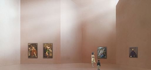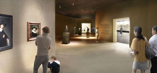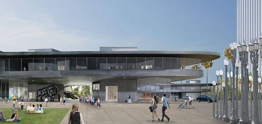
On a newly-launched website, the Los Angeles County Museum of Art has released renderings of the proposed Peter Zumthor-designed building, which would replace four existing buildings designed by William Pereira. In total, the new building, prosaically named the Building for the Permanent Collection, would comprise approximately 393,000 square feet, a reduction of about 25,000 square feet from the current gallery space.


The Swiss architect has been working for years on the project and several changes have been made since the original design was released. Most notably, and controversially, the building is now designed to span Wilshire Boulevard.
The dark grey concrete building will stand on eight giant legs, which will also serve as galleries and retail spaces. So-called “Meander” galleries containing benches and artworks will connect the various galleries along the building’s perimeter. In the renderings, they are shown as wide spaces with large windows providing views over the city. Conventional galleries, named “Cabinet” galleries, are depicted in the renderings instead of the so-called “Chapels”, which will have high ceilings.


As Christopher Hawthorne notes in the Los Angeles Times, Zumthor is known to prefer models over the slick renderings typically employed by architects today. And the renderings look “undercooked”, as Hawthorne states. In other words, they’re not great and seem to be stand-ins rather than representations of what the gallery will actually look like.
Little of the landscaping, to be designed in collaboration with the artist Robert Irwin and the firm Spurlock, is depicted. The famous Urban Light installation by Chris Burden is clearly a cut-out of a Google Maps image and seems to be either relocated or simply in the wrong place, considering that the Renzo Piano-designed Plaza will not be removed according to the site plan. According to Hawthorne, the renderings were produced in part to meet deadlines for an environmental impact report.


Construction on the new building is set to begin in 2018 and projected to be completed in 2023. It’s expected to cost $600-million.
Check out more images in the gallery below.
For more on the Zumthor-designed LACMA building, take a look at these articles:
22 Comments
horrible design - terrible planning for los angeles
why does this POS cost 600 million? it's just a curvy domino slab. the glazing looks terrible. it's not even big curving sheets of glass like SANNA does.
Seriously it is like a piece of "nothing-architecture". Perhaps that is the point.
bleh
I think his phenomenology schtick is played out. The galleries look dark and arbitrarily laid out. The public spaces look banal. This does not seem promising.
wait... they're demolishing the existing buildings to rebuild it smaller? why?
I liked the kitchiness of the Pereira buildings. reminded me of the caldor I used to visit with my mom.
This looks pretty boring. I give Zumthor and team the benefit of the doubt that these half-baked renderings don't tell the whole story, but I'm not excited by the renderings AND they don't outweigh the truly questionable act of tearing down existing buildings to make bigger blander boxes for art.
I know many people, and many artists, are big fans of the stark white box for art viewing, and I enjoy it in small doses, but I also think interesting art today doesn't need that kind of preciousness in its context. Most good graffiti is so much better than most high level art being produced today.
Also relevant: the recent NYTimes article asking why we're building new museum buildings and simultaneously laying off museum workers. Rich people like to fund sexy new projects, but I can say from working inside a museum that what needs to be funded are great employees, programming, and maintenance and upkeep, none of which are as sexy as a rendering by a poet-philosopher Swiss dude.
100%
Oh, just build the fucking thing already. This extended orgasm is leaving me flaccid.
I'm still trying to understand what phenomenology means! Every time I look it up, it confuses me. Anybody?
Thayer-D, Its the study of experience and consciousness. As it relates to Architecture, my understanding is that a designer might be able to work with experiential aspects of architecture (sound, temperature, texture, light and shadow, etc) in ways that enhance an experience, presumably in ways that are different/better than buildings by architects who don't make their work all about phenomenology. He tends to create architecture that over-emphasizes material and shadow. Zumthor almost always produces dark somber, church-like spaces. Steven Holl also considers phenomenology in his design process, but he doesn't make into a whole schtick the way that Zumthor does. The entire show of his remote monk-like existence seems ridiculously pretentious to me.
davvid, thank you. I could have used this last week at a conference on architecture and philosophy where every other presentation was about Heidegger and phenomenology. I love drama, materiality, and chiaroscuro, just not in every building.
This really is a trainwreck for the ages. But, it should be of little surprise that this is what you get with an architect who has only ever utilized what are, in effect, fire stairs for vertical circulation (Bregenz), and then this (Cologne):
I really do appreciate this scheme for the site. It's nice that, in plan, the footprint seems to mimic the famous tar pits of LA, while the interiors treat the art as some sort of spiritual material. I remember in my first semester of architectural history, during a seminar breakout with the prof, she asked what the modern day cathedral or abbey is for the architect - what the ultimate opportunity for design would be, since during medieval and Renaissance times, the ultimate artistic commission would be a cathedral. Today, she pointed out, art museums serve as this honor. So it's appropriate that Zumthor treats the art with reverence in this design, allowing dramatic daylighting to develop sublime moments. To some extent he even treats the city with the same sort of reverence, considering that inside visitors receive panoramic views of LA when they turn away from the art. The incredible massiveness of the form as a whole must leave quite the impact as well, considering the long spans of what, in the very least, appears to be 10' thick concrete slabs from below. So, while I realize this seems to be an unpopular opinion for whatever reasons, I appreciate this concept and I hope to see it realized at least somewhat close to the renderings and models as have been presented this far.
These look like some first year student render. I'm sure it'll turn out better than these renderings.. They could've paid a rendering firm like MiR or so to create some poetic renders but Zumthor has never relied on computer renderings for his built work you know.
Phenomenology - useless blah that only architects understand. Btw I did kind of a research paper on this nonsense when young and stupid (school)
"Under cooked" renderings is an understatement indeed, the material choices and the concept imagines a dark, dank "Vas baths" inspiration.
I do not see or feel the Los Angeles of sunshine, palm trees, surf, west coast Pop Artist or the place where you can make art and architecture which is not dictated by the East Coast establishment.
Where is the freedom of light to dream in this design? Maybe Zumthor, is thinking too much about the Tar Pits, and not about the 20th c., culture of Los Angeles as a historic place which is changing to embrace a new 21st c.
Would love to read a report/recap from the LACMA hosted Aug. 24., "public scoping meeting", Archinect HQ any plans for coverage?
We'll be there Nam!
Looks like a regular office building. The curve form relative to the scale is only knowable from a helicopter. Very disappointing. Who's the architect of record? Hoping Robert Irwin can elevate the landscape to something great like the Getty gardens.
Bummed that the Pereira work is being taken down, but I'm glad they appear to be keeping (and somewhat showcasing) the Pavilion For Japanese Art which is soooooo fantastically bizarre. I love it and its flinstones front stoop, and it's kind of shoved aside in the current campus layout.
These renderings appear to show artwork just sort of hanging out in the interior, as though it's just chilling in a hallway somewhere, with people scurrying past. I hope that's not like, the whole schtick... If so, I wouldn't love that it isn't more organized/specially grouped. One thing that I feel makes a great art museum is the pairing/juxtaposition of certain pieces within a room, such that they speak to or about each other (assuming the curatorial notes are sufficiently well-prepared that they explain the contexts, cross-pollinations, and dialogues between each piece). That hallway rendering weirdly reminds me of Koolhaas' IIT student center, and although I like that building, I wouldn't want one of its random indefinite hallways/gathering spaces to be mutated into an art museum...
A curvilinear nightmare!
Block this user
Are you sure you want to block this user and hide all related comments throughout the site?
Archinect
This is your first comment on Archinect. Your comment will be visible once approved.