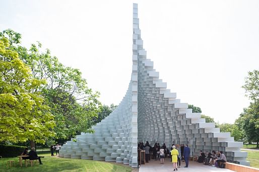

A teetering stack of fibreglass blocks has landed in Kensington Gardens, rising above the Serpentine Gallery in a stepped wall, before billowing out to form a cave-like space within...
From one side, it looks like a wall that has enjoyed a good lunch. The blocks stretch outwards in a swollen bulge, like a snake devouring its gallery-going prey. From the other, it looks caught in a stiff breeze, a pixelated curtain rippling in the wind.
— the Guardian
"In keeping with the best-observed-from-a-distance nature of other BIG buildings, the detailing is also a bit clunky, with each fibreglass frame bolted and bracketed in rather heavy-handedly, due to time constraints," writes Oliver Wainwright. "Still, the interior remains a stunning space, a shape-shifting cathedral that is possibly the Serpentine’s most impressive pavilion yet."
8 Comments
Bjarke Fujimoto > Bjarke Safdie > Bjarke Koolhaas
Bjark-minster Fuller is my least favorite
I actually love the angle bracket connection.
i agree donna. sounds like the author wants it to look more like a rendering. That he is complaining it is all for naught anyway, I can't see why it would make sense to do anything but what BIG did.
Arch journalism in 2016:
https://mobile.twitter.com/ollywainwright/status/740228943442288640/photo/2
Agree with the Sou Fujimoto comparison. + frat boy metaphors,,, unzipping, dress uplifting, etc.
Maybe works best as a pavilion. Because this is horrifying:
https://mobile.twitter.com/ollywainwright/status/740210577335844864/photo/1
It looks pretty nice.
I think many people dislike his work because it is so simple... the truth is, a simple idea executed well (or at all) can be much more exciting than something too complex to immediately understand, especially for the public.
That said, I feel each box is going to be full of dirt, detritus, and spider webs in, oh, 1-2 months.
archanonymous, won't it be gone in two months? Personally, I think it's going to be full of spiderwebs in 1-2 HOURS! But that's why institutions have maintenance staffs (here at the museum where I work we have to capture/collect all bugs, label them with date and location found, and give them to our integrated pest management team).
I also love the reworking of a collection of ideas into variations that can happen over time in an artist/architect's work. This piece is more interesting to me in that way than, say, Gehry's big timber pavilion.
thats crazy cool, donna.
the project by fujimoto was also very good. lightweight, simple, complicated, and utterly fascinating. I cant help but see this as a kind of heavier continuation of that project, but even so its clearly a great project. I've been to a few of these, including the one built last year by selgascano, which was also impressive. The shift in recent years towards celebrating the lightness of being in this place is maybe symbolic of our view of the world as architects as well. The cork project by H+DeM was also awesome, yet felt more like they wished it were permanent, that they were trying to hold back time with a weighty cosntruction. Selgascano and fujiimoto and now BIG seem to be saying lets just experience this place and enjoy and not worry that tomorrow it will be gone. That's a mark of a generational shift maybe and a preview of where our profession is going. Maybe that is part of the appeal of these pavilions.
Block this user
Are you sure you want to block this user and hide all related comments throughout the site?
Archinect
This is your first comment on Archinect. Your comment will be visible once approved.