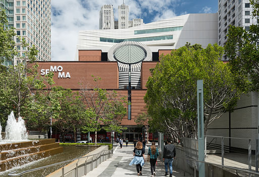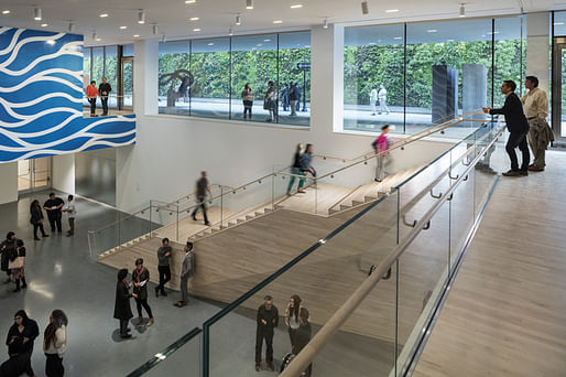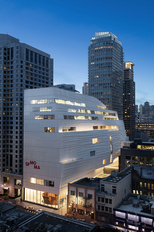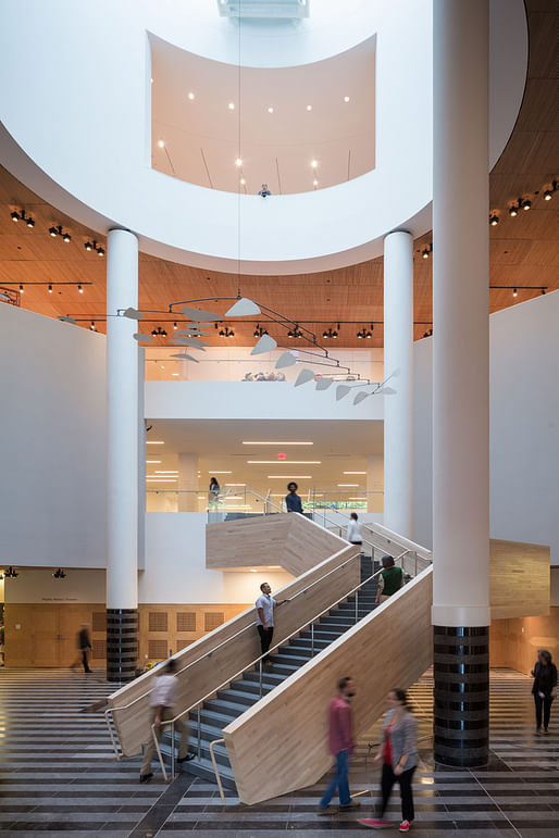
While not open to the public until May 14, the San Francisco Museum of Modern Art has officially unveiled its completed redesign to the press: a massive, iceberg-like addition by Snøhetta, conjoined to the original Mario Botta pomo building.
The redesign is a boon to exhibition space in the museum: Snøhetta's 235,000-square-foot expansion more than doubles the space of the original building, and allows for "art-filled free-to-the-public galleries". In total, that amounts to more gallery space than what the eastern-coast's MoMA has. While much of Botta's original building was left more or less the same, the staircase in the entrance atrium was adapted by Snøhetta to adjust to a projected increase in visitor traffic.

Julia Ingalls attended the press preview; look for her take later this week. Meanwhile, here's what the other critics are saying:
Christopher Hawthorne for the Los Angeles Times is at once pleased by Snøhetta's design and disappointed by the new museum writ large:
Around back and down again at ground level, the Snohetta building comes alive in a complex attempt to simultaneously squeeze the most out of its small footprint and open itself up to the surrounding streets. [...] There is both real deference and an odd sort of architectural fratricide in the way the new building treats the old one. [...] SFMOMA has killed its 1995 building to save it, or saved it to kill it. Take your pick.

Oliver Wainwright for The Guardian finds the whole thing flimsy, clumsy, and disparages its resemblance to Gap storefronts:
Clad in undulating panels of white fibre-reinforced polymer, which are intended to recall both fog and the rippling water in the bay, the building has a inescapable flimsiness, as if has been carved from polystyrene like the architectural models on display inside. [...] Compared to the carefully detailed brickwork and banded granite blocks of the Botta building next door, the whole thing feels a bit cheap, in both material quality and architectural thinking. [...] The two buildings couldn’t be more different, or better reflections of their respective eras, and the pair do not make a particularly happy marriage.

Julie V. Iovine for The Wall Street Journal takes the redesign in stride, praising its unabashed odd-coupling and accommodation to today's mobile museum-goer:
The most striking thing about this expansion is the stylistic difference between old and new buildings. No attempt has been made to gloss it over, and that decision was a smart one. They provide a one-two punch to the city’s fast-changing downtown skyline as the neighborhood evolves into a popular cultural and transportation hub. [...] Snøhetta’s expansion has imagined new ways to experience art in a world filled with museumgoers on the move.
Brock Keeling for Curbed appears to have absolutely zero critical thoughts on the redesign:
The modern update is an unabashed success for both San Francisco and the art world. [...] Much ink will be spilled over SFMOMA's expansion this year — rightfully so. Snøhetta's stroke of brilliance deserves all the gleaming press heading its way. [...] SFMOMA stands out from the rest, as San Francisco's favorite new toy.

Update (5/6/2016): John King, architecture critic for the San Francisco Chronicle, has weighed praise for the addition, ending with the promise that, like any major museum project, it will improve with time:
Inside and out, there are sublime smaller touches that show us why Snøhetta won the job, and why the firm is now on the short list to design President Obama’s library in Chicago. But several major aspects seem forced, like a collection of problems being solved rather than an architectural creation that fits right in. [...] Inevitably, the debut of such a prominent building in today’s San Francisco can be viewed through many lenses — as a symbol of wealth, or a manifestation of the tech boom, or the final step in this part of town’s half-century transition from Skid Row to a posh address. [...] But the reality of architecture is that large buildings often reveal their qualities slowly, the first impression deepening as we explore them in more depth.
14 Comments
Idk the glowing Curbed review suffers for being overly positive, perhaps it's harder to write an interesting positive review in general. Most of the time the critics are all rushing to make the best analogies.... It all seems very lame, positive and negative. Then again, looking at Curbed as a whole it's generally reposted PR written garb or a Buzzfeedy onslaught of brutalism FLW prefab analytics tested content.
At the end of the day it's a nice new museum, perheaps very similar to the Broad--with a photogenic exterior that defies easy gimmickry found elsewhere. SF trying to up their cultural game seems like a good thing, long ways to go though... Anything to jazz up the so so architecture there.
Love the building, trust in Snohetta...
it fits in to the New "San Frantechno"
I'm afraid I tend to agree more with the Guardian review than the other more positive ones. Forget the clouds and the fog and the tides and look at the new building itself which manages to seem both flimsy and tortured in its convolutions. Most obnoxious to me was the new logo and the long, self-important explanation of how innumerable curators and designers arrived at it after agonizing cogitation. The finished product looks like something a second grader would come up with if given cut-outs of the same six letters and told to make them look funny. It's painful to see it pasted onto the rigorously symmetrical facade of the old building. I wish I could say that the Gap founder's collection promised to be any more impressive. It's so full of utterly unimaginative mainstream picks from the decades it represents that anyone hoping for a note of originality in the choices of artists or a surprise or two will, I'm afraid, be sorely disappointed—once they've manage to get beyond the bloated, view-blocking egomania of the ubiquitous Serra's pretentiously oppressive spirals.
Agree that the branding is lame... Museums these days, in content and image, represent the Gap more than anything else. Architects get a bad wrap for not knowing how to design websites and stuff, but what is considered "high-design" these days is flat, bland and sterile. The architecture is probably the best thing going here.
Its growing on me.
I dislike (very much) how the building ignores Howard St. It simply ends, like a foam model cut by hot wire.
I find the overall form of the building to be very attractive. But part of me also wishes that the building was more expressive on the Howard St. side. At the street level, the building form is somewhat conventional and too restrained.
It's very restrained, to the point of being difficult to differentiate from the rest of the street. If it weren't for the large facade above (which provides a suitable fanfare) one might find it challenging to locate the entrance.
I can't wait to go see the Serra, though.
Seems like an overall ok building, but I hate the side facing the street...why didn't they continue the "striations" across the facade facing the street? It's really boring...and kinda looks like a high end boutique shop...If I were walking up the street and saw that in the distance I would expect to find 2400$ shoes not a Serra sculpture.
its been likened to a giant Mac II that over heated on one side or some glitzy store up over in Union square
Where's architecture? It probably looked good as a model but in reality it's bland.
The north-east facade isn't bland at all.
Block this user
Are you sure you want to block this user and hide all related comments throughout the site?
Archinect
This is your first comment on Archinect. Your comment will be visible once approved.