
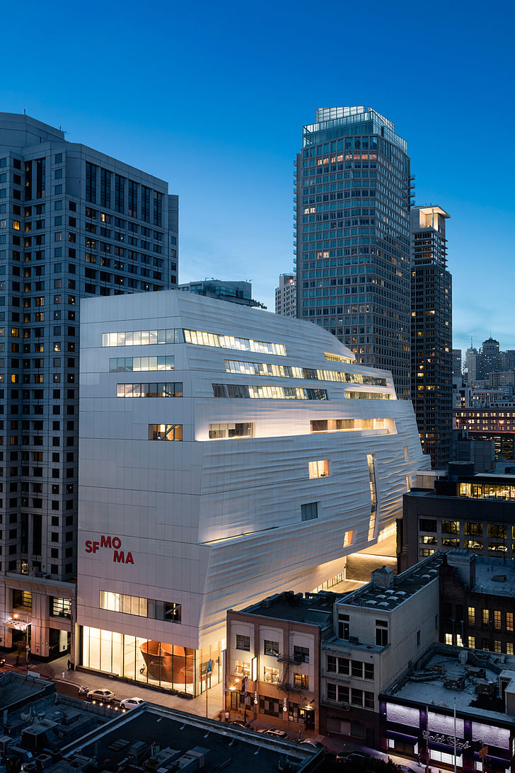
Snøhetta’s expansion of the San Francisco Museum of Modern Art—which incorporates numerous elements of Mario Botta’s 1988 design while simultaneously introducing a far more egalitarian vibe—seems to be a miniature of the constraints and progressive-mindedness of San Francisco itself. Multiple entrances, an emphasis on intimate scaling instead of grand gestures, and dedicated staff floors that sit blatantly atop the public galleries, invert many of the preconceptions of traditional museum design. Instead of attempting to shape the city with a bold new vision, Snøhetta has allowed the city to shape the museum. It is the anti-Bilbao: if not in effect, then certainly in intention.
Located just a few blocks south of Market Street in a neighborhood peppered with art galleries, office buildings, performance spaces and high-end whiskey retailers, the new SFMOMA comes gradually into view, a cloudy wedge that is first glimpsed from behind Mario Botta’s fortress-like brick building on Third Street. As one turns on Howard Street from Third, the dense 19th century urbanity of nearby Market Street gives way to a more car-centric 20th century vista. With the Yerba Buena Center for the Arts facing it on Third and the newly expanding Gagosian Gallery cooly regarding it from Howard Street, the SFMOMA is surrounded by physically small but intense players, a consideration that prompted Snøhetta to purposefully design multiple entrances that favor a more alley-way like approach than a giant boulevard feel.
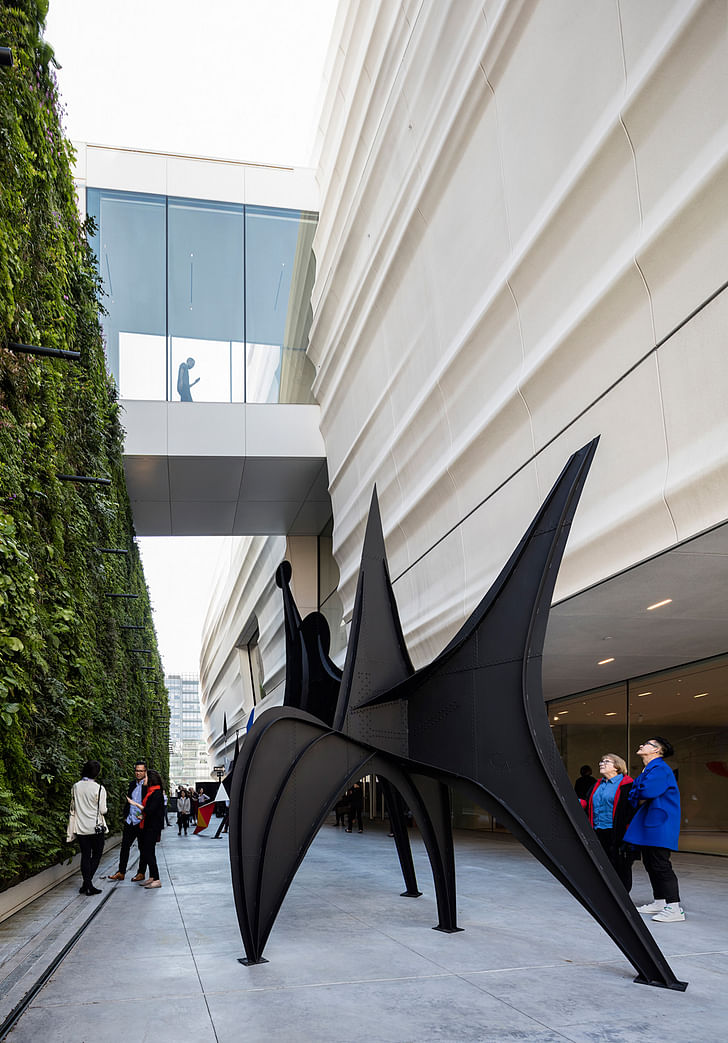
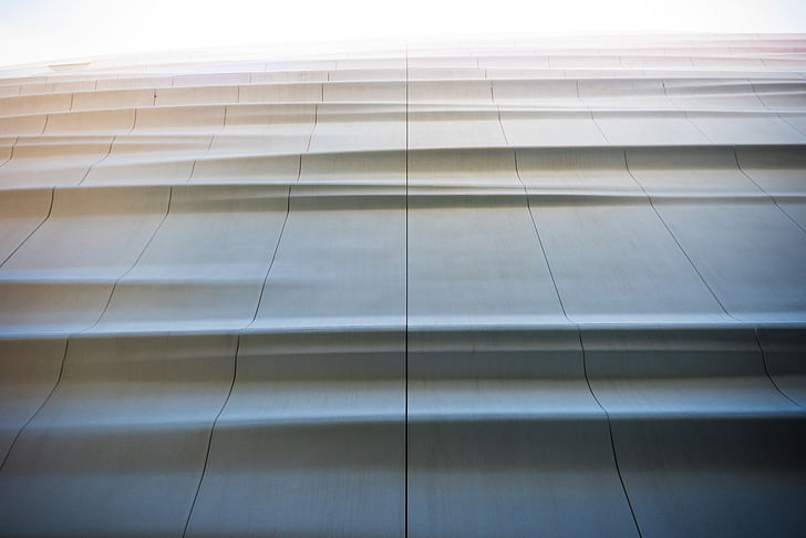
While pedestrians can still enter through the old Botta entrance on Third, the “official” entrance is off Howard, where a staircase gently ushers one up to the free-in-perpetuity second floor. This entrance, which is visually dominated by the fiber-reinforced polymer panelled overhangs of the gallery floors above, successfully creates a narrow, alleyway-like feeling while simultaneously introducing Snøhetta co-founder and principal Craig Dykers’ design concept of “landscapes".
Indeed, Snøhetta has created a museum whose landscapes are as personal as they are reminiscent of the iconic topography of the city itself. Although the quarter-inch exterior panelling is a kind of ode to the marine layer of the San Francisco Bay, the other “landscapes” of the museum evoke the startling momentary glimpses of tightly packed, interconnected city to the seemingly indefatigable paisley-sleeved Dykers, this "room" feeling was purposefulcorridors. I had the opportunity to participate in a suitably egalitarian (Snøhetta, after all, prides itself on keeping the pay of principals only about twice that of an entry level drafter) sit-down interview with Craig Dykers, conducted on amorphous plush seating with three other journalists. Dykers patiently nixed any notions that the museum had a Norwegian quality of light, and explained to an Italian journalist that he was, in fact, American, and that the museum’s illumination was derived from its immediate San Francisco environs.
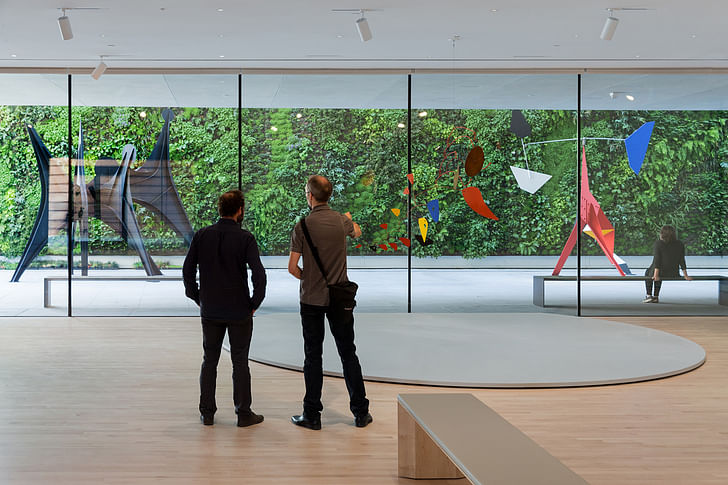
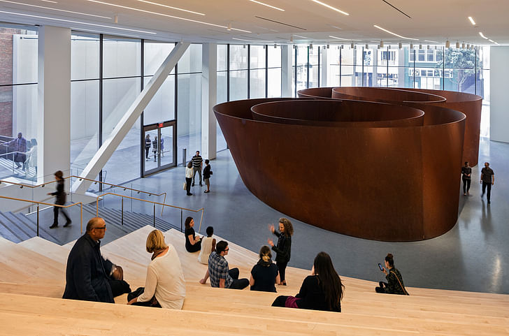
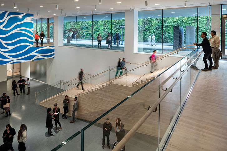
The choice to place Richard Serra’s enormous steel sculptures on the viewable-from-the-street first floor—a move that is practically a cliche by virtue of so many museums (Bilbao, the LACMA, etc.) doing pretty much the same thing—is here a nod to Serra’s San Francisco roots. In an inspired touch, visitors enter a floor above the Serras and are immersed in the gradually unfurling lobby. It’s hard to grasp the layout of the entire lobby floor at once, and as an artful gradation of sensory relief from the busy urban exterior to the relatively sedate interiorthe visitor moves forward the feeling is less of entering a grand cultural institution than slowly encountering one unusual room after another, sans walls. Immediately to one’s right, the coat check area and restrooms create a kind of svelte shelter from the largest portion of the lobby, whose ceiling opens up to the third floor, allowing a window view of a living wall that serves as the vertical backing to the upper floor’s sculpture garden and viewing patio.
According to the seemingly indefatigable paisley-sleeved Dykers, this “room” feeling was purposeful. As he cheerfully led a group of thirty or so journalists on a tour, pausing in his narrative only to take sips from his water bottle, Dykers noted that from the galleries to the bathrooms, the majority of the museum is meant to be experienced one room-like space at a time. Although Botta’s entrance with signature grand rotunda still remains intact, the feeling of immensity is countered somewhat by a staircase that zigzags up to the second floor, creating numerous moments for pausing, reflection, and viewing.
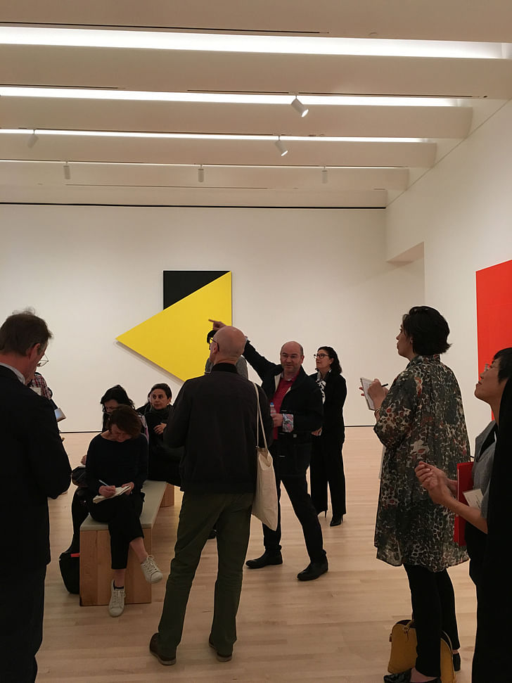
It would be fair to say that Snøhetta has excelled in architecturally setting the pace of the museum. They’ve created an artful gradation of sensory relief from the busy urban exterior to the relatively sedate interior, no matter which entrance one takes. Speaking of sensory relief: each bathroom is painted in a different powerful monocolor, creating what Snøhetta Project Manager Lara Kaufman described as a “meditative space” which will allow visitors to cleanse their visual palette.
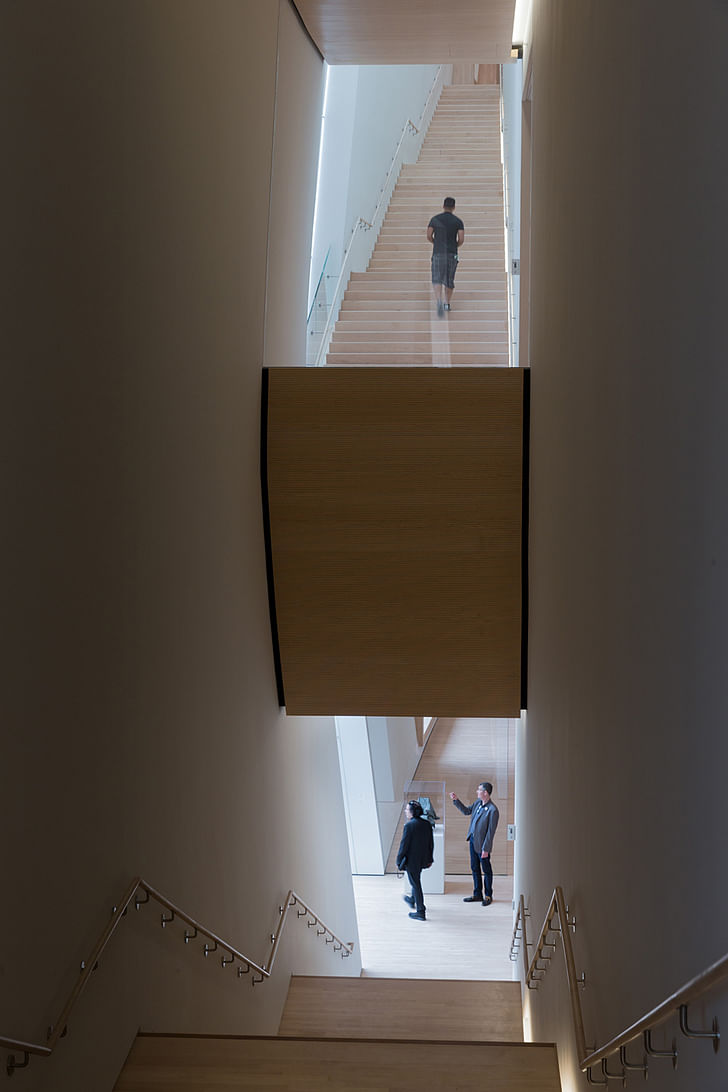
The cove and scallops were designed in order to hide the inevitable pile-up of dustOddly, the grandest visual moment of the museum comes in the form of the wooden staircases that boldly connect the fourth through seventh floors on the museum’s eastern face. At points, visitors can look up and catch a glimpse of all four floors, which appear to float into the artfully lit glass and wood heights. This multiple-floor view can be glimpsed from the base of the stairs, making it possible for people in wheelchairs to participate aesthetically. A subtle backlighting of the stairs, combined with the natural light provided by expansive bay windows and the so-called “ambient” light generated by the cove and scallop ceilings, creates a watery, fog-like atmosphere. It’s hard not to feel as though one is ascending through clouds. The span of the stairs varies as well: according to Craig, the stairs between the 6th and 7th floors purposefully have a wider span at the base but then narrow to a shoulder-brushing width at the top in order to purposefully foster closeness with one’s fellow museum goer.
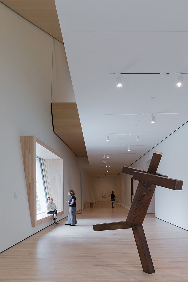
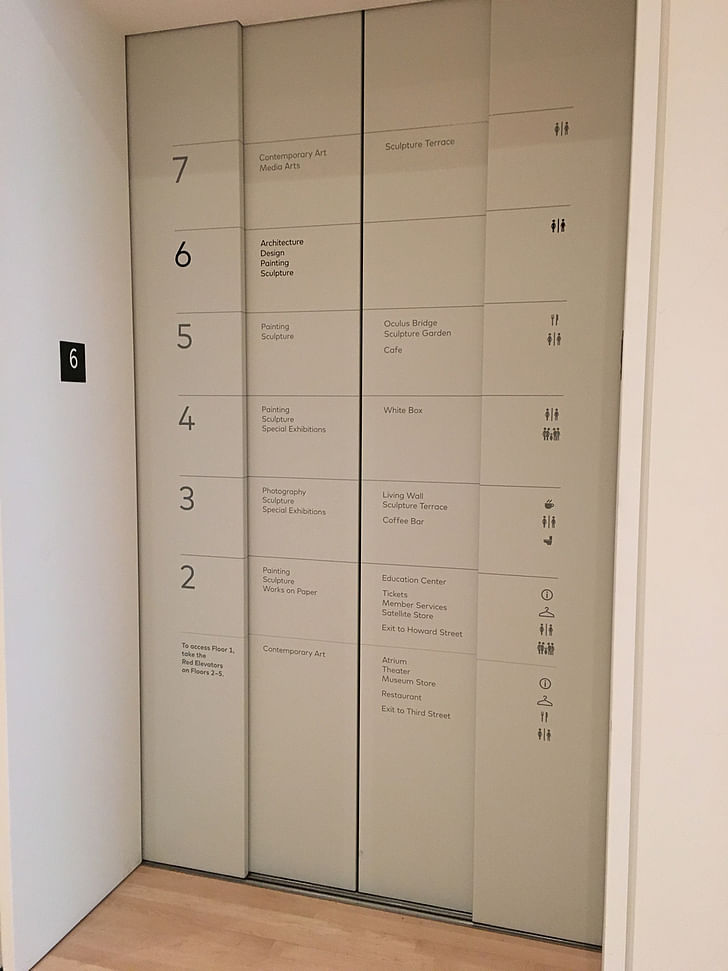
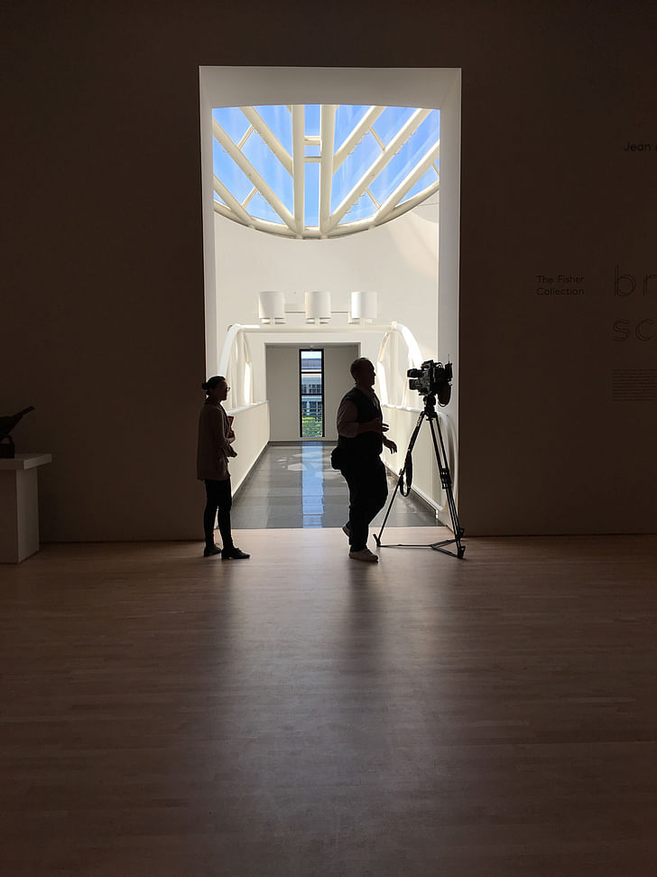
After climbing the stairs and crossing the bay window-lined hallway, one is quickly ushered back into the intimate, room-like feeling with the galleries themselves, which are made up of staggered, removable walls. Pleasing details, including elevator doors that list the contents of each gallery floor (the current floor noted in bold) eliminate the need for a clunky central information kiosk. On the fifth floor, magnificent floor-to-ceiling windows by Botta that were previously covered over to make way for a light-sensitive collection have been unveiled and allowed to sweep what is now a sculpture gallery with light and city views. These Botta windows frame the catwalk that spans the rotunda, which visitors who don’t mind looking down at five floors of empty space beneath them can stroll across.
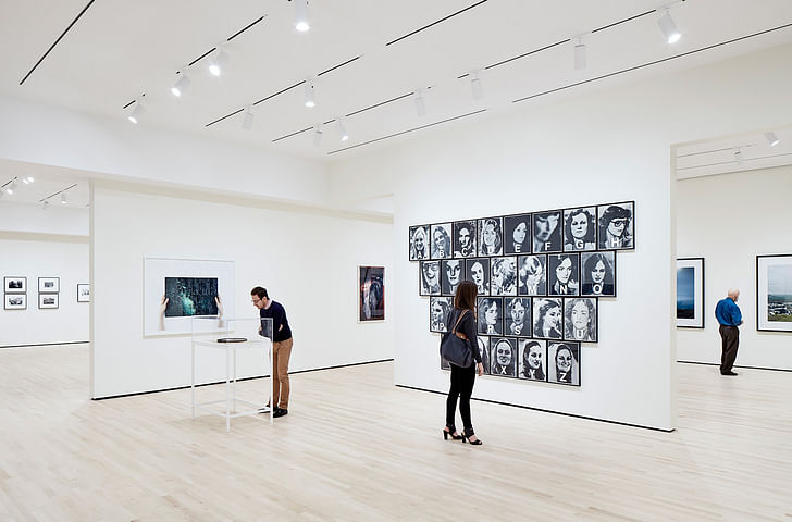
The mish-mash of different architectural styles is surprisingly successful, even within Snøhetta’s own design: the new ceilings differ, from the cove and scallop design of the fourth floor to the flat, rectilinear light strips of the sixth to the exposed, black-painted ductwork of the contemporary art gallery on the seventh. The cove and scallops were designed in order to hide the inevitable pile-up of dust while simultaneously extending the impression of natural light from the windows in the adjacent hallway. The choice to use a mixture of embedded rectilinear strip lighting in combination with spot lighting on the flat ceiling was, according to Lara Kaufman, to keep the distraction level to a minimum and give the art visual prominence.
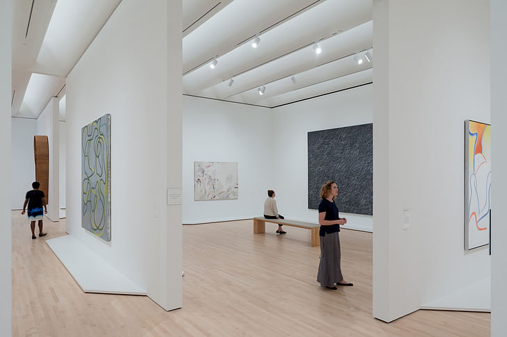
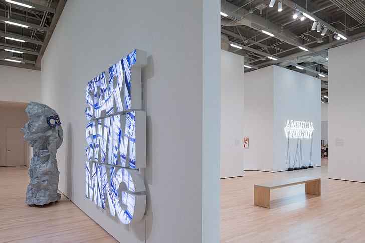
Meanwhile, according to Dykers the exposed ceiling on the contemporary art level was left that way because the art on display is itself in a raw and emerging form, but one can’t help but wonder just how thin that $305 million budget was stretched. This is not a museum that attempts to awe the visitor with scale, but rather with its accessibility
The Samuel Anderson-designed conservation labs, which are located on the seventh and eighth floors, are purposefully linked by a hole in the ceiling in which conservators can shout up to one another. Edith Cohen, who works in the collections department, was thrilled with this design. The hole in the ceiling, along with the panoramic city views and exterior decks on the three staff-only top floors, create what she feels is a warm and altogether beautiful working environment.
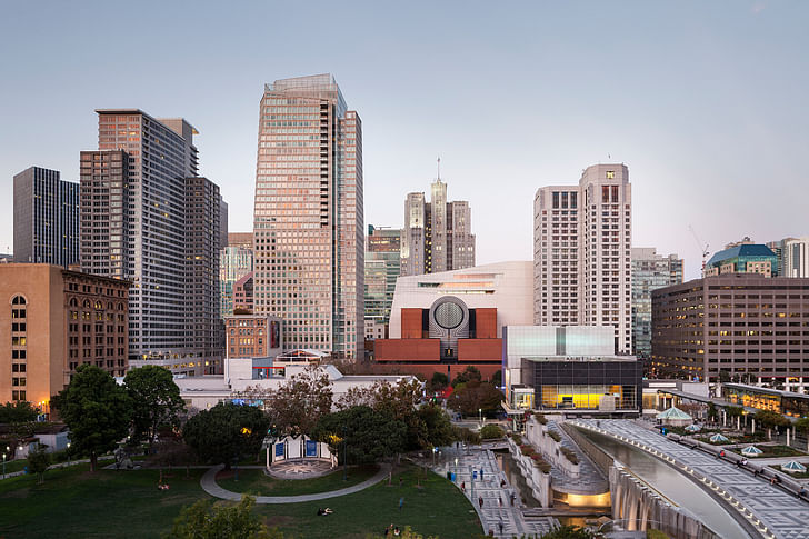
Ultimately, the museum—which boasts a public observation deck on the seventh floor that overlooks downtown San Francisco and a slice of the Bay Bridge beyond—elegantly achieves its stated goals of being accessible and welcoming to all, if not necessarily being a stunning piece of architecture in its own right. Passersby, including one woman who energetically attempted to get into the museum only to be turned away because she was not a member of the press, were uniformly eager for it to open (the public opening is on May 14). This is partially due to the lengthy remodel—it closed in 2013, making the area a bit of a scaffolded eyesore for daily commuters—but also due to its vibrant, shapely facade. This is not a museum that attempts to awe the visitor with scale, but rather with its accessibility. The museum staff stated repeatedly that admission to anyone under 18 will remain free, while the first and second floors now effectively function as some of the most beautiful interior public space in the city. Egalitarianism never looked so good.
Julia Ingalls is primarily an essayist. Her work has appeared or is forthcoming in Slate, Salon, Dwell, Guernica, The LA Weekly, The Nervous Breakdown, Forth, Trop, and 89.9 KCRW. She's into it.
7 Comments
Good review, not the boring contrarianism I've read elsewhere. Serra seems to work best in a museum context, not sure why. Outside of that, his sculptures become invitations to criminal activity. Also, you should have titled this SFMOMA: a New Hope, followed by MoMA: the Empire Strikes Back... Just an idea.
Like the panels - slick - unlike the dented up cladding on Berkeley Art Museum
^ seriously
I was blinded by them on a recent sunny day. And the detailing is terrible. Asking too much from on site steel fab.
Julia Ingalls
the future of architectural criticism.
I agree LiMX, for once a piece of significant substance on architecture with matching literary skills; granted I've always been bias to Julia's writing (it's another level with other levels)
NY Times - you should reach out.
belly of a museum industry.
Don't think NYTImes does architecture/craft anymore. Just political narratives devoid of reality.
Not even close to the anti bilbao - that building is just as much about form and architecture as tourism draw.
Block this user
Are you sure you want to block this user and hide all related comments throughout the site?
Archinect
This is your first comment on Archinect. Your comment will be visible once approved.