
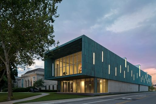
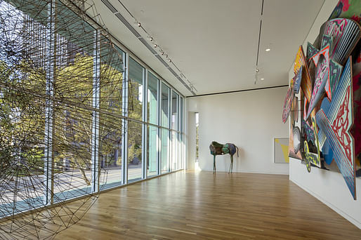
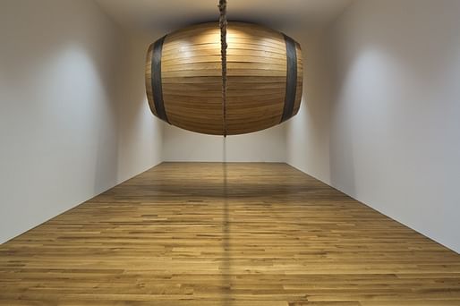
While the new Margaret M. Walter wing of the Columbus Museum of Art won't officially be open to the public until October 25th, we here at Archinect have a sneak peak.
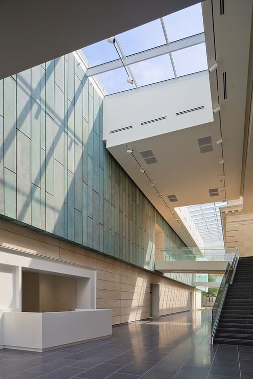
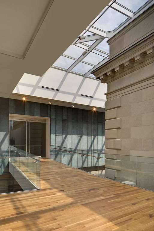
The Ohio-based branch of DesignGroup and landscape architecture firm MKSK joined forces to create the 50,000 square foot addition, which features among other amenities a dedicated video gallery, meeting rooms, sculpture garden, and a museum store.
13 Comments
Wow, beautiful materials and finished. Love the green patina finish
Looks lovely. Dang I was just in Columbus this week; missed it. Will have to go back as I also missed the Wexner this time around (I have seen it 15 years ago).
Did some projects with DesignGroup late in my career just as they broke through to take over Columbus. A marketing juggernaut, corporate modeled with no individual architect as a lead designer (thus the name DesignGroup), no FAIA’s in the bunch, no historical lineage….they even call their clients “customers”, imagine that….a good business model that has legs.
Strong simple form compromised by weak details. Budget related or maybe watered down by collaboration? Not that more than a few would notice.
Not asking belligerently, Miles, just asking: what are the weak details? I was thinking that long "blank" facade on the sidewalk might be off-putting to some people but to me looks carefully crafted enough to keep my interest (but I have a far deeper interest in stacked masonry units [even hung to look like their stacked] than do most people.
Think “stacked” = “organized”, a hallmark of what architects are all about.
The body of their work is let’s say “corporate”, not hard to garner 76 design awards in a vacuum, I can attest to that, but what I admire most is their business model which was used to get-big, and from there you can get good opportunities like this project.
Oh, good lord. "They're stacked" not "their". Ugh that kind of mistake graaaaaates my nerves to no end! Sorry, Everyone!
Think what Miles was referring to was stuff like this, and more, not sweating out the details…the cavity could have held all of this mechanical stuff and eliminated the trac lighting….no art to spotlight.
Carrea's got it. No effort to manage air handling within the architecture, thoughtless grilles and lighting, 1970's HALO track lighting, wood floor on bridge and in gallery runs the wrong way, inconsistent trim details, etc. Not a fan of glass rails, could have done something much more interesting for that kind of money. You never want to look into a light and allowing a picture of your work showing such glaring lights to be published is simply unconscious. They go to all the trouble to make the copper wrap return to distinguish form then clearly apply a surface below it without any return (by the desk).
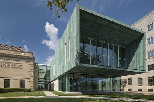
Manipulation of exterior form compromised in several ways, most notably on the sides with minimal overhang and shadow lines that abandon the effort put into the front (offset stacked box) and the 'arty' window pattern.
There's also an uncomfortable contrast between the glass walls on the upper and lower levels, the upper wants to be more open but feels less so. And the grid isn't sized to the opening, it's got a little sliver on the sides. Cheap stock curtain wall or lack of attention? Maybe both.
Good point about the mech and lighting guys, I still love the materials
Thanks, Miles. I agree with a lot of it. I've never liked glass railings, personally. They seem like a cop out.
Museum architecture shouldn’t look like a-kit-of-parts from Sweets Catalog; the best attempts to be “invisible” with invisible parts. Exposed parts like the subject railings should be handmade for the application, think the glass railings just say “catalog”….place needs a Chihuly, not Halo Track….museum architecture should say “Don’t look at me, look at that!!"
Spectacular building!
Block this user
Are you sure you want to block this user and hide all related comments throughout the site?
Archinect
This is your first comment on Archinect. Your comment will be visible once approved.