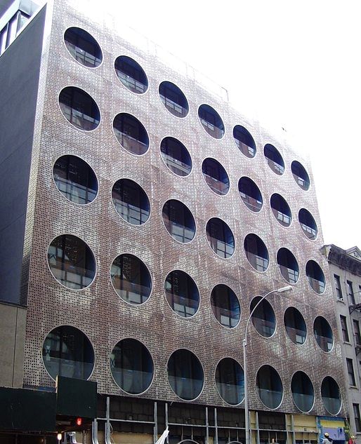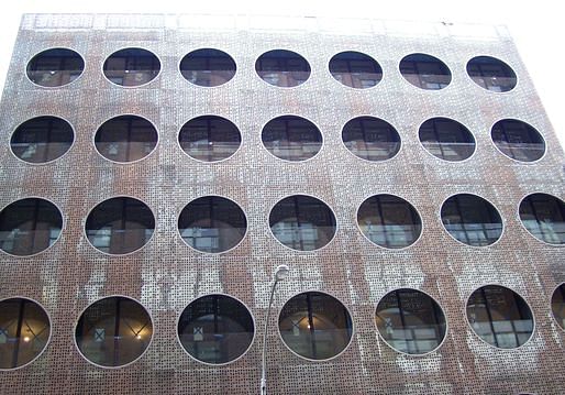
There's a thin line (or radius, in this case) between what enhances a design and what simply makes it look like it's trying too hard. In the case of buildings with circular openings on their exterior facades, the effect is often visually arresting, but is it good architecture? The COR building in Miami is arguably a blend of both: its proposed highly sustainable wind turbines, mounted in the circular openings of the exterior facade, make it stand out on the skyline as well as on energy-savings meters. Compare this to the Dream Downtown Hotel in Manhattan (see below), which is...well, it doesn't have wind turbines in its holes, let's put it that way.

However, the Dream Downtown Hotel is aiming for an altogether different effect, which it achieves brilliantly. Thanks to the combination of stately steel and outsize circular holes, it's quite visually attractive without being ostentatious.

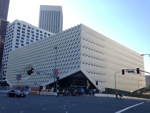
Presumably, guests would want to stay here because it's interesting without tipping over into Las Vegas-y ostentation. But what of the hole in the Broad museum's exterior?

Memorably compared to a contraceptive sponge, the Broad Museum in downtown Los Angeles does appear to be absorbing all it can in an effort to neutralize it. The exterior features one massive circular hole among a facade of darting elliptical slits, like a puddle amidst concrete rain-drops. The big question here is, why the big hole? Were the architects tangibly casting an eye on the adjacent MoCA, or going for that all-encompassing "eye of Sauron" look? Of all three structures, the Broad is the least successful in its usage of a hole in the exterior facade. Unlike with COR and the Dream Downtown Hotel, the Broad's hole is literally that: an absence of thought.
3 Comments
Not sure i agree regarding the Dream Downtown Hotel being "quite visually attractive without being ostentatious". Definitely not ostentatious and the brise soleil(esque) facade is fine for what it does, but the color, pattern and massing are pretty blah...
just to add to this since I like things with holes in them too:
Strata Tower, London. Voted as the ugliest new building in the UK for 2010.
Reier and Umemoto's 0-14, Dubai. One of those buildings that actually looks like a rendering. For better and worse
Morris Lapidus, Founainebleau Hotel Miami. This is the sort of stuff that makes historic architecture worth knowing.
And OMA / Rem Koolhaas, who have probably done more than anyone today to poke holes in architecture. Starting with the house in Bordeaux...
Again at the Prada SF
Nam: Good point. In this case, the surrounding urban context aided in its visual attractiveness.
Block this user
Are you sure you want to block this user and hide all related comments throughout the site?
Archinect
This is your first comment on Archinect. Your comment will be visible once approved.