“The architecture becomes a solution to an almost unsolvable puzzle,” Ingels told me one recent morning. — WIRED Magazine
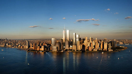
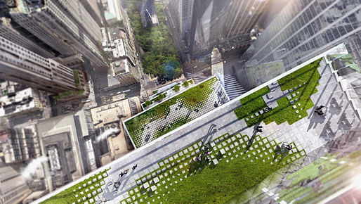
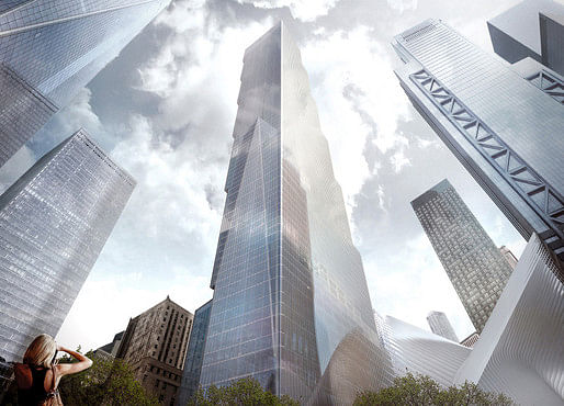
Last week Archinect broke the news that Bjarke Ingels' BIG had taken over the design of Two World Trade Center from Foster + Partners, and today BIG has released its first renderings of its proposed new design. Foster's slanted quadruple diamond crown has been nixed in favor of a stepped-back design of seven stacked boxes that preserves the existing views to St. Paul's Chapel to Memorial Park while making it appear from the New Jersey waterfront that Two World Trade Center is "leaning in" to SOM's One World Trade Center. BIG's significant redesign also incorporates a series of rooftop gardens on each step-backed ledge, which will feature biomes from the arctic to the tropics.

The design attempts to honor the memorial of Ground Zero while simultaneously injecting BIG's signature enthusiasm into what will be the third tallest tower in New York City. As Ingels explained to WIRED Magazine, “On one hand [the design is] about being respectful and about completing the frame around the memorial, and on the other hand it’s about revitalizing downtown Manhattan and making it a lively place to live and work.” Ingels' energy-infused design reflects the attitude of its major new tenants, Rupert Murdoch's 21st Century Fox and News Corp.


38 Comments
What the fuck? The tower by Foster was so much more elegant.
(The article says it will be third tallest? After the spired WTC1 and Vinoly's Park Avenue residential tower.)
Wow...I'm a bit of a pessimist but even I am blown away by how unimpressive this is. All that anticipation for a staircase tower that will blend in quite well with the corporate banality of the rest of the WTC site? (To be fair, this one is complete with roof gardens which will allow occupants to be violently blown off to their deaths from a 1,000 feet above ground!)
Agree @sameolddoctor - Foster's bundled-tubes massing was much more elegant. This is so bulky. The view from across the river actually makes Tower 1 look good, which is both unbelievable and kinda sad.
I've finally cracked the code, Bjarke is the man behind realultimatepower.net
Real Ultimate Power Author in regards to Ninjas:
"Ninjas are the ultimate paradox. On the one hand they don't give a crap, but on the other hand, ninjas are very careful and precise."
Bjarke Ingels in regards to this building:
“On one hand [the design is] about being respectful and about completing the frame around the memorial, and on the other hand it’s about revitalizing downtown Manhattan and making it a lively place to live and work."
Yeah...
Actually if anything I guess if he IS Robert Hamburger I'd never be able to dislike the guy...
(Thanks, Julia.)
I like it. I like all of Bjarke's work, and I like how it's presented. "Like" is a very mild word, I know, but I still need to parse out exactly what/why I DO like it.
Ok. I'll put it out there: I think I may prefer it.
Seems interesting enough not to be boring - but not so interesting as to be threatening (to those who are threatened by such things - it is newscorp right?).
The stacking and offset of the volumes generates the perception of a bit of formal instability that is evocative of the site's recent history. This echo of history was in the Foster design as the confluence of the top planes of the tower at the ground level location of the destroyed towers, yes?
I think the "block-stackiness" of the overall form as seen from the one side articulates it in a way that does avoid the abrasive disjointing when type-scales collide (as it is said was the intent). The New Whitney is volumetrically articulated in such a way that it achieves a similar avoidance of alienating its surroundings, i think. (Same formal device, different building scales and types.)
A little gimmicky maybe with the roof gardens (not that I dislike them - it just seems that it's de rigueur these days) and the salesmanship of the whole thing. But I think it's a step forward architecturally for the site & city. I do like the visual shielding of the rooftop amenities which allows the architectural intent to not be sublimated by the communications equipment requirements.
Knives and forks everyone? Dig in..
I like this a whole lot better than the foster design! but then, I'm a big fan of dumb-block-architecture....
I do question the utility of the roof terraces at 1000+ feet. How can these possibly be usable without massive wind baffles or, worse, a glass enclosure?
The 'vertical village' concept is commendable, but it's a pretty old idea; how many times has the 'vertical city' been attempted? Sky-gardens just can't reproduce street-level activity because there's no connectivity.
Also curious that the renderings were released via Conde-Nast-owned Wired... didn't they just move into 20 floors of WTC #1?
stacked boxes, where have I seen this before? Oh yeah, everywhere!
Isn't the stacking banal volumes what Rem Koolhaas has been doing for the past ten years? I think that Bjarke is a paid actor and BIG is a subsidiary of OMA. Or maybe just OMA-lite dumbed down for developers. This is sort of the only thing you are allowed to do at this scale and site.
Fox News bow down to the masters of propaganda. And in Wired magazine...(maybe the arch press is tasteful). That video was tight (and peak Bjarke) but can't save this tower from being the least elegant of the bunch. And the diagram process still irks me because it is dishonest... An honest process would be Bjarke with a table full of Legos a la Tony Montana surrounded a team of 100 marketing people. It has nothing to do with TriBeCa.... Please. On a side note, I did see a European child projectile vomiting on a New Yorker this morning but didn't realize the significance until now.
a ShoP, Holl or Jeanne Gang, Selldorf or Berke tower would have been way better. I find their response much more craft oriented and interesting.
'It will appear like a vertical village...forming parks and plazas in the sky"
Yup.
Did anyone else notice the half court shot in the basketball scene??? Swoosh!
That half court shot going in is also peak Bjarke. But what who was the young black woman in the elevator doing working at Fox News? Seems unlikely...
So did Bjarke invent the terrace? And yet, I see them all over. So I guess what he means by rejecting modernism is another word for doing all of the same things as modernism, but just add a dash of well produced videos and a marketing complex to convince us it's revolutionary.
I think that's why it was in Wired, arch publications actually know history and precedents. In Wired, every issue is a Revolution in X.
Any way you slice it, BIGs work isn't great architecture. Roof terraces aren't an excuse for mediocrity. If you are looking for inspiration look elsewhere. I'm going to cleanse my self by looking at Enric Miralles or something better.
BIG is..."maybe just OMA-lite dumbed down for developers." Bingo, @Lightperson.
And @ Evan - I am a huge fan of simple boxy architecture too, when it's done well. This isn't. This is trying to be both an elegant volume and a new tower typology, but it ends up being neither - it's like a cool idea that has already been VE'ed down to nothing. I would much prefer a simple, well-detailed box to a fat staircase. It's easily the heaviest tower design in memory, and isn't that the exact opposite intention of breaking up the massing via the boxy-tower concept?
And speaking of both nice boxy towers and OMA's shadow, it's worth remembering two towers Rem proposed in NYC (or just across the river), both of which seem nicer than WTC2. I know, I know - different client / sites / situations, but come on - in terms of design skills these put BIG's amateur hour to shame.
Yes^ those above are much better. Though I'm not really a huge fan of the stacking boxes anyway unless done right. The New Museum is an example of done elegantly, though SANAA doesn't really pretend to be a philistine
Idk, stacking volumes is a 100 year old trend... More traditional than revolutionary. I guess that makes BIG the Al Gore of architecture.
I enjoy it, and my favorite part is that each terrace is a different biome. Using a rather repetitive idea and adding a slight twist. Also, I think it will have a very nice appearance, especially from across the river where it will appear as if it is leaning towards the 1WTC, as the article states.
The SANAA museum is quite nice, because it is not a supertall...
Looks like it wants to tip over and fall down.
Technically the style is much older
http://nyc-architecture.com/STYLES/STY-setback.htm
Then again, our culture love remakes
There's a Murdoch who's sure all that glitters is gold
And he's buying a stairway to heaven
Im trying to be openminded about this, but it just sucks from every angle.
still waiting for the NINJA!
pssst
i got your ninja....
Let's see - I am a low paid "intern" at BIG, and need to put together a design before Bjarke and the rest of the Danish millionaire partners come back for lunch...
DONE!
Everyone keeps comparing BIG's tower to Sejima's New Museum but it's like comparing a pre-owned Ford to a Bentley. The New Museum has setbacks on all sides, which makes the stacked boxes concept so visually compelling. WTC2 is just a repetitive staircase.
Ironically, there was a moment in the video BIG released which showed all of the boxes in a more irregular, New Museum-y way, and I thought "damn! that is going to be an awesome tower." and then 2 seconds later all the boxes shifted to the regular stepped pattern and I thought "damn! that would be bad even for SOM."
Here's a good reaction from Vanity Fairs goldberger
http://www.vanityfair.com/culture/2015/06/two-world-trade-center-news-corp-rupert-murdoch-bjarke-ingels
Repeats my issue with the pretentious nature of the new media PR masking whatever architecture is there. There isn't that much difference between Foster and this, except the marketing and a few terraces, still he is a bit more generous about the idea of volumes that reflect the needs of the occupants. It's a clever idea, but false when you realize that only the bottom two volumes has any clients to start with.
Pretty much the pinnacle of BIGs version of branded architecture, where marketing drives the design process.
The architecture mullet. Business up front, party in the back. I guess it depends on if you like mullets.
The diagram is nice.... Which is the problem with BIG. If only we lived in the diagram. In person, I echo Goldberger... It will probably look the same as the other ones from street level. You won't see the terraces, and the volumes will probably blend together like the Maki tower does (more elegantly).
original concept diagram
Interesting that journalists are against high rises all except for the persuasive BIG whom butters them up and hands them an easy narrative. It's not really as revolutionary as it is ordinary. its nice, but it really is amazing how a fairly ordinary tower is presented by journalists all falling in line .
^ True, and for this reason I am waiting to see what Kimmelman, Wainright or Hawthorne will write. Paul Goldberger is hardly the most critical of architectural 'critics' - I mean, the guy is writing a biography of Frank Gehry for God's sake. He's quick to toe the line of starchitect-worshiping, which might explain his awkward defense of WTC2 at the end of his article.
OMA's Seattle Public Library diagram is another precedent for this process. Though the main difference is the great webbed frame built on top of that one, combined with great interior design. BIG just builds the diagram ..... lame in my opinion. It will probably be successful but many ordinary buildings are. Not great architecture though.
just, enough with the reinventing modernism schtick. you just designed a big glass tower. it's not revolutionary, just more of the same.
But the Seattle Public Library has setbacks on all sides, at random, much like the Sejima Museum. And, it creates a wonderful public space with the leftover volumes. All this creates is a stairway to heaven.
Does the slick promotional video by Fox / News Corp. bother anyone else?
haha boy!
thank you for the answer and he uglee....
remix!
nearly sliced my wrist watching the BIG promo....
this video has more class
what does the fox say!
In a way it is broken both in form and in spirit. Shorter than WTC1 and visibly broken by slightly offset volumes from certain vantage points. We all understand the intentions here, while we forget the evolution of the skyscraper. This building should TOWER over #1. It should be a metaphor for the historical Ascension of the Skyscraper in the US and the lifting of the shadows cast on this country by 911. (x at least 1.25 or 1.3 in height) Architecture in the United States has somehow been stifled by this event in a way that needs broken through. This represents a second chance and the future. It shouldn't stop just short of 1. It should TOWER. The image of the Shadowed Twins should remain their own on the skyline in our memories and this new couple should have an identity all their own. Truly ascend, do not stop short. FLW's Mile High Tower may be a bit lofty here, yet it is closer in spirit to what we need. Dubai, China, next Egypt... we cannot sit by and let the World build while America spends all of our $s on Homeland Security...Otherwise, they have won. Ascend with vertical movement, beauty and poetry, not bulky stacked volumes.
Block this user
Are you sure you want to block this user and hide all related comments throughout the site?
Archinect
This is your first comment on Archinect. Your comment will be visible once approved.