After moving a few times in Cincinnati throughout the later half of the 20th century, the Contemporary Arts Center relocated into its current home at the Lois & Richard Rosenthal Center for Contemporary Arts in 2003. Designed by Zaha Hadid, who won the commission in the late 1990s, the building is the first U.S. contemporary art institution designed by a woman. Shortly after the building opened, Herbert Muschamp of The New York Times hailed the building as "the most important American building to be completed since the end of the Cold War.” The non-collecting museum has housed temporary exhibitions, installations, and performances.

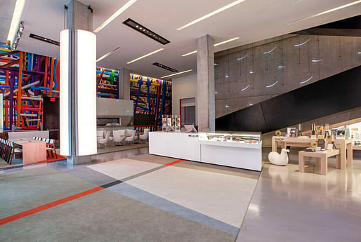
Hadid envisioned the CAC building as an "urban carpet" that draws in pedestrians to experience the interior space by walking on a gently sloping meandering path. Aiming to connect the building's monochromatic exterior with its "playful" interior, FRCH added a cafe, lounge, and seating area in hopes to create a livelier and welcoming lobby for visitors. "We sought to soften the edges of the iconic design through a series of artistic interventions," according to FRCH Senior VP and Principal Jim Stapleton in a statement. CCO and Partner Paul Lechleiter and Stapleton led the $1.1 million renovation that began on January 6, 2015, of which $760,000 was fundraised.


New additions include more art and film installations downstairs from local and international artists, new sofas designed by Patricia Uriqua for the cafe/lounging area, and custom-made chandeliers by local artist Matthew Kotlarczyk. The new retail space is more centrally located and features mobile fixtures and lighting that can be adjusted to accommodate museum functions, special events, and customer demand. A series of illuminated adjustable columns lets artists transform the mood of the lobby and its surrounding streetscape.
5 Comments
Wow. I agree with Lauf. It's a mess.
The original lobby scheme was pretty unfunctional/bad, but nowhere near so bad that it deserved this.
WOW, looks like it was a lead of interior designers and their color vomit design sensibility's.Such a shame the original was not the best building by far but this???
They paid a million dollars to ruin their entry and scar up the building. Astounding. It's like taking a gold bar and having it bronzed.
train wreck
Block this user
Are you sure you want to block this user and hide all related comments throughout the site?
Archinect
This is your first comment on Archinect. Your comment will be visible once approved.