anchor
Critical response to Googleplex expansion focuses on suburban development, not architecture
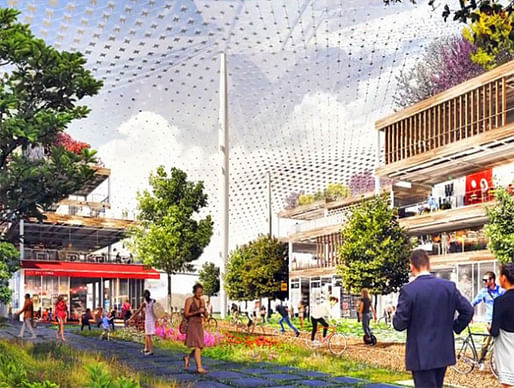
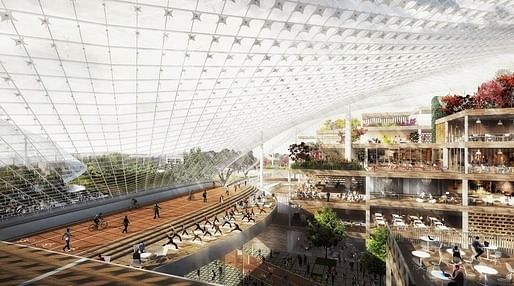
Render of the proposed Google campus plan by BIG and Heatherwick Studios. Credit: Google
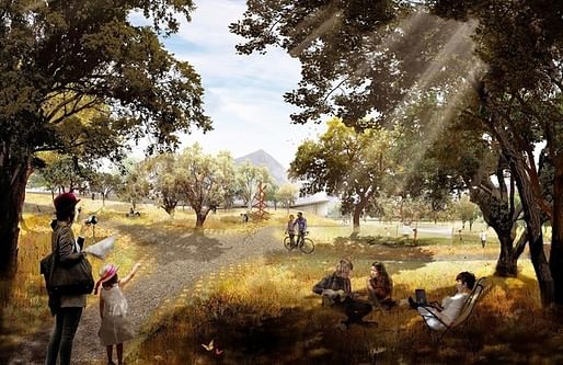
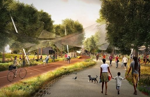
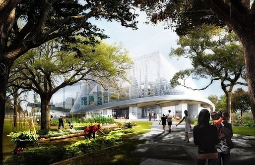
Google’s choice of BIG and Heatherwick Studios to design their Mountain View campus expansion is true to form: big, brash, debatably realistic, with a dash of techno-utopianism. The critical response to the proposal – a series of webbed glass shells covering reconfigurable utility spaces, integrated with the North Shore’s natural landscape and urban life – depended on where it was published. Design and architecture publications picked at BIG and Heatherwick’s design; tech and general publications focused on mega-client Google and the changes to Mountain View.
The renderings released at the end of February (see here) are part of a massive master plan submitted by Google to Mountain View officials on February 27. It is highly unlikely it will proceed as-is. But with the sheer real estate that Google commands in Mountain View, this project adding 2.5 million new square feet to Google’s cache of the majority of privately owned land in the North Bayshore area, it’s certainly not scaling things down. As of 2014, Google owned or leased nearly every office in North Bayshore. As of 2013, it employed 9.7% of the city’s workforce*.
While local anxieties are mounting towards Mountain View becoming Googletown USA, this expansion testifies to a significant spark in the history of urban planning. Tech companies have been experimenting with socio-urban analogies in the design of their campuses, the idea being that it fosters innovation. But the sheer scale of this project is too big for analogy; Google is actually being its own urban planner, operating in the critical space of suburbia.
Here’s how a few critical voices are interpreting this evolution of the company town – for architecture, for citizens, for transit, for everything:
Nathan Donato-Weinstein, Real Estate Reporter for the Silicon Valley Business Journal, on how Google treats master planning with the same technological determinism that drives its other pursuits (emphasis mine):
- "current architecture is too rigid, and construction methods too slow"
- "Louise Mozingo, chair of the landscape architecture and environmental planning and urban design department at U.C. Berkeley, called the proposal "utopian." "They're absolutely trying to remake a whole district in a city," Mozingo, who studies tech campuses. "There's no other company that's ever tried to do this. That's a very ambitious vision." The tremendous scale is possible only because Google, with $64.4 billion in liquid assets, has assembled the vast majority of privately owned land in North Bayshore, a 500-acre enclave north of Highway 101 on the edge of the San Francisco Bay. About 35 percent, or 19,000, of Google's 53,700 workers now work in what is affectionately called the Googleplex, the company said at a recent city council meeting.
- "In an introduction to the master plan, Google acknowledges its approach is unfamiliar: "Above all, our plan is a commitment to inventing a new way of doing things — an attempt, in the Google spirit, to bring the future close to hand." […] "We envision there will be some more permanent structures like stairwells and restroom cores and things like that," said Radcliffe, who is Google's vice president of real estate and workplace services."
- "If it sounds futuristic, that's because it is. Much of the technology doesn't exist yet, Radcliffe said."
Christopher Hawthorne, architecture critic for the Los Angeles Times, on the design's corporate ethos:
- "What likely sealed the deal for Heatherwick and Ingels was something different: an appeal to Google's conscience. The Heatherwick-Ingels design is meant, above all, to send a restorative message. It aims, in no particular order, to: hide the scars inflicted by car culture; bring nature and (small-scale) agriculture back to the Silicon Valley landscape; sit lightly in a drought-stricken region on a warming planet; undo the mistakes and loosen the rigidity of modernist office-park architecture; and in very clear terms reject the privatized, exclusive posture of the new Apple headquarters now under construction in nearby Cupertino."
- "It sets out, in other words, to polish up and take the dings out of Google's old company motto, "Don't be evil." Having gained its supreme place in the corporate world by occasionally throwing that three-word mantra under the Google bus in recent years — especially in dealing with Beijing and the National Security Agency — the company is using architecture not just to avoid new missteps but to make up for past ones. And not just its own but those of the wider society too."
Conor Dougherty for the New York Times, on the economic weight Google pulls in Mountain View (emphasis mine):
- "[Google's] success has brought Mountain View loads of tax dollars and a 3.3 percent unemployment rate, as well as skyrocketing home prices and intolerable gridlock. Good and bad, tech is responsible for most of it: Google is Mountain View’s biggest taxpayer, and technology companies account for 27 percent of the jobs in the Silicon Valley region, compared with 7 percent in California and about 5 percent nationally, according to Moody’s Analytics.The result is an existential argument that pits residents who want to halt the city’s growth against people who think Mountain View needs to grow up and become a real city."
Richard Waters for ft.com's Tech Blog, on how Google's design compares to other giants' Facebook and Apple:
- "It is unlikely, however, that any of these projects will be able to compete in terms of sheer aesthetics with Apple’s new donut-shaped headquarters. Conceived while Steve Jobs was still alive, its curved glass walls are set to become the emblem of a tech industry at the height of its power and self-confidence."
Oliver Wainwright, architecture critic for The Guardian, on how the design will adapt to future scenarios and maintain Google's dominance:
- "It's a kind of plug-and-play, click-together city, highly reminiscent of the dreamy projects of experimental 1960s group Archigram, whose Plug-in City envisaged a world of modular pods stacked up in a flexible framework."
"At the core of the plan is the dream of ultimate flexibility, a future-proofing strategy based on the idea that we don’t know what work will be like in 10 or 20 years’ time. It’s treating architecture as software, imagining a building that can be continually updated just like the latest apps."
Will Oremus, senior technology writer for Slate, on the feasibility of the design's utopian vision:
- "They’re wildly ambitious, high-concept, weird, and perhaps a little naively utopian. Which is to say, they’re just as Googley as you’d imagine. […] I can see them now: hordes of bright-tailed, bushy-eyed Googlers, coasting silently to work on their self-driving solar-powered bikes, saving the world by lunchtime and then rearranging their offices to save it again in a different way before dinner. All while mingling fruitfully with the diverse yet clean-cut local Mountain Viewers who for some reason will find it convenient to cut through North Bayshore on their daily constitutionals."
Steven Fleming of the Cycle Space blog, on whether the master plan is good for cyclists:
- "there are aspects of Google’s proposal about which we (cyclists) can be excited. The project promises to bring together a lot of directions architecture is generally taking that I have been saying will be beneficial to cycling generally, if we see them coming and are ready to critique or embrace as required. 1. It will be a heterotopia, an “other place”, separated from a world dominated by the logic of cars, and can thus stand as an inspiration. 2. it will embody what I called in my last book the campus condition, my way of describing buildings one can visually enjoy while riding around them in a park setting. 3. It will put cycling under one giant roof, like that of an airport, protected from rain. 4. It promises to allow every person to ride their bike to their desk."
Similar articles on Archinect that may interest you...


17 Comments
so why not just use a tensile fabric structure like the denver airport? the glass is dumb. looks like epcot center. its also dumb that the glass is all swoopy. swoppy and clear. its clarity mutes the form anyway. why does everything have to be swoopy these days.
The mesh appears to be embedded with objects which leads me to think it serves some kind infrastructural purpose....maybe for energy collection, responsive shading, lighting etc.
Fun rendering tricks to make things look cool without actually designing ...
1. Add an attention grabbing overhead plane
2. add lots of Photoshop trees, because nature can make cooler stuff than you.
Life in the (curvy) bubble, perfect metaphor.
It's mind blowing to me how ignorant general media is of the past and how brainwashed they are in their perception of something that is only a big deal because of who is involved and not what it is.....Davvid the video covers that, Heatherwick folding paper etc.....half assed work gets half assed Commentary....I am waiting
"only a big deal because of who is involved and not what it is"
But the only reason anyone cares about Heatherwick and Ingels is because of the work that Heatherwick and Ingels has produced. I don't understand the perception that the attention is not merited.
I meant Google.
The problem with Heatherwick and Ingels at this point is much of their work is theoretical... and tends to look better on the drawing board then reality. They are both learning, it seams, so I don't fault them for that, but it seems that all of the diagramming and rendering tends to come out as cheap looking in reality. It's more of a media problem than anything (see Hawthorne's response)--Google seems more interested in the PR aspects than actually building the thing. The 8 house looks cheap in reality, the W57 looks cheap, Heatherwick does installations, and the Google project is a nice rendering that they don't know how to build. A glass heavy building can take 5 years to detail and test, and that's a simple one. This is a glass tent.
sooner or later the PR stunts have to become architecture...
I think the glass canopies will kill a lot of birds, and when the dirt from rainstorms builds up it will be hard to keep clean.
It is nice to see that the concept of a company town is still alive and well, especially when Pullman in Chicago has just been designated a national monument.
Over and OUT
Peter N
Architecture as PR.
Yep.
Whats the opposite of public relations? Is it autonomy? Peer-relations? Client-relations? Self-relations?
REAL relations.
Peter, don't worry. The rainstorms aren't likely to be a problem out here.
Silicon Valley will find out that architecture is much more difficult to absorb than design, especially if you don't believe in its fundamentals.
Olaf, Can you elaborate on that?
I realize that PR is normally only associated with scheming corporate goons trying to sell stuff or spin things, but noble causes also manage public relations through architecture. Institutional buildings project strength. Religious architecture projects an otherworldliness or a sense of transcendence. Rich people throughout history have been projecting wealth, class, taste, power through architecture. Memorials especially deal in sentimental or nationalistic messaging and perception crafting.
Larry Silverstein's architect's were SOM so although there was this huge competition with major firms invited to participate, in the end SOM designed the Freedom Tower (for all intents and purposes), the experts.
There are no experts involved in this project yet.
Block this user
Are you sure you want to block this user and hide all related comments throughout the site?
Archinect
This is your first comment on Archinect. Your comment will be visible once approved.