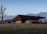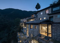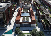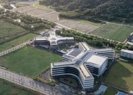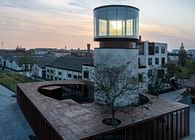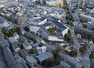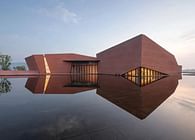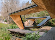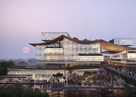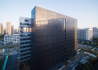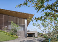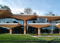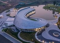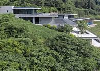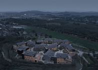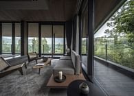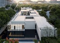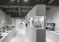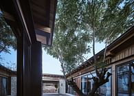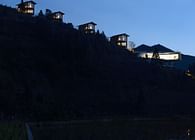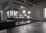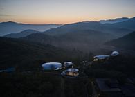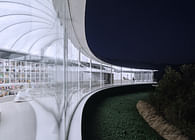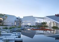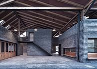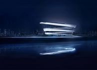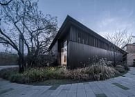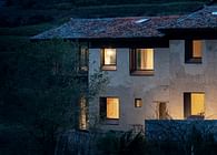
"In contrast to designing a pure and austere art center, I envision the Lishui Guyanhuaxiang Art Center as a vibrant and diverse space. During the day, visitors can explore exhibitions, while in the evening, they can stroll, gatherings, and square dances. The iconic suspended structure brings visibility, while the scattered small box-like structures on the ground exude a lively atmosphere. Art and everyday life nourish each other, merging into a symbiotic relationship, achieving a truly shared space for daily activities." — Meng Fanhao
The Zhejiang Lishui Guyanhuaxiang Art Center was designed by Meng Fanhao, Co-Founder and Chief Architect of line+ studio, leading an integrated team of architects, interior designers, and landscape architects. The project officially opened to the public on April 28, 2024. As the largest art complex in LiShui city, the Art Center is poised to become a pivotal hub for cultural exhibitions and activities, enriching the public cultural infrastructure of the scenic area. It aims to foster urban development by integrating art and tourism seamlessly.
Zhejiang Lishui Liandu Guyan Huaxiang Ancient Town, named after the 1500-year-old world heritage site "Tongji Canal (Guyan)" and the birthplace of the "Lishui Barbizon School of Painting (Huaxiang)," sits across the water from "Ancient Canal" and "Artistic Village." This town, nurtured by its ancient charm and the coexistence of modern art, has gradually developed into a unique ecological system integrating art galleries, art education, cultural tourism, and residential life. In 2019, it was honored with the title of "Zhejiang Province's Third Batch of Provincial-level Characteristic Towns."
In 2020, the local government planned to construct an art center in the core area of the town to meet the growing needs of local residents, tourists, artists, and students. This center would serve both as an art exhibition space and a venue for public education. Additionally, it was envisioned to become a significant platform for showcasing the town's culture and a landmark building in the future.
01 Side by Side, Blending Together:
Abstract Art and Vivid Daily Life
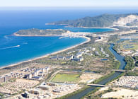
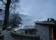
The art center is nestled in a densely populated old residential area, with the traditional settlement forms of the ancient streets nearby. Surrounded by mountains, it sits close to the Ou River's Daxi section to the north, exuding an authentic atmosphere of local life.
During the initial research and planning stages, we realized that the typical "stage" role of art public buildings, in this town, its institutional and public nature are deconstructed into a new juxtaposition—where the art center and town life become mutually backgrounded. On the other hand, from the perspective of art space operation, relying solely on the existing artistic industry foundation of the town for exhibition content is insufficient to sustain the long-term operation of such a large-scale art center.
Therefore, during the briefing stage, we proposed a proactive approach to operations and discussed project positioning and sustainable operating models with the client. Together, we formulated the design brief to ensure that the project would become a high-efficiency public space. By incorporating the daily activities of the town and expanding the possibilities of the art center in terms of time and space, we aimed to stimulate spatial vitality by integrating various mixed-use formats and composite scenarios, including future commercial, cultural, entertainment, leisure, art curation, and educational activities.
Based on this, the art center has clarified its two main aspects: one is as a space for displaying contemporary art, and the other is as a space for the daily activities of town residents. The design of the art center unfolds through four aspects: functional nature of artistic institutions, extension of public spaces, diversified functions, and regional expression. It seeks to establish a relationship of juxtaposition and integration between abstract contemporary art and vibrant daily life in the town. Juxtaposition is primarily reflected in the dialogue between volume and material expression, while integration occurs through the overlap of spatial and temporal dimensions.
02 Enclosure, Openness:
Resolving Site Contradictions through Two Scales of Design
Balancing the institutional and public aspects of the art center, as well as managing its dialogue with the surrounding residential areas and natural landscape, are crucial for shaping the building into a new landmark for the town. With a site area of 13,129.92 square meters and a floor area ratio of 1.05, the project aims to achieve these two main objectives through its architectural design.
To address the need for coherent circulation and efficient traffic evacuation within the art center, the architecture adopts a strategy of large-scale overall structures complemented by smaller-scale elements. This approach not only alleviates the sense of oppression within the block but also accommodates diverse functional formats.
The building is laid out as close to the site's red line boundary as possible, maintaining the integrity of the old street boundaries while ensuring the continuity and integrity of the streets and alleys. Two courtyards are enclosed on the inner side, one large and one small, and the building adopts an open posture through boundary setbacks and corner elevations. The upper part of the building accommodates art exhibition functions with a super-normal large-scale structure, featuring a continuous and irregular suspended form that echoes the distant mountains and distinguishes itself from the surrounding residential areas. The lower part of the building is designed to fit the daily scale of the neighborhood, with small box spaces arranged in a staggered manner to accommodate various retail and leisure functions. Thus, the institutional and public aspects of the art center are juxtaposed vertically.
03 Plaza and Block:
Everydayness and Publicness
The public nature of the town's art center lies not only in its open physical environment but also in its direct connection to the daily lives of the town residents, inviting them to be the main participants in the space. Therefore, we incorporate the prototypes of the square and the block, which serve as important carriers of public activities in the town, into the architectural design, and this is realized through three strategies.
Firstly, at the three street corners facing the old street and the direction of the town, we create three larger-scale street corner squares and ground-level elevated spaces by retreating the boundaries and elevating the corners. This design encourages people from the streets and alleys to enter the building.
The ground floor of the art center is derived from the reorganization of the spatial texture surrounding the site, allowing for seamless integration with the surrounding streets and alleys. Multiple commercial volumes of residential scale, through rotation, insertion, advancement, and retreat, enclose appropriately scaled street spaces with the low-rise residential houses nearby, allowing the architectural form to be broken down into human scale, thus extending the memory of the site.
The enclosed spaces inside the complex feature elevated walkways on the second floor, breaking the monotony of the large spaces. Various-sized courtyard squares enrich the art center's public nature: the large square serves as a venue for town gatherings, while the small courtyard, centered around century-old trees, continues the tradition of communal spaces found in towns, often centered around large trees.
04 Three-dimensional Exhibition and Spatial Transformation:
Institutionality and Narrativity
The exhibition space, suspended above the town life, is composed of interconnected galleries and corridors of varying sizes, forming a coherent spatial flow. Following the undulating architectural form, it creates a narrative of "exposition, development, climax, and conclusion" for the exhibition, providing curators with a unique perspective for curation.
The exhibition circulation begins at the street and plaza, leading through the ground-level open space and courtyards into the art center. Visitors traverse gentle steps, sloping ramps, and suspended bridges, passing through exhibition spaces to reach the rooftop. Incorporating materials with transparency and translucency, the experience of art viewing intertwines with scenes of daily life, creating unique and memorable encounters that blend conflict with surprise.
In the predominantly monochromatic exhibition space interior, the unifying element is the red metal rusted staircase, echoing the architectural features, piercing through it. This breaks away from the typical enclosed "white box" impression of art galleries, allowing for seamless integration between interior and exterior spaces, enriching the internal spatial experience.
05 Structure and Materials
The architectural challenge lies in its irregular large-scale cantilevered form, while the material challenge lies in the spatial implications and dialogue between spaces of different scales.
Steel Structure
To attract pedestrian flow from the surrounding area and make the art center a venue for daily activities, the building features several large cantilevers and elevations. Considering construction feasibility and cost-effectiveness, it was decided to use a steel structure for the upper part of the building, with trusses employed in areas with large spans and elevations.
Above the lobby, there are multiple skybridges connecting in various directions, guiding visitors to the rooftop platform. To create a sense of lightness for the skybridges, they are suspended from the roof beams using cable rods.
Concrete
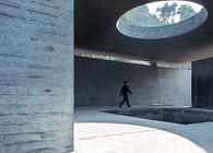
The main material for the exterior facade is board-formed concrete, known for its warm tones and textured surface, which can soften the imposing scale of the building and present an elegant ambiance. It fosters a gentle dialogue between the contemporary architecture and the vernacular surroundings of the old town.
Due to the heavy weight of cast-in-place concrete, which would impose significant loads on the structure and affect the usable space and overall cost of the project, we opted for a facade structure composed of decorative concrete and aerated concrete blocks instead. Aerated concrete blocks weigh only 1/4 to 1/5 of cast-in-place concrete per unit, reducing structural risks while effectively controlling construction costs. This approach allows us to achieve the natural and rugged qualities of concrete while ensuring a lighter overall structure.
The façade utilizes a 50mm thick thinly poured wooden formwork concrete, with reusable rubber and plywood composite formwork for the concrete molds. After the overall concrete wall is poured, a visible seam is cut every 6 meters, which is later filled and repaired with mortar to ensure consistency between vertical and horizontal joints, maintaining the continuity of the façade.
Ground-level commercial boxes
The primary function of the ground floor is commercial space, with small boxes arranged in a staggered manner in terms of scale, form, and material, echoing the characteristics of the ancient town. To continue the material texture of the old houses in the ancient town, we use blue bricks, small green tiles, and weather-resistant steel plates. This approach helps to soften the coldness of the large-scale concrete structure above and provides more color and warmth at the human scale.
By extracting the existing village texture from the surroundings, we dispersed and reorganized the small-scale commercial volumes of the ground floor, integrating them with carefully designed paving to extend the spatial memory of the site. In selecting paving materials, we continued the facade texture of the ground-level commercial boxes, incorporating bricks and tiles into the ground paving to enhance the sense of place.
Metal grille
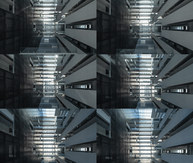
The vertical components formed by faux wood grain aluminum panels, combined with wood-molded concrete, maintain the architectural strength while adding a warm and friendly texture. This combination also creates rich light and shadow effects inside the building.
Slate Tile Roof
Echoing the undulating terrain, the roof serves as the important fifth facade of the building, and the rooftop viewing platform is a crucial element of the exhibition experience. Considering the drainage requirements, visual effects, cost, and other factors of a sloped roof, we ultimately chose slate tiles. Their color and texture blend seamlessly with the environment of the ancient town. Alternating shades of tiles are laid out to create a continuous yet detailed roofscape.
06 Building an Art Center for the Town
Building an art center for the town is not just about creating a space for art exhibitions; it's about fostering a vibrant community hub that reflects the lively and dynamic scenes of everyday life in the town. Rather than catering exclusively to a niche group of professionals, the Guyanhuaxiang Art Center is designed to serve the broader community, allowing the majority of its space to be utilized for town activities. By integrating daily life into the traditional concept of a closed-off art space, we've transformed it into an organic urban hub.
In essence, we haven't just built a public space for art; we've constructed a community center with art exhibition capabilities. This center will accommodate various functions such as commerce, culture, training, and education, unlocking multidimensional value and empowering life in the town.
Status: Built
Location: Lishui, CN
Additional Credits: Project Name: Lishui Guyanhuaxiang Art Center
Location: Guyan Painting Township, Lishui City, Zhejiang Province, China
Architecture Design Firm: line+ studio
Interior Design Firm: line+ studio
Landscape Design Firm: line+ studio
Chief Architect / Project Principal: Meng Fanhao
Project Architects: Li Xinguang
Design Team: Hao Jun, He Yaliang, Xu Hao, Wan Yuncheng (Architecture); Zhu Jun, Jin Yuting, Yang Li, Liang Guoqing, Zhang Sisi, Lv Siqi, Deng Hao, Ge Zhenliang, Qiu Limin, Chen Wen (Interior); Li Shangyang, Jin Jianbo, Rao Feier, Zhang Wenjie, Li Jun (Landscape); Liu Xinhui (VI System)
EPC Manager: Ding Yibo
Owner: Lishui Liandu Tourism Investment Development Co., Ltd.
Collaborating Firm: Xicheng Engineering Design Group Co., Ltd.
Curtain Wall Consultant: Shanghai Yidu Curtain Wall Construction Consulting Co., Ltd.
Lighting Design: Zhang Xin Studio, School of Architecture, Tsinghua University
Building Area: 13,738.96 m² (above ground), 6,463.65 m² (underground)
Construction Period: October 2021 — March 2024
Structure: Steel Structure
Materials: Concrete, Blue Bricks, Small Blue Tiles, Slate Tiles, Weathering Steel Plates, Wood Grain Aluminum Plates
Photography: schranimage, DONG Image, line+


