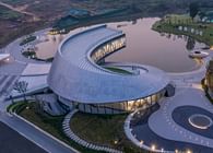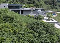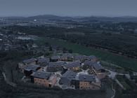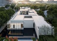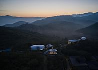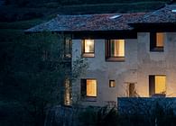
Dongximen Village, established in the Qing Dynasty, is at the foot of the range of Mount Tai. This small village grew silently for hundreds of years, until the villagers left and then gradually declined.
In 2019, LuShang Group introduced the Pusu Inn here in an attempt to activate the village as a high-end resort. During the design process, with respect for the original site, we use as little design techniques and materials as possible to naturally reveal the temperament of the site itself.
01 Retain the Memories
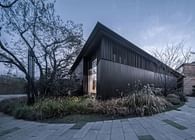
In the southwest corner, there were four utility rubble rooms. The relationship between them was the result of continuous change between the villagers' life and the natural mountain.
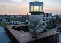
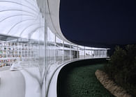
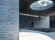
We renovated these long run-down rooms on the original scope, and establish a sunlight atrium by the glass roof to preserve the site texture and emphasize the building volume.
There is no traditionally defined internal and external façade, and the atrium is also the outdoor activity space. At the same time, the industrial glass and traditional handmade rubble complement each other.
Each volume is opened at a corner, and the opening is highlighted by the weather-resistant steel plate and black steel plate. The reception, children's activity room, bubble pool and stairs are led into the atrium. The independence of the building block and the integrity of the internal space are simultaneously reflected.
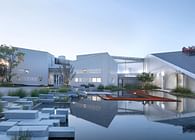
The original pothole in the center of the site was renovated into a stepped sunken courtyard, making it flexible and stable. And set a sofa there for the visitors to enjoy the natural view from the generous glass.
The renovated stone houses with changing functions will always silently carry the memory of the village.
02. Renew the Traditions
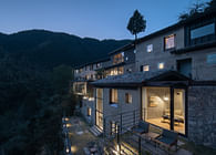
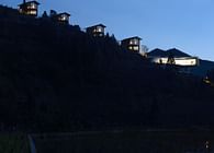
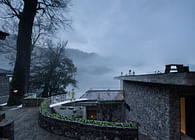
The residential courtyards of the village are mostly distributed on steep hillsides, mainly L-shaped courtyards and three-section compounds with natural resources and old life memory. All the guest rooms are born out of these declining courtyards.
We retained the original texture and spatial relationship, and strengthened the introduction of the landscape and the centricity of the inner courtyard, based on which, incorporated the functions of guest rooms and public activities in groups. Those preserved rubble walls and reconstructed rubble walls have witnessed the heritage of the new and the old. Operating the floor plan, functions, terrain and orientation, make every building out of the ordinary.
Visitors can not only enjoy high-quality vacation experience here, but also communicate with traditions.
03. Hide in the Mountains - The Introduction of Landscape
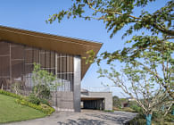
Escape from the urban reinforced concrete, just to feel the primitive nature. The natural beauty and the original courtyard space are the core of the entire living experience. With the existing rubble façade, the steel structure system makes it possible for the panoramic views and renders the demarcation between inside/outside ambiguous.
The visual passage is defined by the solid walls on both sides, fully opening a landscape view of the mountains. The bed is also set facing the mountain, so that visitors can awake in nature.
While maintaining views through the L-shaped glazed façade,make the visitors asleep in nature. And the terrace allows the visitors to get closer to nature.
Each room is partially opened to the courtyard, and the sliding door of the public living room can be fully opened, at which time, the internal and external public spaces have no boundaries and are integrated into a whole.
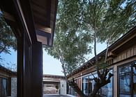
We hope to preserve the symbiotic relationship between the existing old elm tree and the courtyard, so the guest rooms are around this tree.
The bedroom, living room and bathroom form a C-shape and wrap the old tree.
04.Less is More - Space Processing Techniques
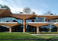
The pure geometric shape removes the deliberate decoration and modeling, restores the original state of the space, and brings a moment of tranquility to people.
The original slope roof is separated two parts by the geometric shape. The flat roof dissolves the height difference to form a stable area and hide equipment to ensure the purity. And the roof above the passage is sloping. The two parts of the ceiling are made of different materials, which also implies dynamic and static.
The necessary functional modules of the guest rooms are no longer regularly scattered in the plan, but integrated into a volume, which can be used to separate the space.
The mini bar, wardrobe, TV cabinet and hallway cabinet are effectively combined to separate the hallway, living space and bedroom space. Each area is both independent and interrelated.
Combined with the interspersed relationship of the ceiling and the difference in materials, we strengthened two visual channels in the space, allowing the visitors to admire the scenery in the distance and nearby.
In the case of sufficient space and depth, the space is confined by the processing of the height difference, while providing a better viewing perspective. The washbasin extends horizontally turns into a bar counter space. Metal mesh set at the back of the bed separates the space but not blocks the view. The mirror surface also expands horizontally, presenting a picture of distant mountains.
05. Silent and Organic - Materials and Furniture
It is our pursuit to use gray color to operate the space atmosphere, which is different from other similar resorts. As the building with the heavy rubble is perfectly integrated into the mountain, we hope the interior is also in this way, so that the mountain, courtyard and indoor space are integrated into one.
The grey surface is coated with concrete texture, which is rich in details while ensuring the purity of the overall tone. The pure colors and geometric shapes make the visitors feel calm and peaceful.
Against such gray tone, walnut wood is interspersed with the natural feeling and comfort of wood, bringing suitable warmth to the guest room. The exquisite wood facing also provides a guarantee for the quality of the space.
The convergence of gray concrete combined with the geniality of walnut wood grain makes visitors feel quiet rather than cool.
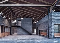
The rubbles carry the story of the place and become the main material of the building facade. We also extend them to the inside in the open public space. And the inside and outside seem to be in dialogue through rubble and wood facing.
The furniture is highlighted in this clean space. The dark gray of the cabinets, the black of the countertops and the gray concrete walls form a plain system. The sofas, armchairs, dining tables and other objects echo the space through walnut wood.
Light and warm colors of cotton, linen and rattan plaited articles add soft touch and natural toughness. The earthen jars, dead branches and old wood in the space are the continuation of nature and the precipitation of the years.
MENG Fanhao
Co-Founder & Chief Architect of gad · line+studio
2021 Venice Architecture Biennale
Gold Winner, ARCASIA Awards for Architecture
First prize in Architectural Society of China Award
Dezeen Awards Winner
Mr. Meng has long been committed to the architectural practice of both urban construction and rural revitalization, actively exploring and considering the possibility of urban environment improvement and rural revitalization under the current system and social development status. He constantly foucus on digging out the value beyond the noumenon of architecture and expanding the influence of architecture into the top-level fields such as contemporary society, economy and culture.
In recent years, he has been invited to participate in many important exhibitions at home and abroad, including the 17th Venice International Architecture Biennale, the 26th World Architects Congress in Seoul, the Bi-city Biennale of Urbanism / Architecture, Shanghai Urban Space Art Season, etc. He was awarded the honorary titles of one of Perspective 40 Under 40, the FA Emerging Architect award top 12. His firm won the dezeen awards Emerging Architecture Studio of the Year and Architecture Masterprize Architectural Firm of the Year. His design works have won the gold winner of Arcasia Awards, the first prize in Architectural Society of China award, winner of Dezeen Awards, AIA Shanghai Design Awards and iF design awards Award, etc. And his works are also published by Detail, The Architect, Time Architecture and other well-known media publications at home and abroad. At the same time, his works have also been widely concerned and praised by CCTV, Phoenix Satellite TV, Xinhua News Agency, people's daily, Sanlian Life Weekly and many other social media.
Status: Built
Location: Taian, CN
Firm Role: Architect
Additional Credits: Project Name: Jiunvfeng · Cloud of Hometown Resort Hotel
Project Location: Tai’an, Shandong
Design Firm: gad · line+ studio
Chief Architect/Project Leader: Meng Fanhao
Person in Charge: Tao Tao (Architecture), Zhu Jun (Interior), Li Shangyang (Landscape)
Design Team: Xu Hao, Huang Guangwei, Yuan Dong, Li Sanjian, Xie Yuting, Hao Jun, Xu Tianju, Deng Hao, Zhang Sisi, Qiu Limin, Jin Jianbo, Chi Xiaomei
Soft Furnishing: Yang Jun Design Office
Floor Area: 2200㎡
Design Time: 2019/06-2019/10
Construction Time: 2019/10-2020/07
Photographer: Pan Jie, zystudio


