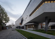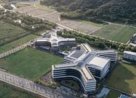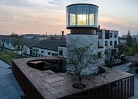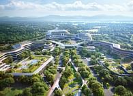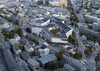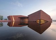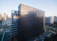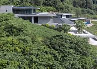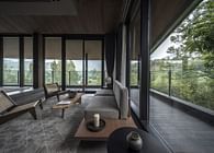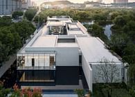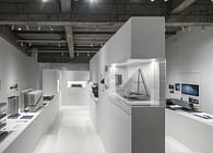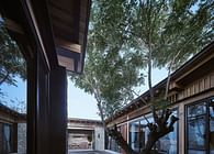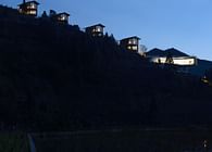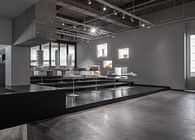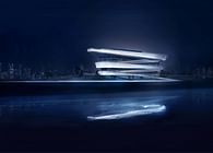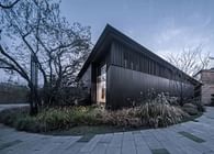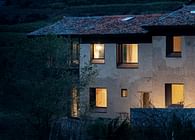
After 4 years, line+ completed the headquarters building for VIEWSHINE, a listed company developing from traditional instruments to intelligence. With integrated design, line+ has created a brand-new office space accommodated the ever-evolving working scenarios and needs in the future, reflecting a unique corporate image in the historic city center.
After the tailor-made architectural space language has completed the empowerment of the company's own brand image, we hope that through interior design, the original concept and vision will be embodied in the spatial details of the user's personal experience and the intangible corporate values will be conveyed. Ultimately, line+ incorporates corporate culture into the workplace by building its headquarters.
01
Light and shadow are eternal ornaments
For the whiteness of white is never just white; it is almost always transformed by light and that which is changing; the sky, the clouds, the sun and the moon…In this way whiteness has been one means of sharpening perception and heightening the power of visual form.
—— Richard Meier
Between the white and black blocks, VIEWSHINE Headquarters gives an initial impression of elegance and simplicity through precise order and rigorous modulus. We can't find colors other than black, white and gray, but the subtle charm of VIEWSHINE Headquarters happens to be here. Light and shadow can come and go freely in VIEWSHINE Headquarters in its most comfortable way, so we find the most eternal ornaments in this building.
Stepping into the entrance hall, you will see the contrast between the deep and shallow atrium interfaces on the left and right sides. Between the light and the dark, the reception, the front desk, and the display unfold in sequence.
The entrance hall is topped by the corridor on the third floor, which defines two levels of the entrance hall and the atrium space. Visitors in the entrance hall are the first to feel the sunlight pouring down from the top but cannot see the full view of the atrium, attracting them to go inward.
Entering the atrium, you can see the central large steps, which are connected by two floors from the entrance of the cafe to the corridor behind, like a "waterfall" pouring down with light and shadow from the top. The display table and rest seats wrapped in anodized aluminum are scattered on the "waterfall", inviting visitors to sit and stroll up the stairs.
With irregular rhythm changes, the big steps have become a changeable space integrating complex functions such as corporate display and employee communication, showing the company's welcoming attitude to employees and visitors.
The strategy of separation of office space and auxiliary functions allows the building to be visually externalized into two separate blocks. For the atrium formed by the separation of the two blocks, we do not routinely take the centrality of the atrium as the design starting point, but present the virtual-real relationship formed by the blocks in the atrium.
The west side of the atrium adopts the façade material of the auxiliary functional block, and the dark perforated panel is deepened by the curtain wall company, which maximizes the sense of volume and integrity of this functional block.
The horizontal continuous ultra-clear glass on the east side follows the unitized curtain wall of the façade, which strengthens the connection between the office space and the atrium. The concrete part is painted with concrete to maintain the simplicity of the space. The material continuity of internal and external and the material contrast between virtual and real emphasize the order on the side of the office space.
The small glass boxes hanging on the east block continue randomness of the large stair seat vertically, and extend the office space to the atrium horizontally, creating a small communication space with a relatively wide field of vision for employees who can communicate freely here. The glass boxes also use ultra-white glass and concrete paint, following the order of virtual and real of the office facade.
The glass boxes correspond to the openings of the auxiliary functional blocks on the west side, creating a rhythmic atrium façade.
Through the use of black and white, the separation strategy of the architectural design is reinforced in the interior space. The contrast between dark and light colors of the building skin continues naturally in the interior, blurring the boundary between the interior and exterior of the atrium. When the sun shines, the change of light in the interior also emphasizes the ambiguity of the boundary. In the inside is the outside.
02
Define a new definition
We regard office buildings as mixed organizations. Office buildings are no longer a simple workplace. More work behavioral demands are extended from the work mode, and it also encourages the office space to accommodate more diverse and rich work scenarios.
In this mixed organization, in order to avoid the repeated adjustment of the space due to changes in future, we have separated auxiliary functions to the west side to form a continuous and undivided large office area which will be adjusted by users.
The 3rd to 11th floors of the office space all adopt the model of large proportion of open office and small proportion of independent office. We set up independent offices and meeting rooms at the north and south ends to ensure the integrity of the open area in the middle of the office space to adapt to future flexible needs.
The application of modulus is the guarantee of the final quality of the design. We take the horizontal distance of the unitized curtain wall as the basic modulus of the interior of the office space: the dimensions of the metal stretched mesh panel of the ceiling and the division of the bay size of the independent office are all based on this criterion. It not only ensures the quality of internal and external space, but also facilitates adjustment in later use.
The corridor is located on the north and south sides of the atrium as the link connecting the black and white blocks, which is the most frequent traffic space for employees in their daily work. The light-colored PVC floor combined with the transparent glass on both sides of the corridor allows pedestrians to soak in the sunlight of the atrium and the external landscape while walking. Through the transparent glass, you can stop to see the distant view, or feel the spaciousness of the atrium. At this time, the people in the building are also the scenery outside the building: as you are enjoying the scenery on a bridge, upstairs on a tower people are watching you.
To illuminates the aisles in the auxiliary space with sunlight and shadow. The sunlight of the atrium penetrates through the black metal surface on the west side, projecting the order of the unitized curtain wall from the façade to the ground. Details of perforated aluminium panels project the mottled expression of the walls and floors.
The corridor on the senior management office floor on the top floor introduces an outdoor courtyard. The small courtyard is not only a landscape of the corridor, but also a small back garden of the manager's independent office. Connecting distant view with nearby landscapes allows managers to stimulate broad thinking when dealing with daily affairs. The interior and exterior landscapes of the building are integrated here, and the interior interact exterior here.
Different from the plain office space, the conference room, the lecture hall, and the independent office of the senior management introduce warm walnut and dark wood veneer, and continue the simple style of the overall space with an elegant atmosphere, which to make the participants more relaxed.
Since the completion of the headquarters in the fall of 2021, various departments are still moving in. The interior design strives to restore the essential space, hoping to inspire users to update more freely. With the development of the enterprise, this basic space, which is minimalist but does not lose care and details, will create its unique vivid colors from the continuous use of users. Define a new definition.
Project Name: Viewshine Headquarters
Location: Hangzhou, Zhejiang
Design Firm: line+
Chief Architect/ Design Principal: Fanhao Meng
Project Leaders: Jun Zhu (Interior), Xinguang Li (Architecture), Shangyang Li (Landscape)
Design Team:Jun Zhu, Hao Deng, Zhenliang Ge, Sisi Zhang, Limin Qiu, Wen Chen (Interior), Xinguang Li, Guangwei Huang (Architecture),Shangyang Li, Jianbo Jin, Xiaomei Chi (Landscape)
Curtain Wall Consultant: Shanghai Eduth Facade Consultants Co., Ltd.
Floor Area: 2,1497.49 square meters
Design time: 2019/07-2020/12
Construction Period: 2021/01-2021/12
Client: Viewshine Ltd.
Materials: Metal Stretch Mesh, Anodized Aluminum, Concrete Paint, Dark Perforated Aluminum Sheet, PVC Flooring Sheet, Prefabricated Terrazzo Sheet
Photography: shiromio, Aaron & Rex
Status: Built
Location: Hangzhou, CN
Firm Role: Architect & Interior Designer & Landscape Designer


