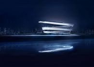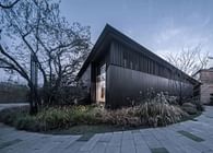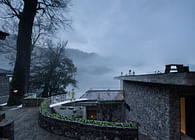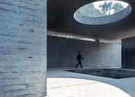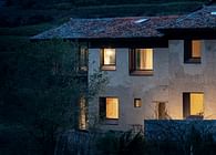
01 Art Architectural Installation and Yunnan-Guizhou Red Land
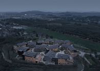
Dongfengyun Art Town, where the Art Center is located, is on the outskirts of Miele City, Yunnan Province, about an hour's drive from Kunming, the Provincial Capital. Since 2014, Luo Xu, an artist from Yunnan Province, has created a series of sculptural installations such as "Kaleidoscope" and "Half A Cloud", as well as large and small clusters of tile kilns built of red bricks, which have constituted an unrestrained exotic world with the red boundless Yunnan-Guizhou Plateau and rugged mountains. The Art Town, which covers an area of about 1.6 square kilometers, is well known to people.
02 Certainty and Uncertainty of Assignment
In 2018, we were invited by the Client to participate in a Conceptual Scheme Competition to create a new arts center for the town. In the original design assignment, the floor area was about 4000㎡, and the site was in a small valley. Under the premise of controllable investment, the Client hopes to improve the supporting functions of the town and meet the needs of small-scale art exhibitions and small outdoor concerts.
Different from urban public cultural buildings, we abandon the symmetrical layout of the middle axis that emphasizes the sense of ceremony and choose to blend with the interior and exterior in a way that is hidden in nature, so that the Art Center becomes a daily public space and creates a friendly and relaxed atmosphere. After expert evaluation, our concept was recognized by the Client and experts, and we successfully won the design right. We take this as the design direction and further promote the scheme deepening.
In the subsequent process, the Client's demand for function and scale has changed, and the lightweight art space has been transformed into a large-scale comprehensive art center. Functions such as Art Collection Exhibition, Opera Performance, Press Release and Lecture Hall were also added to the assignment. The floor area was expanded to nearly 10,000㎡, and the site was also transformed into a high point on the hill overlooking the art sculpture community. As a result, the site is more prominent, the area is larger, the height limit is stricter, and the Client's requirements are also demanding. It is hoped that the new art center can become a new landmark of the town, and trigger traffic with its media effect to attract tourists. It is a new challenge for us to balance identity while blending with nature.
03 Concept: Stone Form in Nature
During the initial brainstorming, we tried a variety of physical concepts, but their relationship with the site was difficult to explain. As we cast our eyes once more upon the vast expanse of red earth, a group of "stones half-hidden in the sand" appears slowly, with a primitive sense of eternity, linked with a sense of awe for nature, as well as a dialectic view of humility in Chinese wisdom, "Great art conceals itself."
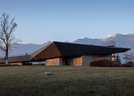
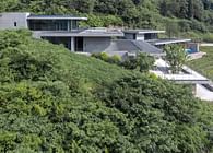
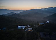
Inspired by this, we choose to return to nature, and set a group of growing "red stone formation" on the red high ground. The free-cutting shape and rough texture weaken the artificial sense of the building, making it like five extraterrestrial stones, which are still standing here after weathering over time.
04 Space: Canyon-Like Tension Remodeling
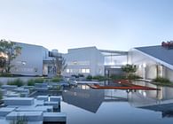
The building of visitors' sense of experience and scene is also an important factor for us to consider. We lengthened the path for visitors to enter the building. Through the sea of flowers, water features and walls, visitors slowly approach the angular "red stone formation" in the gradual transition between natural and artificial landscapes, creating a sense of ritual before entering the building.
Under the cutting of non-orthogonal shape and volume, the space experience between canyons is formed. The scaling between volumes reshapes our viewing perspective and physical experience of the sky, fields and mountains of the site.
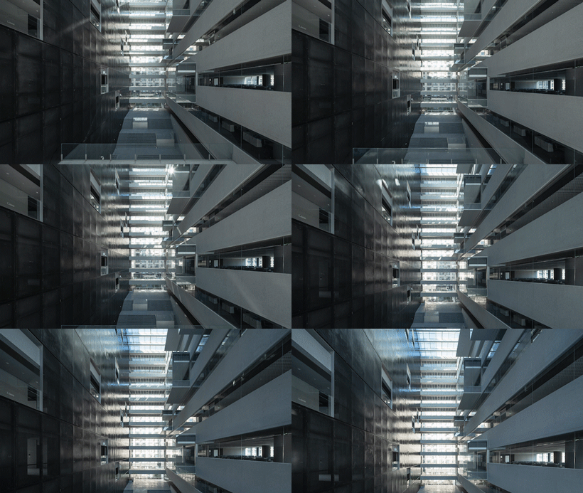
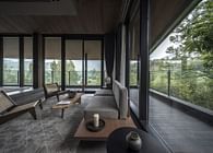
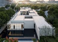
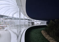
The strategy of "stone formation" realizes the division of the building functions into parts, while the glass atrium connecting five separate "red stones" integrates the architectural form. The atrium thus becomes the core of the internal space. All activities are carried out around the atrium. At the same time, all spaces can be operated independently. The art center realizes the unity of decentralized layout and overall functions. In the vertical direction, the large steps in the atrium, which conform to the natural height difference between the north and south of the site, connect the space between the first floor and the underground floor, and form a public performance and book bar space built on the terrain, where visitors can fully enjoy the sunshine and feel the natural penetration between the inside and outside.
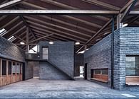
Individual "stones" bearing large and small exhibition halls and theaters are arranged at different heights. Inside the space, the steps traverse a height difference of 5-6 meters, allowing visitors to experience the "mountain walkway" and finally reach the bright and open atrium on the ground floor: "At first, it is extremely narrow and only accessible for one person. After a few dozen steps, the space opens up."
The image of the canyon is also extended to the design of interior strip lights, bar shaped Windows, front square path and other architectural elements, the space tension circulates between the inside and outside cycle.
05 Materials and Construction: In Situ Expression of Industrialized Materials
When dealing with the relationship between the building and the site environment, we must also consider the relative relationship with the red brick sculpture complex. Therefore, the use of traditional materials used by the sculpture complex was an effective response. However, under the multiple requirements of technical specifications, construction accuracy and structural safety, we finally choose to realize the local cultural expression through the industrial application of modern materials, and also try to provide some experience for the development process of local building industrialization and construction technology in Mile in the future.
Finally, the main structure of the art center is the steel structure system, and the facade is the red concrete dry-hanging curtain wall system, forming a "red stone" like cutting shape and plain texture.
1、Non-Orthogonal Skeleton
The structure should meet the following four conditions to achieve irregular volume cutting; a column-free large span space is built to bear theater and exhibition functions. For example, the maximum span of the exhibition hall is 35 meters from east to west, and the span of the glass atrium is nearly 24 meters; the civil construction of the whole building shall be completed within half a year; the local seismic anti-crack degree grade shall not be less than level 8. Thus, the steel structure system becomes the only choice.
2、Stone Curtain Wall
After comparing the construction scheme of a variety of modern materials, we finally selected the GRC dry-hanging curtain wall system. It is mainly due to its natural surface texture, controllable color difference; the 1.5×3m veneer plate width breaks through the limitation of the small plate width of Yunnan red sandstone stone and can be divided into a variety of scale standards, which is convenient for texture layout design; Secondly, a variety of internal/external angle treatment can be done to achieve the shape of the stone with sharp edges and corners. At the same time, open curtain wall design can be done to reduce the traces of artificial construction as much as possible.
2.1 Texture Shaping
In the first round of the scheme, we faced the existence of the curtain wall joints and transformed them into design elements, so that the uneven texture of the surface and the structural joints together form the overall texture, making the facade rich in variation.
After more than six months and more than ten times of texture proofing experiments, we found the following problems during on-site mock-up: due to the irregular concave and convex texture, the joint of the plate cannot be aligned, and the base plate is exposed on the side; At the same time, when viewed from a distance, the joint that originally intended to strengthen the structural sense also greatly weakened the overall sense of each raw stone; for the sake of authenticity, the hand-made, completely non-standard custom polystyrene plate mold cannot be reused. The above factors not only increase the cost of construction, but also bring great challenges to the construction, and have uncontrollable risks to the completion quality.
Combined with these problems, we re-examine the initial appeal of the design: how to ensure the control of process quality, as far as possible to achieve the rough and tough stone texture in an industrial standardized way?
We finally choose straight and powerful horizontal lines and put them together by means of vertical joints. The upper and lower joints are hidden in the internal angle of the rack, so as to weaken the rabbet node and enhance the overall sense of the raw stone. In terms of the balance between standardization and simplicity, most of the non-corner plates are standardized production, and only corner plates are customized production. At the same time, the non-standardized texture made by hand is used to weaken the misalignment of the rack when the corner is staggered, so as to give certain randomness to the standardized plate.
In the end, the texture of the building with the depth of the raw stone texture presents different shades in the sunlight, which strengthens the toughness of the massive "giant stone formation".
2.2 Color Adjustment
The first version of the color scheme uses industrial dye. The result is red floating on the surface of the plate, which is easy to fade in the perennial weathering, and the color stratification after cutting is obvious, the artificial trace is heavy. To make the curtain wall show a color similar to Mile red brick, we blended the local red soil into the casting process of GRC board, so that the red color and board are fully integrated.
2.3 Standardization under Multiple Elevation Slopes
The transverse rack of each facade needs to be horizontally connected, but the slope of each facade is different, resulting in different plate size and rack width at adjacent corners. The challenge is how to integrate the rack and ensure the standardization of the production and construction of the hangings board as much as possible under the multiple slopes of the facade.
The key to solve the problem is how to make the overall corner board well. We change the projection mode and verify it by comparing the computer model simulation with the mock-up. The result is that adjacent racks of different slopes meet and overlap, and the bottom of the rack is connected. Only the intersecting tips produce the faulting of slab ends and then the ideal texture can be obtained by manual chiseling of the faulting of slab ends. The improved fault tolerance rate through manual reprocessing makes up for the lack of precision in standardized production and realizes the sense of simplicity in the concept.
Through on-site building measurements, we have produced about 1600 production drawings. Combining the different parts of the building, the facade is divided into a variety of standardized prefabricated panels with transverse rack connections at different scales. In the longitudinal direction, the adjacent panels are spliced by means of mirror arrangement and combination, which ultimately makes the production of the panels standardized but the overall facade has slight changes.
Considering the texture integrity of the raw stone, the exterior wall texture needs to be extended to the interior and roof. However, due to the construction cost and the intensive space structure, we finally replaced the dry hanging system of the roof and interior with wet pasting to reduce the thickness of the plates. Finally, by adjusting the finished surface of the base, the texture of the indoor and outdoor interface, the roof parapet and the top surface are completely continued to a certain extent.
06 The Practice of Renewal under the Field Temperament Dialogue
The first impression of the vast expanse of red land in Yunnan and Guizhou is rough, wild, quiet and eternal. We hope that the intervention of architecture will not disturb the original field order and temperament. The raw and bold architectural form reminds people of the thousands of years of changes on this land, and will also express its multiple identities in the change of time, as a recorder and a witness.
Furthermore, Dongfengyun Art Center is not only a physical space, making up for the group gathering and cultural activity space in addition to vacation and leisure, but also will be the spatial symbol of the town, creating a unique experience of space and materials for those who come here. Finally, as the largest public space in the town, it will continue to support the town's voice and enhance the influence of art, driving the future development of the town.
Project name: Yunnan Dongfengyun Art Center
Location: Mile, Yunan
Design Firm: line+ studio, gad
Chief architect/Design Principal: Meng Fanhao
Design team: Xu Hao, Sun Xiaoyu, Wang Yubin, Jin Lingbing (Internship), Lin Nijun (Internship), Gao Junfeng (Internship) (Architecture); Jin Xin, Zhang Ding, Hu Jinwei, Tao Shuai (Interior)
Gross floor area: 9937.44 square meters
Design period: July 2018 - October 2019
Construction period: October 2019 - March 2021
Client: Yunnan City Town Construction Investment Co. Ltd.
Construction drawing: Yunnan Daokai Urban Architecture and Planning Design Co. Ltd.
Landscape design: WISTO Landscape
Concrete consultant and construction: SUZAO ARCHITECTS
Team: Du Jie, Zhang Wen, Zhang Xiang, Guo Hengrui, Song Hanrui, Li Linfeng, Xu Qin, Xu Jin, Pang Yan
Photography: schranimage, Wang Ce
Model photography: Chen Xi, Sun Lei
Status: Built
Location: Yünnan, CN
Firm Role: architect


