Does anyone know how Diller, Scofidio + Renfro do their renderings? I really like the simple style of it that feels more artistic but with a digital touch...not so "official" and "concrete" as in typical realistic renders...
Just thought Id throw it out there and see if anyone had any ideas...thanks!!
and that coming from someone who actually wants to see what they're doing.
from what I can recall about images seen in the past, seemed to be a lot of drawing scanning and photoshop, not much in the sense of 'push-button-done-rendering' type of action. But also a lot of exuberant, stylistic, 'emphatic' or overdone line action.
i believe there is a previous post on this topic which goes in depth into how they create the images.
personally, i am not a fan of the newer renderings. i prefer the older ones. the new ones just don't appear to have the depth and workmanship of the older ones. for example, the competition in dc just looks underworked.
all that is just opinion on the current renderings, not on the quality of the architecture/idea. it is in fact a place i would love to work.
I'll have to concur with the above statements, looks like some ambient occlusion render pass with hand drafting layered in and photoshop post production. I think the difference with many of their later renderings is that they are no longer done by the original artist, as they are now a big design firm in their own right completing some of the worlds most sought after projects.
Most of the renders done in the 'classic' DSR style seem to be from 2000-2007, a friend of mine likened the style to Dali, a surrealist mixing of photograph and masterful drafting. There is a rendering from the installation at the MOMA with a drill penetrating the galleries that I really love that illustrates the idea.
I agree that their newer renders are not near the same taste as their past renders...
I couldnt seem to find a similar thread, but I didnt look TOO hard...think Ill just try the suggested workflow. Im sure they dont use this one, but Ive been using Artlantis for a while and may try mixing it with Piranesi and then photoshop to see if I can get something close from that route also...
i saw a rendering similar to something i've been experimenting with lately.. Vraying Ink & Paint materials in 3dMAx.
the very nice pool image above, if I were to do it...
ink & paint black and white for most the building in 3dMax. then use 70% transparent light blue standard max material (phong-100,100). render just the building on a white background
now in photoshop, use some light artistic filters over a duplicate of the building image, and then turn transparent that layer over the original until you get an almost sketch like quality
use fading gradients throughout in white or black on as 'overlay' to create the lighting hotspots
photoshop in the people, pool, grass and background
boom done.
doing a realistic render would probably take 10 times longer.
sspringer i normally don't tell people how to do what i do, but lately i've become more of an architect than aritist so i'm letting some trade secrets out.
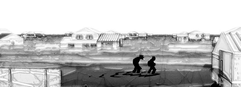
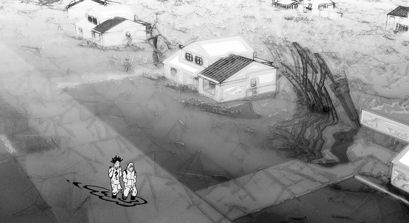
I had good feed back on the following images, that most likely won't get published now
3dMax + Photoshop
Steps:
1) apply B&W 'Ink + Paint' materials to objects in 3dMax scene. use ink with variable widths, on denser geometrical images use thinner lines, on more important objects use thicker.
2) for sketchy wild lines, use black wire frame on a heavily meshed object (as in the water waves shown)
3) use 'Advance Ray Trace' settings for one 'Directional light'. turn raytracer settings down to '2' instead of '9'
4) open in photoshop and duplicate the image, so two identical layers
5) background layer, use 'Chrome' filter, make it fat and juicy
6) layer on top, use 'Distort's' - 'Diffuse Glow' and set layer to around 60% transparency
7) over the complete image add a layer set as 'overlay', do a black to white paint gradient from bottom to top
I think it's better to refer to DSR renders as the Cooper Union style.
here a classic Diller+Scofidio from the MoMA archives:
1991. Cut-and-pasted color electrostatic prints and graphite on frosted polymer sheet taped to board with cut-and-pasted color photograph, 12 3/8 x 18 3/8" (31.4 x 46.7 cm)
I don't think its wrong to use the computer to develop techniques to match the style of the above rendering by DSR, matter fact it should be the next step in computer rendering to continue the graphic design development of the profession.
Realistic renderings have a very obvious limit, if perfect it will look real.
So I find experimenting with various modes of representation in the computer a lot more exiting than making a real rendering.
(Plus if you have ever dealt with client after showing them a real rendering you know more abstract is less painful and leaves their minds open to imagination)
I disagree that there is an 'obvious limit'. Generally speaking, that is correct, but that is also like saying that because we have movie cameras, then we've seen the limits of cimena (or photography, for that matter).
What you forget is that there is still the element of creativity.
There are boring photos (most) and amazing photos (rare). They are the same process, same equipment, but it is the artist that makes one special.
Anyway, DSR's renderings could easily be made in any 3D software from 15 years ago. No GI or plugins necessary.
While I think these newer ones look flat and boring, a la many renderings from 15 years ago, the value is they can be made extremely quickly.
I agree that those old ink on mylar/collage drawings are where some of these abstract presentations should move. The problem is, without good GI, renderings look very cold and flat.
Thanks elgenvectors, very nice image! I agree with you that a significant benefit to the more abstract style of rendering is that they are quicker and dont lead the client to believe thats EXACTLY what its going to look like...you can more simply and effectively convey the idea behind what youre doing, as well as preserving flexibility and openness with the client. That was why I wanted to see how others would approach this style of rendering, theres so many potential ways to do it, and in the end its the artist behind the brush (or mouse ;-p) that makes it happen.
Funny you should say that trace, right now I am doing raytrace images with no GI for an artist, she likes that style, but having trouble making the illuminated glass pop, so have to figure some photoshop tricks to make it work. GI is quite magical.
I agree somewhat with what you are saying, but besides exiting camera angles and focusing tricks, the real images if exciting are because the design in the rendering is exciting.
Once you make the real take on a style and any hint of abstract impressions you are moving away from real renderings and into something with more potential.
trace...nice images you posted..i particularly like the last image, although one of my pet-peeves are floating people - or shadows disconnected (unless the girl in the red pants is skipping!)
on a side note, a lot of the renderings I do start with an "abstract-ish", or concept relevant graphic (usually raw/dirty stuff) but then get cleaned up towards realism by the time clients get to look at them...
audience, i guess...
the last one is nice, but the part cut off from the image above looked interesting...
GI is amazing, it's a done a lot for renderings, if it wasn't for GI you wouldn't have that very eye candy look to it...
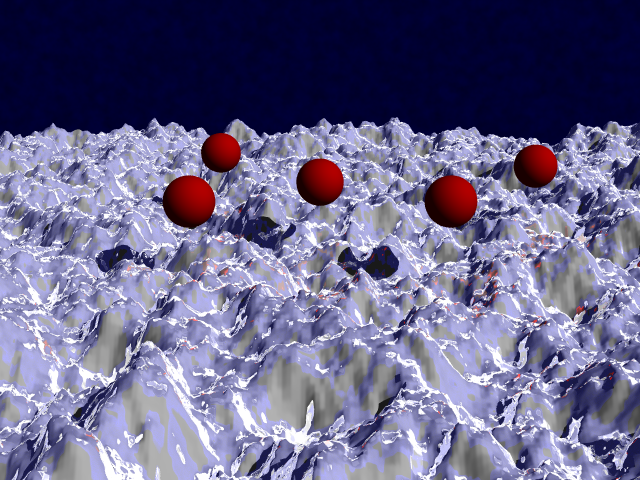
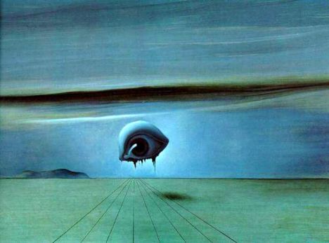
random side note since we're talking about rendering...
my first taste was 15 years ago in text based pov-ray and at the time the trendy, or cool renderings looked just like Dali landscapes...well sort of, because unless you were mathematically gifted the best you could do was a reflective sphere on a landscape with terrain elevation based on some jpeg image...
best samples i could quickly find...
Jul 31, 09 11:15 pm ·
·
Block this user
Are you sure you want to block this user and hide all related comments throughout the site?
Archinect
This is your first comment on Archinect. Your comment will be visible once approved.
DSR Renderings
Does anyone know how Diller, Scofidio + Renfro do their renderings? I really like the simple style of it that feels more artistic but with a digital touch...not so "official" and "concrete" as in typical realistic renders...
Just thought Id throw it out there and see if anyone had any ideas...thanks!!
Diller Scofidio + Renfro
OMfG that website is UNpleasant to navigate.
and that coming from someone who actually wants to see what they're doing.
from what I can recall about images seen in the past, seemed to be a lot of drawing scanning and photoshop, not much in the sense of 'push-button-done-rendering' type of action. But also a lot of exuberant, stylistic, 'emphatic' or overdone line action.
It looks like sketchup + vray + mild photoshoping.
sketchup model -> tons of "billboard objects" - > vray render -> sketchup line overlay in photoshop -> photoshop for halos and fog.
i believe there is a previous post on this topic which goes in depth into how they create the images.
personally, i am not a fan of the newer renderings. i prefer the older ones. the new ones just don't appear to have the depth and workmanship of the older ones. for example, the competition in dc just looks underworked.
all that is just opinion on the current renderings, not on the quality of the architecture/idea. it is in fact a place i would love to work.
momentum,

i agree.
there is no depth here compared to say the hybrid renderings of the eyebeam atelier, though it seems to be a lot of the same techniques.
i think there is less intuition and more formulaic process to their newer renderings
I'll have to concur with the above statements, looks like some ambient occlusion render pass with hand drafting layered in and photoshop post production. I think the difference with many of their later renderings is that they are no longer done by the original artist, as they are now a big design firm in their own right completing some of the worlds most sought after projects.
Most of the renders done in the 'classic' DSR style seem to be from 2000-2007, a friend of mine likened the style to Dali, a surrealist mixing of photograph and masterful drafting. There is a rendering from the installation at the MOMA with a drill penetrating the galleries that I really love that illustrates the idea.
I agree that their newer renders are not near the same taste as their past renders...
I couldnt seem to find a similar thread, but I didnt look TOO hard...think Ill just try the suggested workflow. Im sure they dont use this one, but Ive been using Artlantis for a while and may try mixing it with Piranesi and then photoshop to see if I can get something close from that route also...
Well the no-no-smoking chamber is definitely sketchup... you can tell but the angulation of the curves on the circle.
From what i know, sketchup is one of the the only programs that does that.
There's a crosshair and a few lines styles that are identical to sketchup's construction marks and sketchy edges.
In another render, the bounce back light is very grainy... typical to what a light cache render engine produces.
i saw a rendering similar to something i've been experimenting with lately.. Vraying Ink & Paint materials in 3dMAx.
the very nice pool image above, if I were to do it...
ink & paint black and white for most the building in 3dMax. then use 70% transparent light blue standard max material (phong-100,100). render just the building on a white background
now in photoshop, use some light artistic filters over a duplicate of the building image, and then turn transparent that layer over the original until you get an almost sketch like quality
use fading gradients throughout in white or black on as 'overlay' to create the lighting hotspots
photoshop in the people, pool, grass and background
boom done.
doing a realistic render would probably take 10 times longer.
sspringer i normally don't tell people how to do what i do, but lately i've become more of an architect than aritist so i'm letting some trade secrets out.
I had good feed back on the following images, that most likely won't get published now
3dMax + Photoshop
Steps:
1) apply B&W 'Ink + Paint' materials to objects in 3dMax scene. use ink with variable widths, on denser geometrical images use thinner lines, on more important objects use thicker.
2) for sketchy wild lines, use black wire frame on a heavily meshed object (as in the water waves shown)
3) use 'Advance Ray Trace' settings for one 'Directional light'. turn raytracer settings down to '2' instead of '9'
4) open in photoshop and duplicate the image, so two identical layers
5) background layer, use 'Chrome' filter, make it fat and juicy
6) layer on top, use 'Distort's' - 'Diffuse Glow' and set layer to around 60% transparency
7) over the complete image add a layer set as 'overlay', do a black to white paint gradient from bottom to top
nice work eigenvectors!
and thanks for sharing technique. very good of you.
I think it's better to refer to DSR renders as the Cooper Union style.

here a classic Diller+Scofidio from the MoMA archives:
1991. Cut-and-pasted color electrostatic prints and graphite on frosted polymer sheet taped to board with cut-and-pasted color photograph, 12 3/8 x 18 3/8" (31.4 x 46.7 cm)
Thanks jump.
I don't think its wrong to use the computer to develop techniques to match the style of the above rendering by DSR, matter fact it should be the next step in computer rendering to continue the graphic design development of the profession.
Realistic renderings have a very obvious limit, if perfect it will look real.
So I find experimenting with various modes of representation in the computer a lot more exiting than making a real rendering.
(Plus if you have ever dealt with client after showing them a real rendering you know more abstract is less painful and leaves their minds open to imagination)
Yes, nice work ev and nice of you to share.
I disagree that there is an 'obvious limit'. Generally speaking, that is correct, but that is also like saying that because we have movie cameras, then we've seen the limits of cimena (or photography, for that matter).
What you forget is that there is still the element of creativity.
There are boring photos (most) and amazing photos (rare). They are the same process, same equipment, but it is the artist that makes one special.
Anyway, DSR's renderings could easily be made in any 3D software from 15 years ago. No GI or plugins necessary.
While I think these newer ones look flat and boring, a la many renderings from 15 years ago, the value is they can be made extremely quickly.
I agree that those old ink on mylar/collage drawings are where some of these abstract presentations should move. The problem is, without good GI, renderings look very cold and flat.
Thanks elgenvectors, very nice image! I agree with you that a significant benefit to the more abstract style of rendering is that they are quicker and dont lead the client to believe thats EXACTLY what its going to look like...you can more simply and effectively convey the idea behind what youre doing, as well as preserving flexibility and openness with the client. That was why I wanted to see how others would approach this style of rendering, theres so many potential ways to do it, and in the end its the artist behind the brush (or mouse ;-p) that makes it happen.
Funny you should say that trace, right now I am doing raytrace images with no GI for an artist, she likes that style, but having trouble making the illuminated glass pop, so have to figure some photoshop tricks to make it work. GI is quite magical.
I agree somewhat with what you are saying, but besides exiting camera angles and focusing tricks, the real images if exciting are because the design in the rendering is exciting.
Once you make the real take on a style and any hint of abstract impressions you are moving away from real renderings and into something with more potential.
I haven't been there in ages, but PushPullBar used to have some great competition entries and abstract-ish presentations:


(Quick find)
trace...nice images you posted..i particularly like the last image, although one of my pet-peeves are floating people - or shadows disconnected (unless the girl in the red pants is skipping!)
on a side note, a lot of the renderings I do start with an "abstract-ish", or concept relevant graphic (usually raw/dirty stuff) but then get cleaned up towards realism by the time clients get to look at them...
audience, i guess...
the last one is nice, but the part cut off from the image above looked interesting...


GI is amazing, it's a done a lot for renderings, if it wasn't for GI you wouldn't have that very eye candy look to it...
random side note since we're talking about rendering...
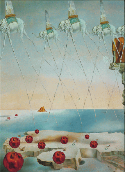
my first taste was 15 years ago in text based pov-ray and at the time the trendy, or cool renderings looked just like Dali landscapes...well sort of, because unless you were mathematically gifted the best you could do was a reflective sphere on a landscape with terrain elevation based on some jpeg image...
best samples i could quickly find...
Block this user
Are you sure you want to block this user and hide all related comments throughout the site?
Archinect
This is your first comment on Archinect. Your comment will be visible once approved.